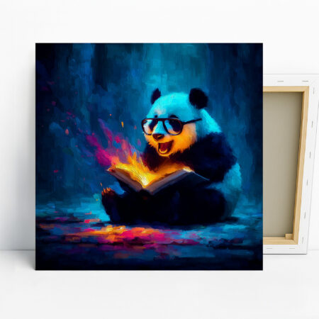
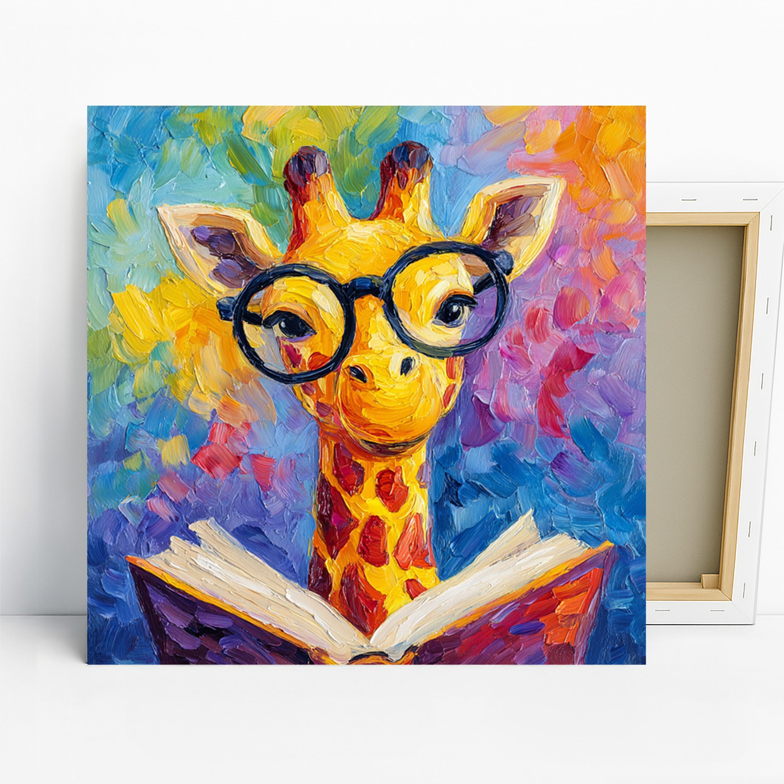
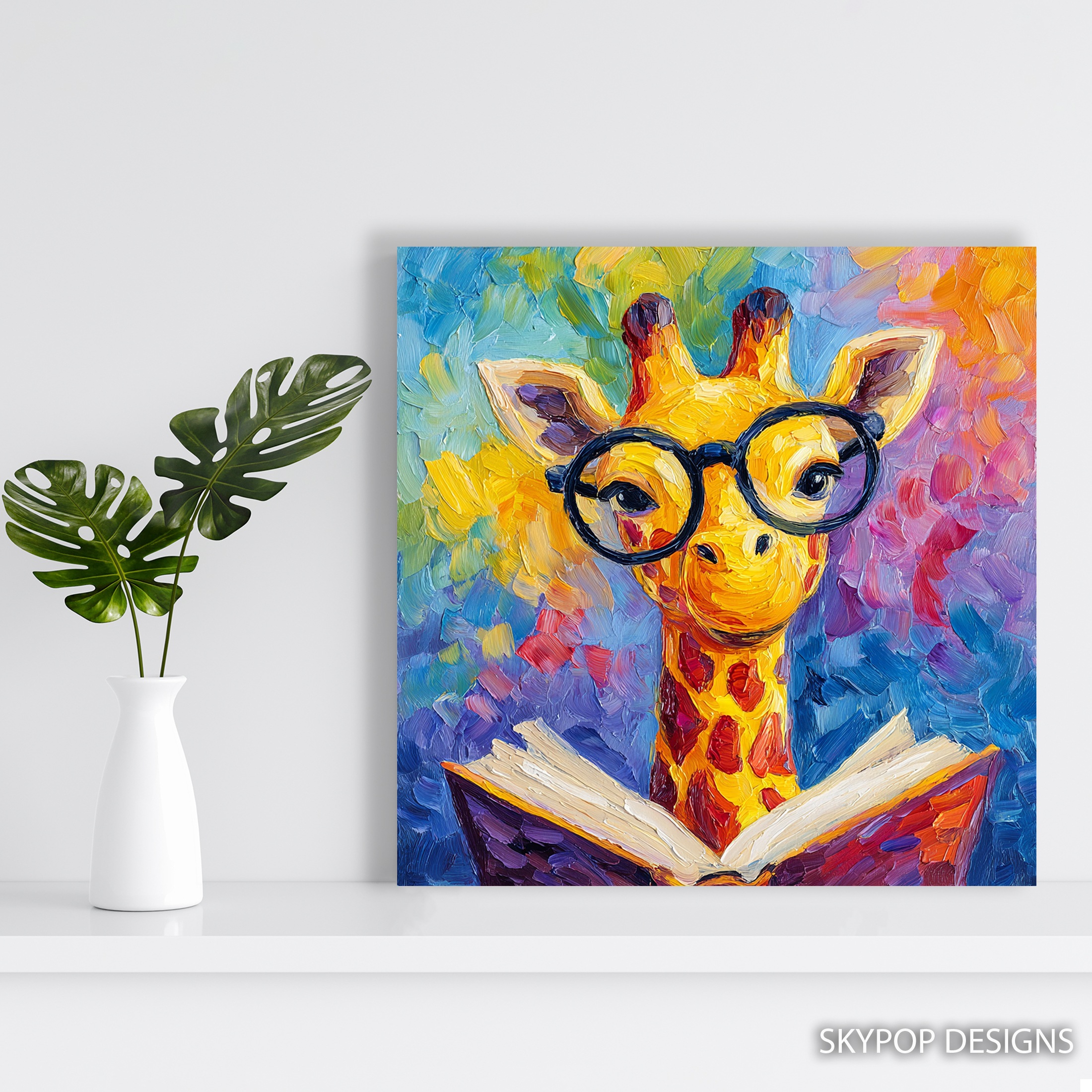
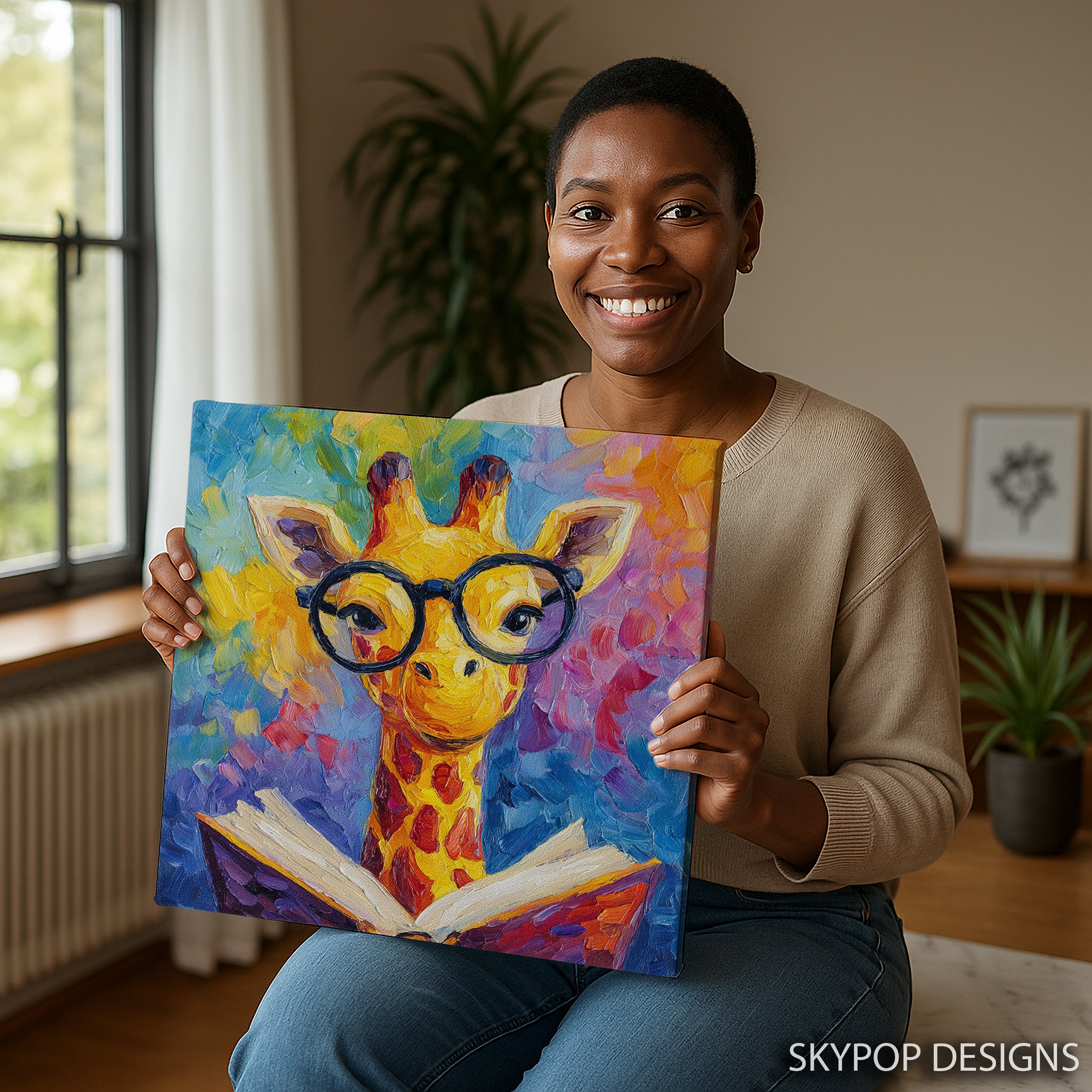
This giraffe reading art does something most animal prints can’t—it injects a dose of intellectual whimsy into your space without feeling childish. Picture a tall giraffe, glasses perched on its nose, nose-deep in a colorful book against a vibrant backdrop of yellows, blues, reds, and purples. It’s the kind of piece that sparks conversations, whether you’re a book lover stocking a home library or a parent aiming to inspire reading in a kid’s room. I love how it fits eclectic setups, blending playful vibes with modern edges.
If you’re eyeing this for your office or nursery, you’re in the right spot. These tips will walk you through hanging it just right, from size picks to color matches. We’ve got families, young pros, and literature fans in mind here at Sky Pop Designs. Check out our Giraffe category for more animal-inspired finds, or dive into our blog for 2026 decor trends. By the end, you’ll see exactly how giraffe reading art can brighten your walls and your mood. It’s versatile enough for professional spots like libraries too—think adding personality to a bland bookshelf area. No more staring at blank walls; this artwork turns them into story starters.
1. Pick the Perfect Size for Your Wall
Sizing matters more than you think with giraffe reading art—get it wrong, and it either dwarfs the room or gets lost. Start by measuring your wall space. For a cozy nook like above a desk in an office, the 16×16 inches or 18×18 inches options keep things intimate without overwhelming. I’ve hung the 20×20 inches version in my own library setup, and it fits perfectly over a single chair, leaving about 6-8 inches of breathing room on each side.
Bigger walls call for bolder choices. The 24×24 inches or 28×28 inches shine in children’s rooms, where they command attention without crowding play areas. Fair warning: the smallest 10×10 inches works for shelves but skips it for focal walls—it’s too petite and loses impact. Always factor in ceiling height; aim for the center of the piece at eye level, around 57-60 inches from the floor. This follows solid scale and proportion in interior design principles, ensuring giraffe reading art feels balanced. Test with painter’s tape before committing. In a nursery, the 14×14 inches adds charm above a changing table, but pair it with neutral walls to let the colors pop. Bottom line: match size to function, and this print becomes a seamless part of your decor.
2. Wall Colors That Complement giraffe reading art
Giraffe reading art thrives against walls that let its vibrant palette shine, but not every shade plays nice. Soft neutrals are your best bet—think light grays or warm whites like Benjamin Moore’s ‘Simply White.’ These grounds the yellows and blues without competing, making the giraffe pop like it’s stepping out of the frame. In my experience, pastel blues echo the artwork’s cooler tones beautifully in a bedroom, creating a serene yet fun vibe.
Avoid deep reds or stark blacks; the built-in crimson accents in this piece can clash, turning playful into chaotic. For offices, a soft sage green wall tempers the purples nicely, tying into 2026’s biophilic trends. According to basic color theory, complementary hues like soft oranges alongside the blues boost energy without overload. Test samples in your lighting—daylight amps the yellows, so lean cooler at night. In kids’ rooms, a pale yellow wall amplifies the whimsy, but keep it subtle to avoid a candy-store feel. One caveat: if your space has heavy wood tones, balance with crisp whites to prevent muddiness. Ultimately, giraffe reading art demands walls that support, not steal, the show—choose wisely, and it transforms ordinary spaces into inviting ones.
3. Light Your giraffe reading art Just Right
Lighting can make or break how giraffe reading art looks—too dim, and those colors fade; too harsh, and glare kills the texture. Natural light is ideal; hang it near a window in a living room where morning sun highlights the brushstrokes without washing out the purples. I’ve positioned mine facing east, and the soft glow brings the reading giraffe to life, emphasizing its joyful expression.
For low-light spots like libraries, add targeted LEDs. A slim picture light at 3000K warm tone casts even illumination, mimicking daylight and preventing shadows on the canvas edges. Steer clear of overhead fluorescents—they flatten the vibrancy. In children’s rooms, clip-on spots work wonders above beds, adjustable to follow the kid’s growth. Pro tip: keep bulbs at least 12 inches away to avoid heat buildup on the archival inks. This setup not only showcases the whimsical details but also sparks curiosity, perfect for book nooks. If your office has recessed cans, angle one directly but diffuse with a frosted cover. Harsh spots? They emphasize the glasses on the giraffe awkwardly. Experiment with timers for evening reading sessions. Done right, lighting turns giraffe reading art into a mood booster, drawing eyes and smiles all day.
4. Pair giraffe reading art with Furniture and Accents
Furniture choices elevate giraffe reading art from wall filler to room star—pair it thoughtfully for cohesion. Mid-century modern pieces in walnut or oak grounds the eclectic energy; a simple armchair below in a library pulls the blues and yellows together without fuss. Add potted plants on side tables—the greens nod to the animal theme, softening the bold canvas.
In bedrooms, colorful eclectic sofas with neutral throws balance the purples and reds. Skip heavy leather; it fights the playful mood. For accents, rainbow pillows in soft fabrics echo the book’s multicolors, but limit to two—overdo it, and the space feels cluttered. Bookshelves nearby amplify the reading motif; stack classics for that intellectual touch. One limitation: in small offices, avoid bulky desks underneath—the 28×28 inches size might crowd. Opt for slim scandinavian lines instead. Metal finishes like brushed brass lamps complement the warmth, adding subtle shine. In 2026’s dopamine decor trend, this combo sparks joy without excess. Vary textures: pair the canvas with woven rugs in beige to anchor the vibrancy. It’s all about harmony—let the artwork lead, and your furnishings follow. This approach makes giraffe reading art feel intentional, not tacked-on.
5. Installation Tips for Lasting Impact
Hanging giraffe reading art right ensures it stays put and looks pro—don’t rush this step. Use the included sawtooth bracket for easy wall mount; for heavier sizes like 24×24 inches, add French cleats for stability in high-traffic kids’ rooms. Center it 8-10 inches above furniture—too high, and it disconnects from the space.
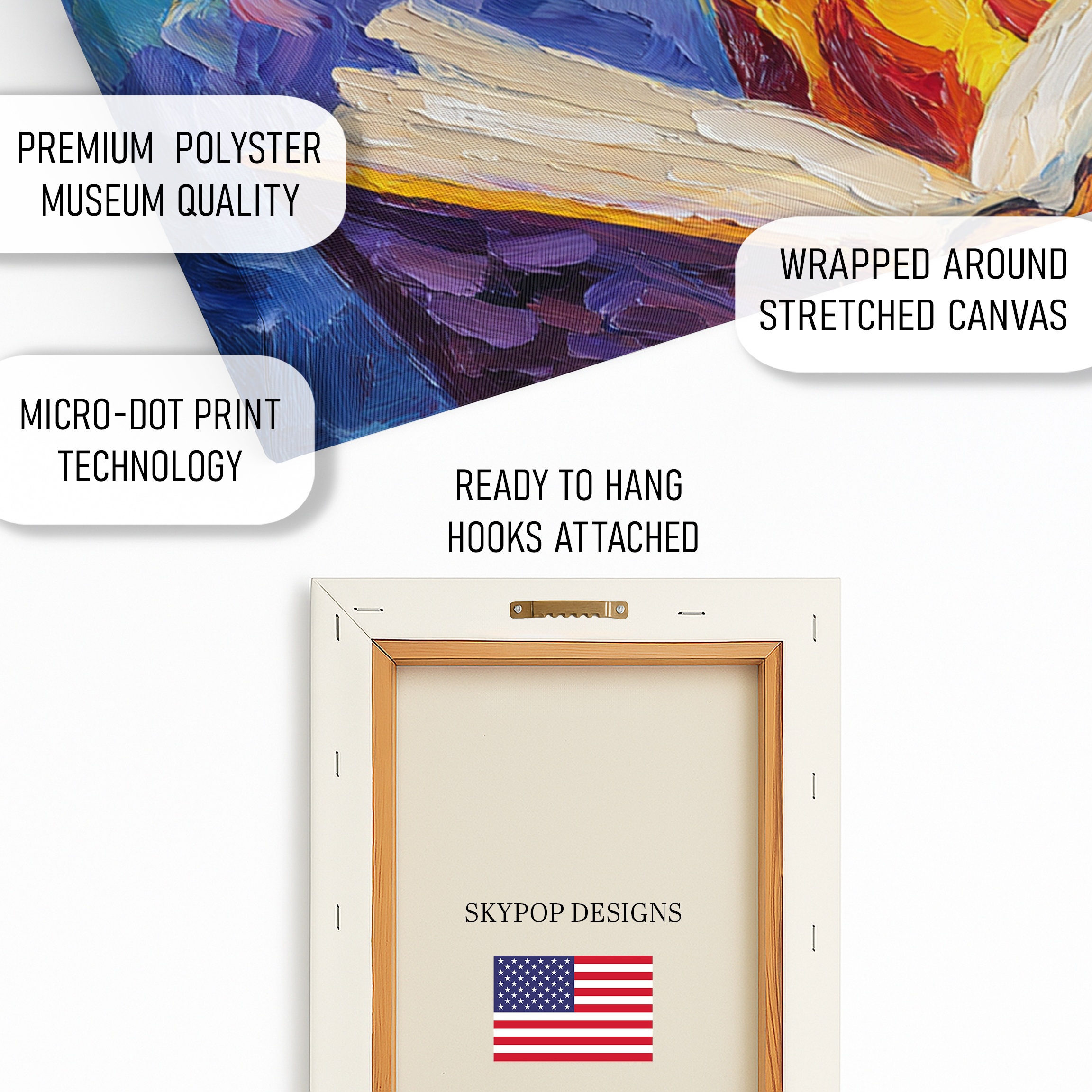
Measure twice: from floor to wire hook, hit that 57-inch eye line for most viewers. In offices, secure to studs if possible; drywall anchors work for lighter 12×12 inches prints but test weight first. Avoid direct humidity in bathrooms—stick to drier spots like entryways. I’ve used command strips for renters on the 14×14 inches, removable without damage. Lighting wires? Route them neatly behind for a clean look. For gallery walls, flank with smaller neutrals to frame the giraffe without stealing focus. One heads-up: the gallery-wrap depth (0.75 or 1.5 inches) adds dimension, so account for shadows in tight corners. Professional installers charge around $50, worth it for large pieces. This method keeps giraffe reading art secure and spotlighted, turning walls into focal points year-round.
What You’re Getting
You’re getting a high-end 290 gsm Giclee canvas with an ultra-fine texture that mimics traditional painting—it’s sturdy and gallery-ready. Archival inks ensure colors stay true for generations, no fading even in sunny spots. The matte finish cuts glare, so views stay clear from any angle. Choose slim 0.75-inch depth for a modern float or 1.5-inch gallery wrap for built-in framing, both ready-to-hang with sawtooth brackets. Posters come on premium 200 gsm paper if you prefer a lighter option. Everything’s handcrafted in Ohio, supporting local makers. Ships in 3-5 business days, rolled or stretched to arrive pristine. Check the product page for current pricing and exact options.
What Customers Are Saying
“This giraffe reading art totally transformed our home office—it’s quirky but not over-the-top, and the colors make me smile every morning while I work.”
– Sarah K., Verified Buyer
Frequently Asked Questions
What sizes are available for this giraffe reading art?
Options include 10×10, 12×12, 14×14, 16×16, 18×18, 20×20, 24×24, and 28×28 inches—pick based on your wall for the best fit.
How does giraffe reading art pair with wall colors?
It works great on light grays, soft whites, or pastel blues to let the yellows and purples stand out; avoid deep reds to prevent clashing.
Is this suitable for a children’s room?
Absolutely—its playful giraffe and book theme inspires reading in kids’ spaces, but the vibrant colors also suit libraries or offices for whimsical touches.
What about shipping for the canvas?
Ships in 3-5 business days from Ohio with free shipping on orders over $75; canvases arrive stretched or rolled, posters flat-packed.
Bottom Line
Giraffe reading art isn’t just decor—it’s a spark for imagination in offices, libraries, or kids’ rooms. With these five tips, you’ll hang it confidently, matching sizes, colors, and setups to your style. Head to the product page to explore sizes and options. Grab yours and watch your walls come alive—no more bland spaces.
Free shipping on orders over $75 • 30-day satisfaction guarantee
Shop Related Art
Complete Your Collection
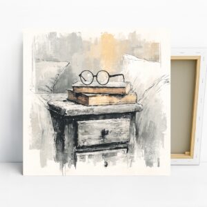
Vintage Reading Nook Art, Canvas or Poster, Still Life Rustic Decor, Office Library Living Room Bedroom Wall Art, Brown Beige Grey White
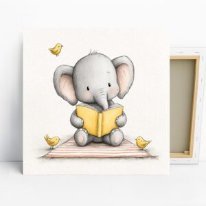
Elephant Reading Book Art, Canvas or Poster, Whimsical Minimalist Decor, Children's Room Nursery Bedroom Wall Art, Grey Yellow White
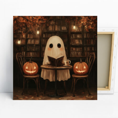
Ghost Reading Nook Art, Canvas or Poster, Whimsical Bohemian Decor, Living Room Bedroom Nursery Wall Art, Brown Orange Beige Multicolor