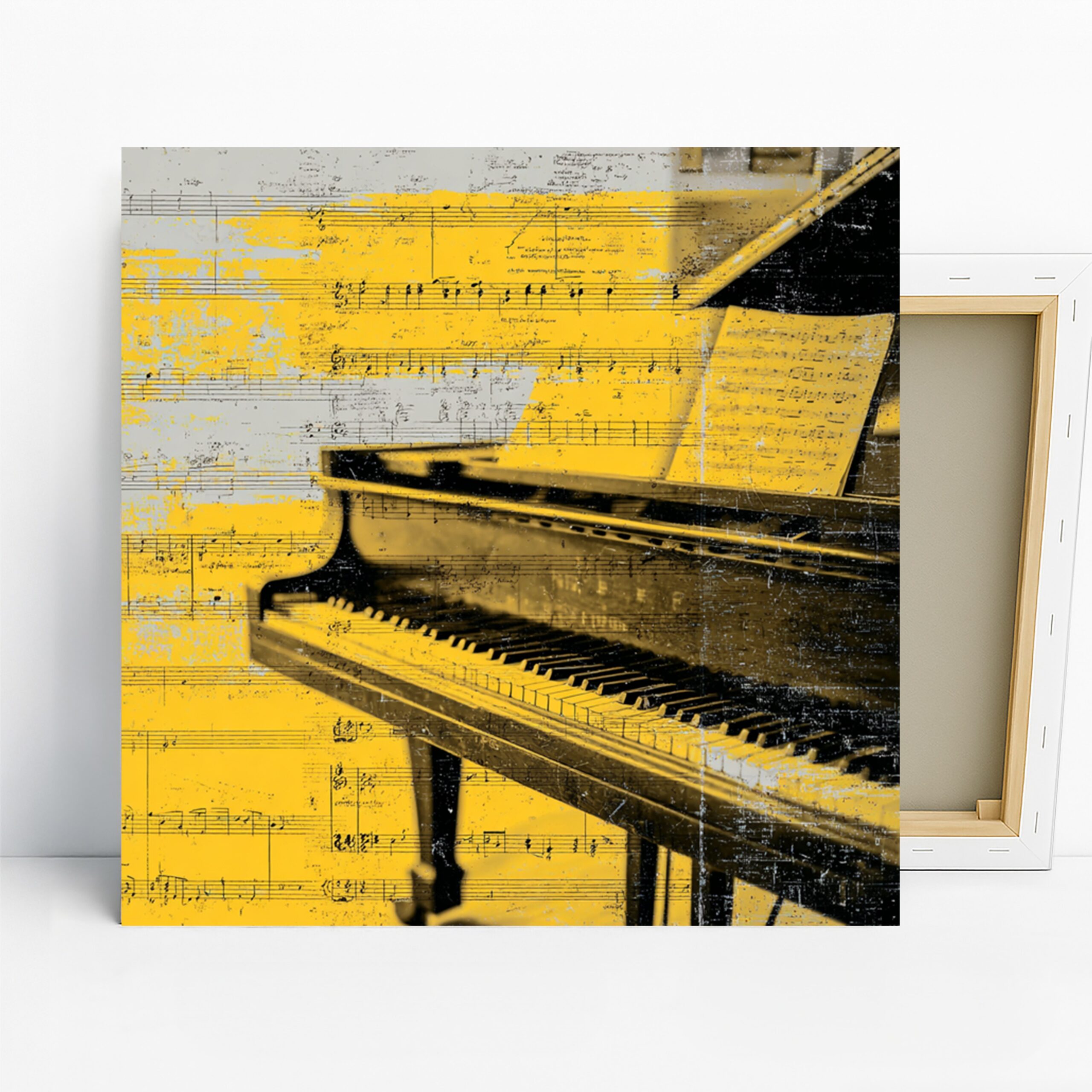
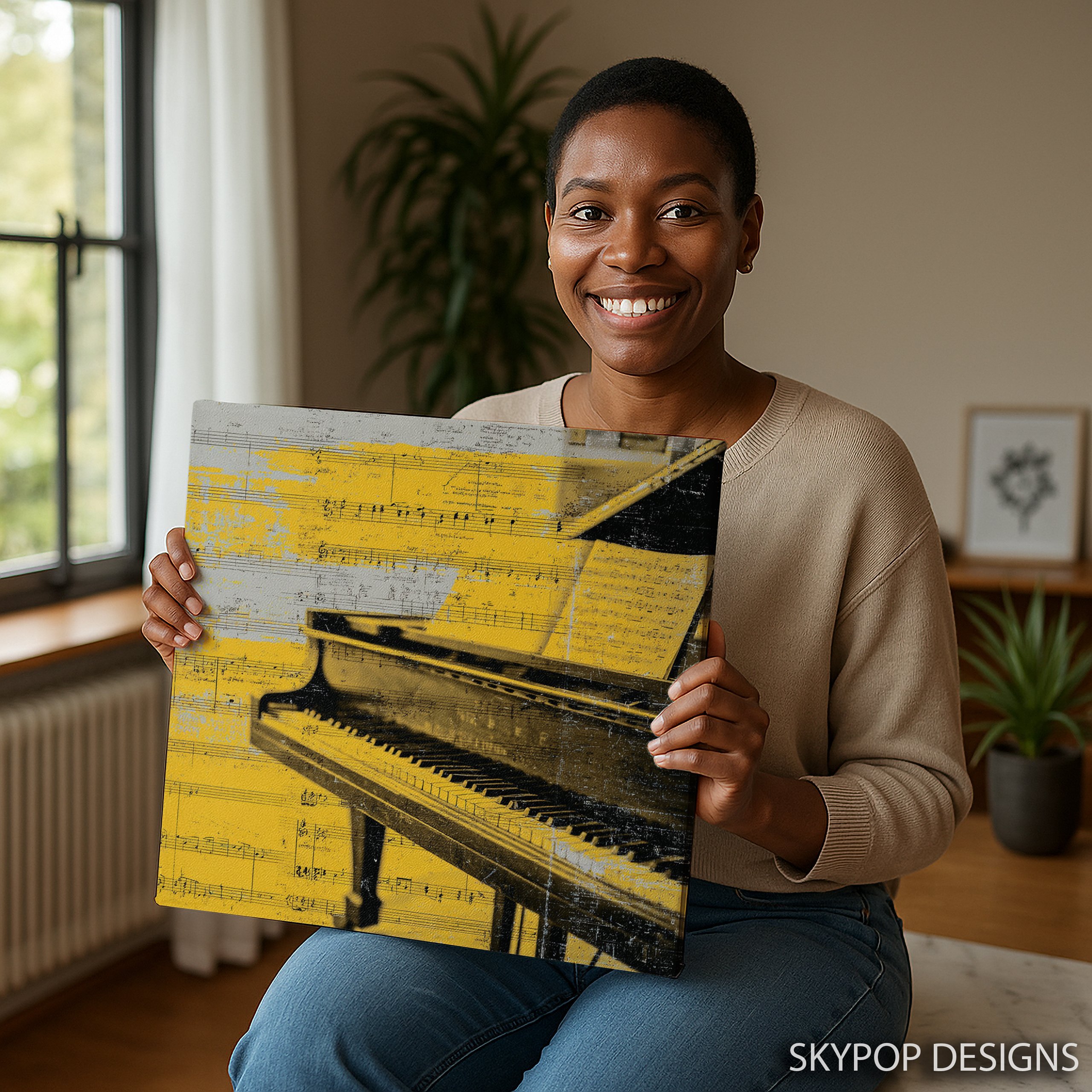
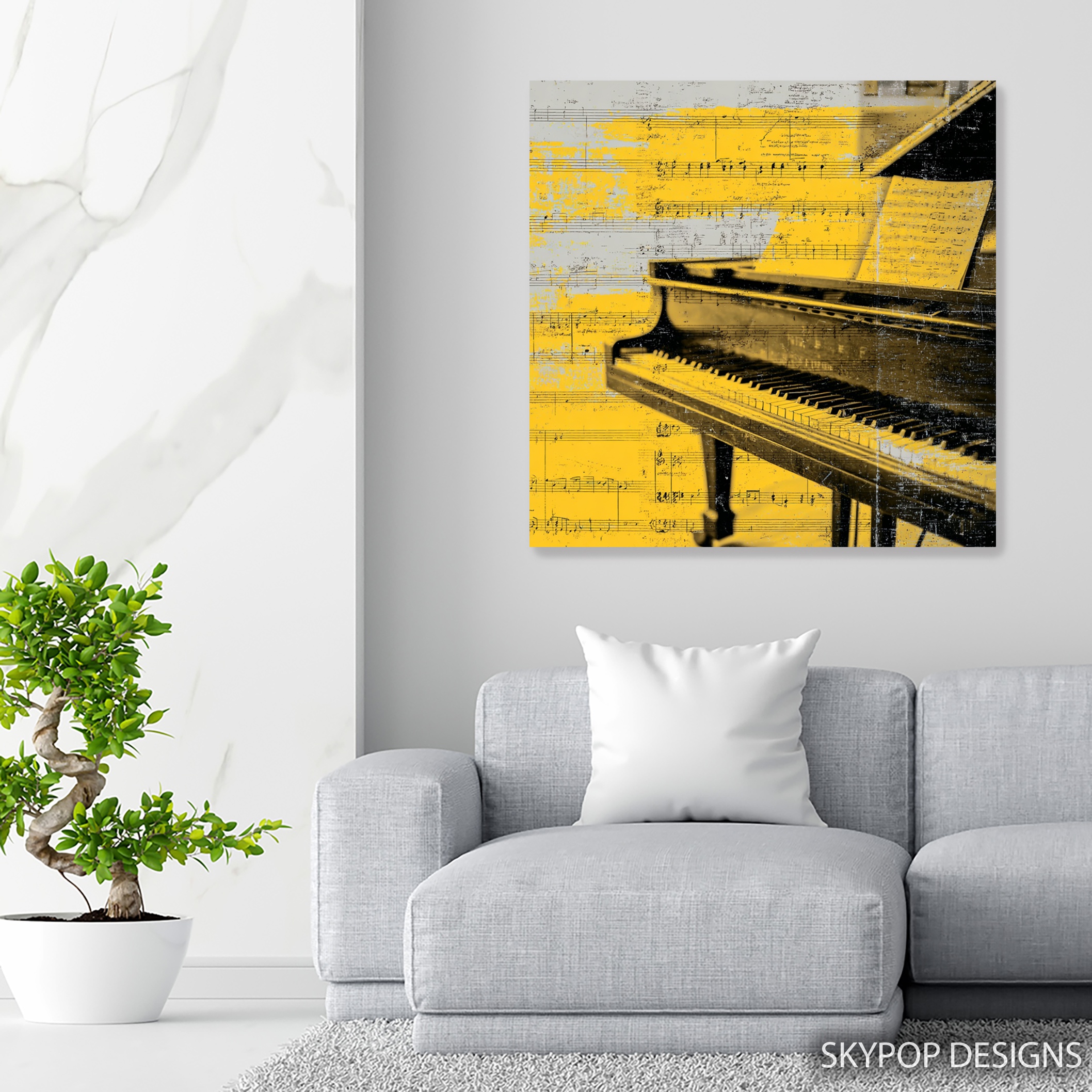
This piano wall art catches your eye right away with its vintage grand piano layered over sheet music, all against a bold yellow backdrop that pops without screaming. It’s got that nostalgic feel mixed with contemporary edge, making it ideal for music enthusiasts or anyone wanting to add a melodic touch to their home. Think young professionals setting up cozy offices or families with kids taking piano lessons—they’ll love how it sparks conversations.
You’ll walk away from this post knowing exactly how to style it in your space, from picking the right size to pairing it with furniture that doesn’t compete. We’ve got five straightforward tips ahead that fit right into 2026’s warm minimalism trend, where pieces like this bring personality without clutter. If you’re into contemporary vibes or modern setups, this fits seamlessly. Check out our blog for more decor ideas that feel personal, not cookie-cutter. It’s not just decor; it’s a nod to creativity that warms up neutral walls in living rooms, music rooms, or even offices. The black and white notes against yellow create contrast that draws you in, evoking sophistication and a bit of melody in everyday spots. Fair warning, though—its warm tones shine best on softer grays or beiges, not stark whites that might wash it out.
1. Pick the Perfect Spot for Piano Wall Art
Start with placement—hang your piano wall art where it can breathe and become the focal point without crowding the room. In a living room, position it above the sofa at eye level, about 57 inches from the floor to the center of the piece; this follows standard gallery height and keeps it from feeling too high. For music rooms, try centering it over a piano bench— the vintage piano motif ties right in, creating that inspiring heritage vibe without overwhelming the instruments below.
Avoid tight corners; this artwork needs at least 6-8 inches of breathing room on each side to let the yellow notes scatter visually. If you’re in an office, mount it opposite your desk so it catches your gaze during breaks, boosting that melodic creativity. One caveat: steer clear of hallways— the bold yellow can feel chaotic in narrow passes. Pair it with mid-century modern furniture for balance; a sleek credenza underneath grounds the energy. This setup turns a blank wall into a conversation starter, especially for families sharing music stories. Remember, good placement makes the piano wall art feel integrated, not slapped on. Test it with painter’s tape before committing—move it around until it just clicks with your flow.
2. Size It Right to Fit Your Space
Sizing matters more than you think for piano wall art—go too small, and it gets lost; too big, and it dominates. Our options run from 10×10 inches up to 28×28 inches, all square for that balanced, modern look. For a cozy study nook, the 12×12 or 14×14 inches works without swallowing the wall, leaving room for shelves nearby. Above a console in the entryway? Opt for 18×18 or 20×20 inches to fill the space proportionally—check scale and proportion in interior design for why this avoids awkward gaps.
In larger living areas, scale up to 24×24 or 28×28 inches; these command attention over sectionals, with the distressed texture adding depth from across the room. But here’s a limitation: the smallest 10×10 is best for gallery walls, not solos— it won’t carry a solo spot over a mantel. Measure your wall first: aim for the artwork to cover about 2/3 of the furniture width below it. This piano wall art’s square format suits minimalist setups, blending vintage charm with clean lines. Families might pick 16×16 for kids’ rooms, keeping it playful yet sophisticated. Get the scale right, and it elevates the whole area effortlessly.
3. Coordinate Colors Around Piano Wall Art
Colors in this piano wall art—the sunny yellow base with black piano keys, white notes, and gold accents—demand thoughtful pairing to avoid clashes. It thrives on neutral walls like soft gray or warm white, where the yellow pops as a warm focal point without fighting the scheme. Steer toward beige or light taupe backdrops; they let the gold shimmer subtly, tying into 2026’s quiet luxury trend.
For bolder rooms, add black frames to echo the keys, but skip deep reds—they muddle the yellow’s vibrancy. Check basic color theory to see how complementary blacks ground the warmth. In offices, pair with navy accents for contrast that sharpens focus, or gold lamp bases to highlight the metallic hints. A quick warning: cool blues can dull the mood—warm it up with amber pillows instead. This setup creates a cozy, inspiring atmosphere, perfect for music lovers. Vary textiles: linen in summer, velvet in winter, always nodding to the artwork’s palette. Done right, your piano wall art unifies the space, making it feel curated and alive.
4. Light It Up to Make Piano Wall Art Shine
Lighting can make or break how your piano wall art looks—the yellow glows under warm bulbs, but harsh fluorescents flatten it. Use LED spots at 2700K warm white, angled 30 degrees from above to minimize glare on the matte finish; this highlights the sheet music overlay without shadows pooling on the distressed edges. In living rooms, a floor lamp nearby softens the gold accents, creating that nostalgic depth after dark.
For offices, desk lamps work if positioned to the side—direct overhead washes out the black contrasts. Avoid spotlights in humid spots like bathrooms; moisture could affect the canvas over time. This piece draws from the Pop Art movement‘s bold contrasts, so layer ambient light with a picture light for evenings. It’s straightforward: test bulbs until the melody feels alive. In music rooms, string lights draped subtly enhance the creative vibe without competing. Proper lighting turns this piano wall art into a mood setter, evoking sophistication day or night. Keep it simple— no need for fancy setups; natural window light during the day does half the work if you hang it facing south.
5. Pair Piano Wall Art with Everyday Decor
Furniture and accents should support, not steal from, your piano wall art—think mid-century modern sofas in gray that let the yellow stand out, or a vintage eclectic side table with gold legs echoing the accents. In bedrooms, flank it with simple nightstands and white linens; the melodic theme calms without busyness. Add musical nods like a small metronome shelf below, but limit to three items max—clutter kills the contemporary clean.
For offices, pair with ergonomic chairs in black to mirror the keys, creating focus that ties into office setups. Warning: avoid ornate mirrors nearby; they fragment the vintage texture. This works in living room scenes with velvet cushions in warm tones for texture play. Swap seasonal pillows—light florals in spring, chunky knits in fall—to refresh around it. The gold details pair well with brass hardware, adding subtle luxury. Ultimately, this piano wall art integrates best when decor feels intentional, sparking joy for piano fans or creative types. Keep pairings neutral-heavy, and it becomes the room’s heartbeat.
What You’re Getting
You’re getting a high-end 290 gsm Giclee canvas with an ultra-fine texture that captures every note and distress detail sharply. Archival inks ensure it won’t fade for decades, even in sunny spots. The matte finish cuts glare, so views stay true from any angle. Choose slim 0.75-inch or gallery-wrap 1.5-inch depth for a frameless look that hangs flush. Sawtooth brackets make installation easy—no special tools needed. Handcrafted in Ohio with eco-friendly materials, it ships in 3-5 business days, rolled securely to arrive pristine. For posters, it’s on premium 200 gsm paper if you prefer a lighter option. Check the product page for current pricing and exact finishes.
What Customers Are Saying
“This piano wall art transformed my home office— the yellow pops against my gray walls, and it’s inspired my daily piano practice without feeling kitschy.”
– Sarah K., Verified Buyer
Frequently Asked Questions
What sizes are available for this piano wall art?
Options include 10×10, 12×12, 14×14, 16×16, 18×18, 20×20, 24×24, and 28×28 inches—all square to suit various wall spaces. Pick based on your room’s scale for the best fit.
How does this piano wall art pair with wall colors?
It shines on neutral beige, soft gray, or warm white walls, where the yellow and gold accents create warm contrast. Avoid cool tones like icy blue, as they can mute the vibrancy.
Is this piano wall art suitable for a music room?
Absolutely—its vintage grand piano and sheet music design adds an inspiring, melodic touch that complements instruments and sheet stands without overwhelming the space.
What’s the shipping time for canvas vs. poster?
Both ship in 3-5 business days from Ohio, with free shipping on orders over $75. Canvas arrives rolled or stretched; posters are flat-packed for easy handling.
Bottom Line
These five tips show how piano wall art like the Melodic Piano print can fit right into your 2026 decor, whether you’re refreshing a living room or office. It brings that vintage-contemporary blend without fuss, as long as you nail the size and colors. Head to the product page at https://skypopdesigns.com/product/melodic-piano-art-skydesigns1003628/ to see available sizes and grab yours—check for current pricing there. Your walls deserve this melodic upgrade.
Free shipping on orders over $75 • 30-day satisfaction guarantee
Shop Related Art
Complete Your Collection
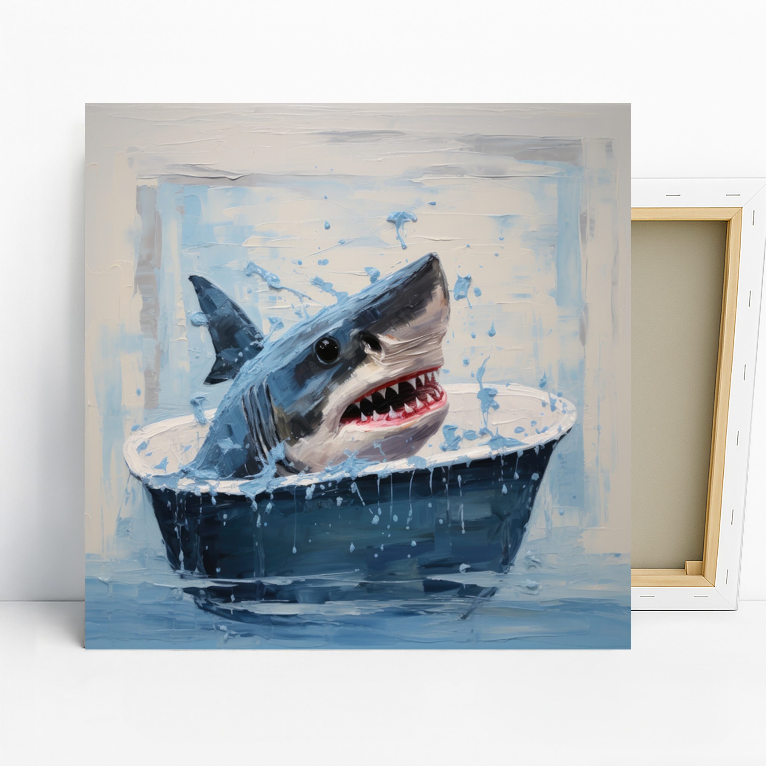
Frog Bath Art, Canvas or Poster, Whimsical Pop Animal Decor, Living Room Bedroom Bathroom Childrens Room Wall Art, Blue Green Teal White
Frog Art, Canvas or Poster, Vibrant Bohemian Contemporary Decor, Living Room Bedroom Office Sunroom Wall Art, Multicolor Green Blue Orange
Daisy and Butterfly Art, Canvas or Poster, Floral Rustic Decor, Living Room Bedroom Dining Room Wall Art, White Yellow Blue Green

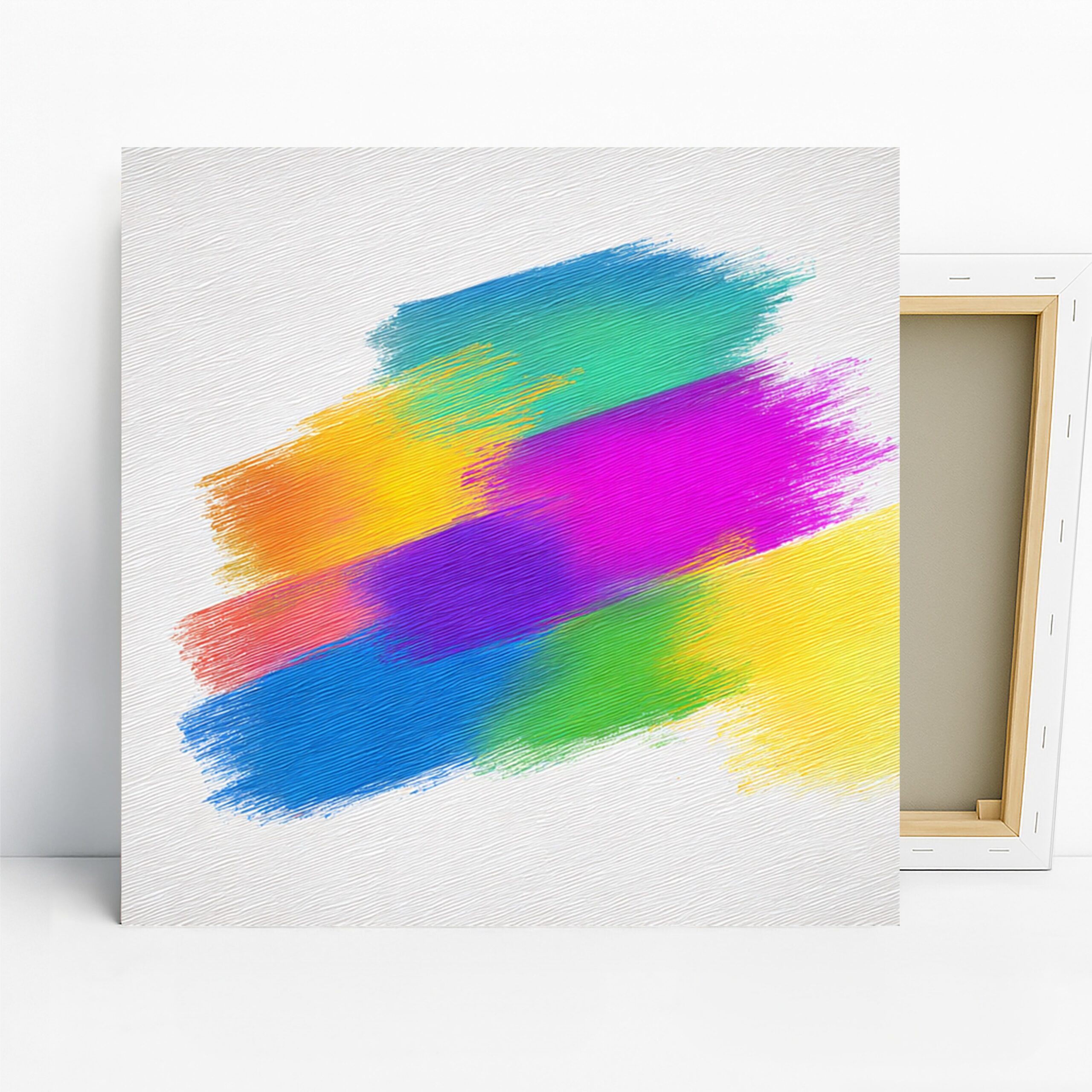
Colorful Dancing Women Art, Canvas or Poster, Contemporary Bohemian Decor, Living Room Bedroom Dining Room Wall Art, Yellow Pink Blue Orange