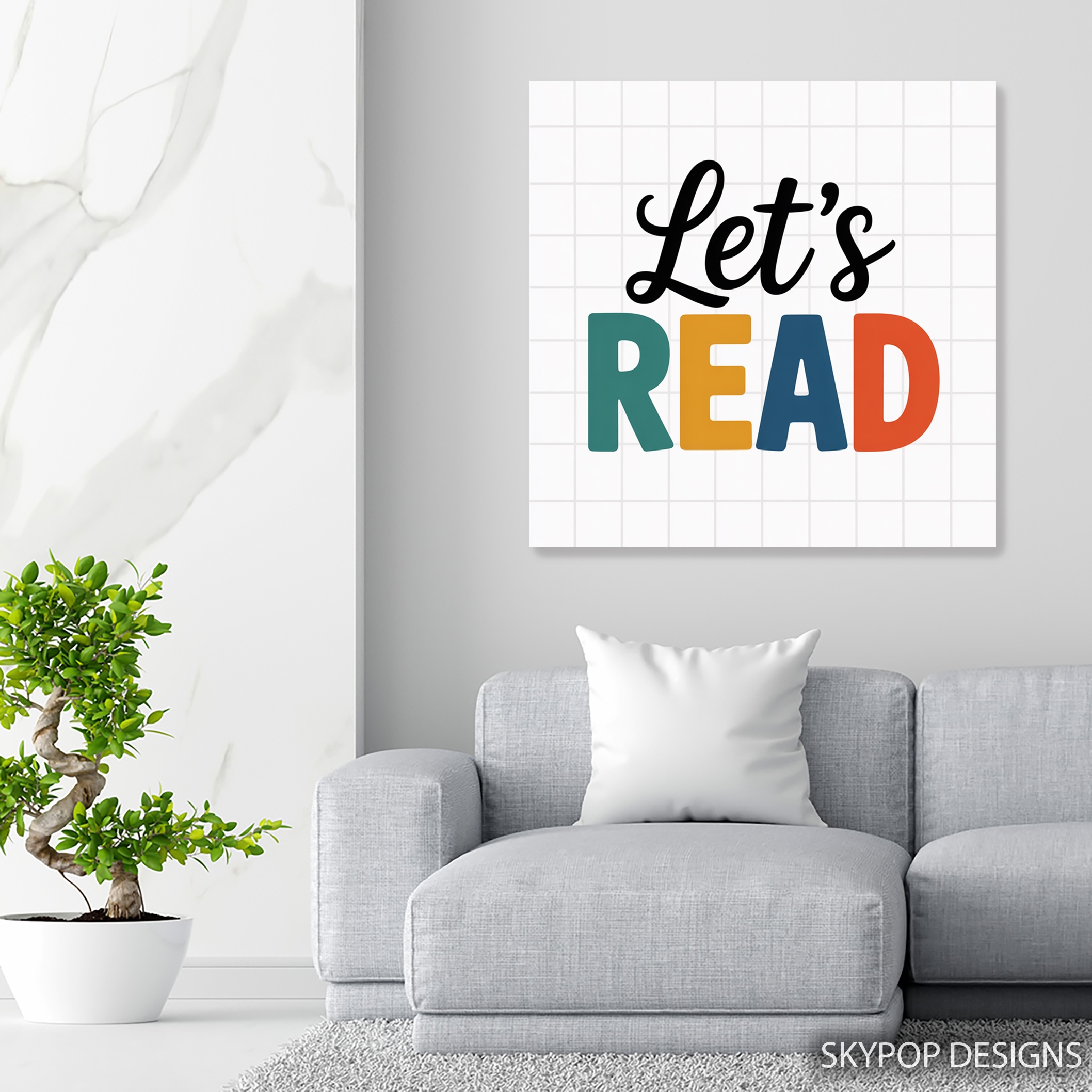
If you’re hunting for let’s read wall art that actually motivates kids to pick up a book without looking stuffy, this piece nails it. The bold ‘Let’s Read’ typography in black, yellow, green, and red pops against a clean grid background, turning any wall into an inviting spot for stories. It’s perfect for parents, teachers, or anyone setting up a nursery or classroom—think families with young kids who want decor that’s fun and functional. In our Nursery category, it fits right in with other playful prints that encourage learning.
You’ll walk away from this post knowing how to style it in different spaces, from sizing it right to lighting that makes those colors sing. We’ve got tips drawn from real decorating challenges, like avoiding clashes with existing furniture. Check out our blog for more ideas on mixing modern pieces like this into everyday homes. Whether it’s a home office for remote-working parents or a playroom corner, this let’s read wall art brings energy without chaos. It’s all about creating spots where curiosity thrives—let’s dive into the styling details.

1. Pick the Right Size for Your Space
Sizing matters more than you think with let’s read wall art—get it wrong, and it either drowns in the room or feels cramped. Start by measuring your wall: for a standard kid’s bedroom wall above a low dresser, the 20×20 inches or 24×24 inches options work best, leaving about 6-8 inches of breathing room on each side. If you’re eyeing a larger classroom setup, go for 28×28 inches to command attention without dominating the blackboard area.
Here’s the thing: smaller sizes like 12×12 inches shine in tight spots, say over a nursery changing table, but skip them for focal walls—they’ll look lost. According to scale and proportion in interior design, aim for the artwork to cover about two-thirds of the wall’s width for balance. One caveat: the square format means it’s not ideal for horizontal furniture like sofas; center it to avoid awkward stretching. Test with painter’s tape first—mock up the 16×16 inches on the wall and step back. This ensures your let’s read wall art feels integrated, not slapped on. In a playroom, that 18×18 inches hits the sweet spot for eye-level viewing from the floor, sparking those reading chats right away.
2. Coordinate Colors Around Let’s Read Wall Art
Those vibrant hues in let’s read wall art—teal accents with pops of yellow, black, red, and green—demand thoughtful pairing to avoid a circus vibe. Pair it with soft white or pale yellow walls; the grid background ties in nicely, keeping things crisp. Navy or light gray? It’ll ground the boldness without muting the playfulness, especially in a modern Office setup.
Draw from basic color theory: the warm yellow and red energize, so balance with cool neutrals like beige furniture. Avoid deep reds elsewhere—they’ll compete and make the space feel smaller. In a nursery, add green throw pillows to echo the lettering; it creates harmony. The Memphis Design movement inspired this playful clash of colors, making it a nod to 80s whimsy in 2026 homes. Pro move: if your room leans bohemian, layer in wooden shelves for texture. This let’s read wall art thrives when colors support the message, turning walls into literacy boosters. Test swatches against the print—hold fabric near it to see what clicks.
3. Find the Best Room Placement
Placement sets the tone for let’s read wall art—hang it where it sparks daily interaction, like eye-level in a child’s bedroom across from the bed. In classrooms, position the 24×24 inches near reading nooks; kids will spot it during circle time, reinforcing the fun of books. Avoid hallways—traffic zones dilute its impact.
For home libraries, center it above a cozy chair at 57 inches from the floor; this gallery-standard height makes it accessible without straining necks. In smaller playrooms, the 14×14 inches on a side wall works, paired with low shelves. One limit: steamy bathrooms? Skip it—the humidity could warp the canvas over time. Think flow: in a Contemporary living area, it bridges kid zones and adult spaces seamlessly. Measure twice—leave 8 inches above furniture to let the artwork breathe. This setup ensures your let’s read wall art isn’t just decor; it’s a gentle nudge toward storytime every day.

4. Light It Up Properly
Good lighting turns let’s read wall art from flat to fabulous—the matte finish handles glare well, but direct sun fades those brights over years. North-facing walls get even, soft light that keeps yellows true without washing out the greens. In south-facing spots, sheer curtains diffuse the intensity.
Artificial? Warm LEDs at 2700K make the reds glow invitingly, perfect for evening reading in a nursery. Skip cool fluorescents—they’ll make black lettering look harsh. Track lights angled at 30 degrees highlight the typography without shadows. For budget setups, a simple clamp lamp nearby does the trick. This artwork’s vibrant mood shines under layered lighting: ambient plus a focused beam. In classrooms, overheads work if diffused; otherwise, add a desk lamp bounce. Remember, the grid background catches light subtly, adding depth. Proper setup means your let’s read wall art invites closer looks, encouraging that love for pages.
5. Pair with Furniture and Accents
Styling let’s read wall art means smart pairings—mid-century modern bookshelves in light wood complement the clean lines, letting colors pop in a Modern room. Add colorful pillows in teal or yellow on a scandinavian sofa; it ties the whimsy without overload.
Kid-friendly eclectic? Wooden toys scattered below ground the playfulness. Avoid heavy antiques—they clash with the fresh vibe. In offices, a sleek desk nearby makes it motivational for homework. Scale it: 20×20 inches over a twin bed pairs with slim nightstands. The piece calms chaos in playrooms when balanced with neutrals. Mix textures—velvet cushions soften the bold print. This approach makes your space feel curated, not cluttered. Test the combo: live with mockups for a day. Done right, let’s read wall art elevates everyday spots into inspiring nooks.
6. Master the Installation
Hanging let’s read wall art is straightforward, but details matter—use the included sawtooth bracket for drywall, adding anchors if needed for sturdier hold. Center at 60 inches for adult eye level, or drop to 50 in kids’ rooms for accessibility.
Two people help with the 28×28 inches; it’s lighter than framed art but still unwieldy. Find studs for larger sizes—toggle bolts for plaster walls. Mock it up with paper first to nail spacing. In galleries, 57 inches is standard, but adjust for furniture: 6-8 inches above. Avoid tape for long-term; it damages edges. This canvas wraps gallery-style, so no frame fuss. Quick fix for uneven walls: adjustable hooks. Proper install ensures your let’s read wall art stays level, looking pro. It lasts—archival quality means no worries.
What You’re Getting
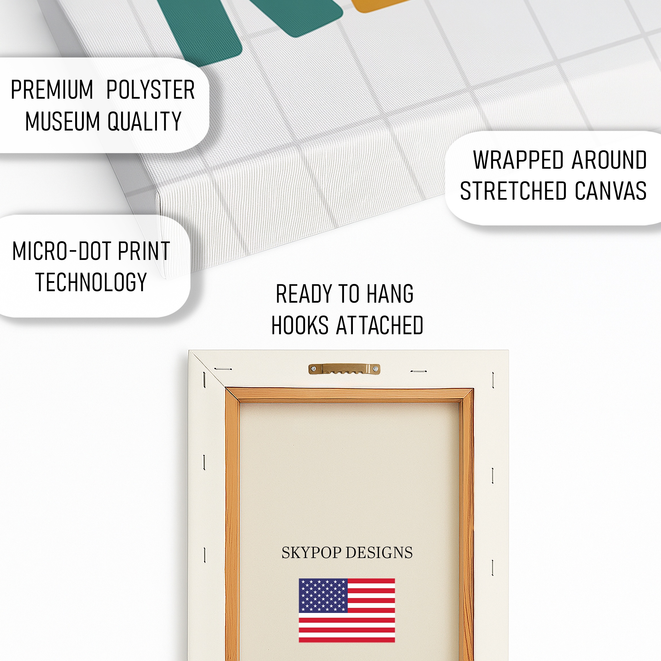
You’re getting a high-quality giclee print on 290 gsm canvas with an ultra-fine texture that mimics traditional artist canvas. Archival inks ensure colors stay vivid for decades, resisting fade even in sunny spots. The matte finish cuts glare, making it versatile for any lighting. Choose slim 0.75-inch depth for a modern look or 1.5-inch gallery wrap for added dimension—both ready to hang with a sawtooth bracket. Handcrafted in Ohio, it ships in 3-5 business days, rolled or stretched depending on size. No stretcher bars needed; it’s built to last without sagging. Check the product page for current pricing and exact options in sizes like 24×24 inches.
What Customers Are Saying
“This let’s read wall art transformed our daughter’s playroom— the colors are so cheerful, and she points to it every time we read together. It’s sturdy, easy to hang, and really encourages her curiosity without feeling preachy. Perfect size at 20×20 for our small space.”
– Sarah T., Verified Buyer
Frequently Asked Questions
What sizes are available for this let’s read wall art?
Options include 10×10 inches up to 28×28 inches, all square formats. For most rooms, 18×18 or 24×24 inches strikes the balance; check the product page for visuals.
Does this artwork pair well with green walls?
Yes, the green accents in the print harmonize with light green walls, adding vibrancy without clashing. Pair with white trim to keep it fresh.
Is it suitable for a classroom, and how long does shipping take?
Absolutely—its encouraging message fits educational spaces perfectly. Ships in 3-5 business days from Ohio, with free shipping on orders over $75.
Bottom Line
Bottom line: this let’s read wall art isn’t just a print; it’s a spark for literacy in kid-friendly zones. With these 6 tips, you’ll place it confidently, from sizing to lighting, making your space more engaging. Head to the product page at https://skypopdesigns.com/product/lets-read-art-skydesigns1001662/ to explore sizes and options. Grab one—your walls (and little readers) will thank you.
Free shipping on orders over $75 • 30-day satisfaction guarantee
Shop Related Art
Complete Your Collection

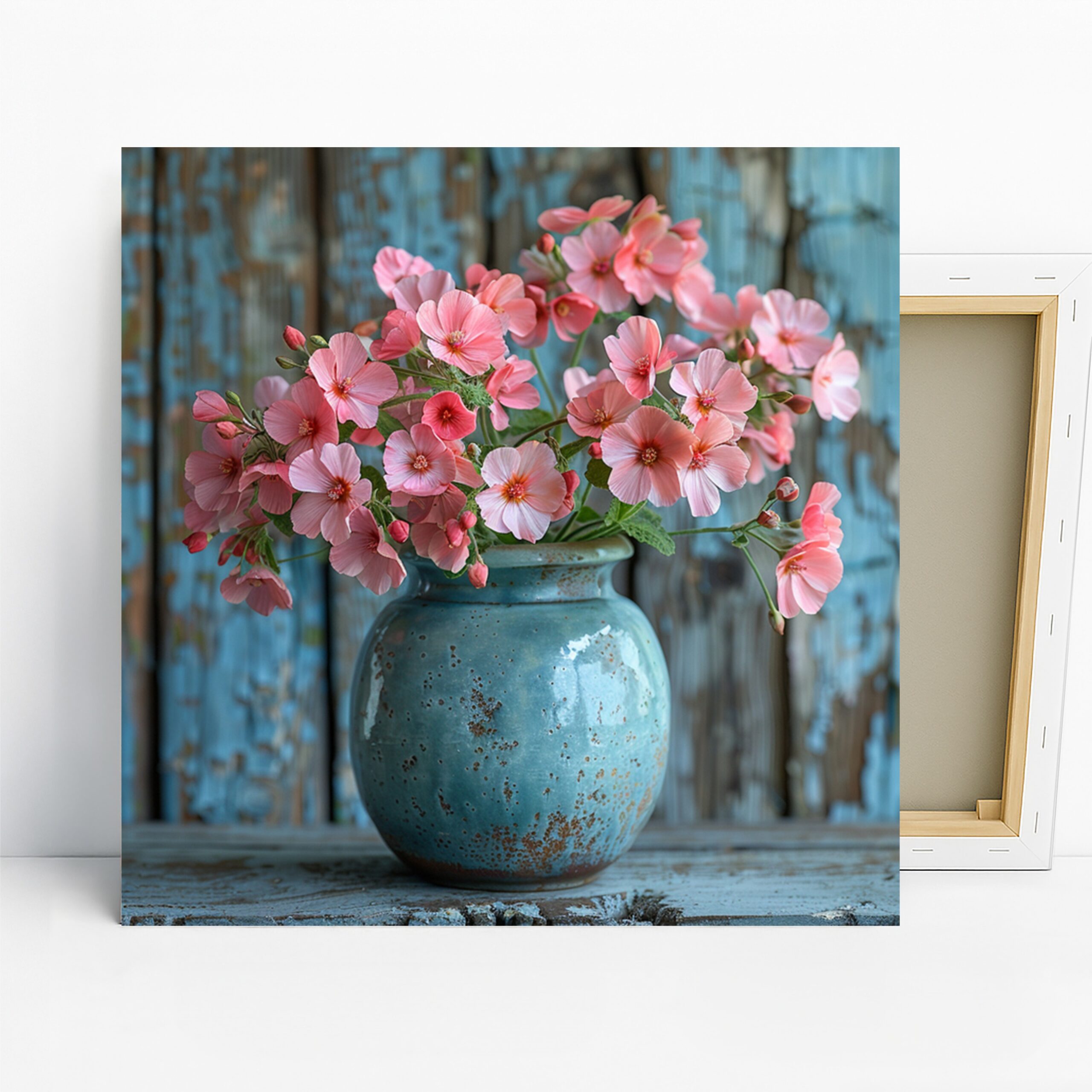
Iris Art, Canvas or Poster, Classic Rustic Farmhouse Decor, Living Room Bedroom Dining Room Entryway Wall Art, Blue Yellow and Brown
Deer Art, Canvas or Poster, Contemporary Rustic Decor, Living Room Office Bedroom Wall Art, Black White Brown Beige Colorful Print

Tropical Paradise Beach Art, Canvas or Poster, Contemporary Coastal Decor, Living Room Bedroom Bathroom Wall Art, Blue Turquoise Green Pink
Blue Butterfly Art, Canvas or Poster, Contemporary Minimalist Decor, Living Room Bedroom Office Nursery Wall Art, Blue White Gray