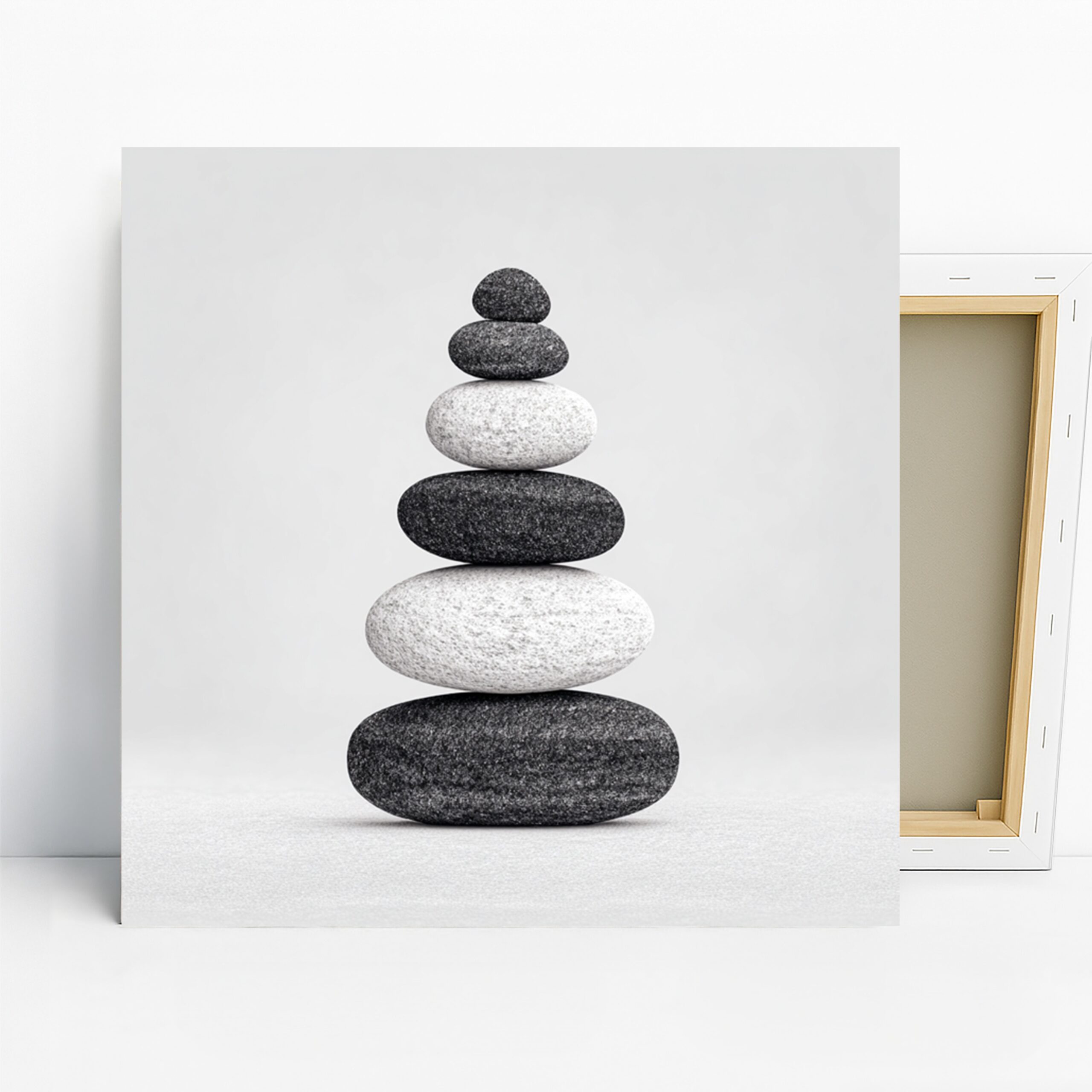
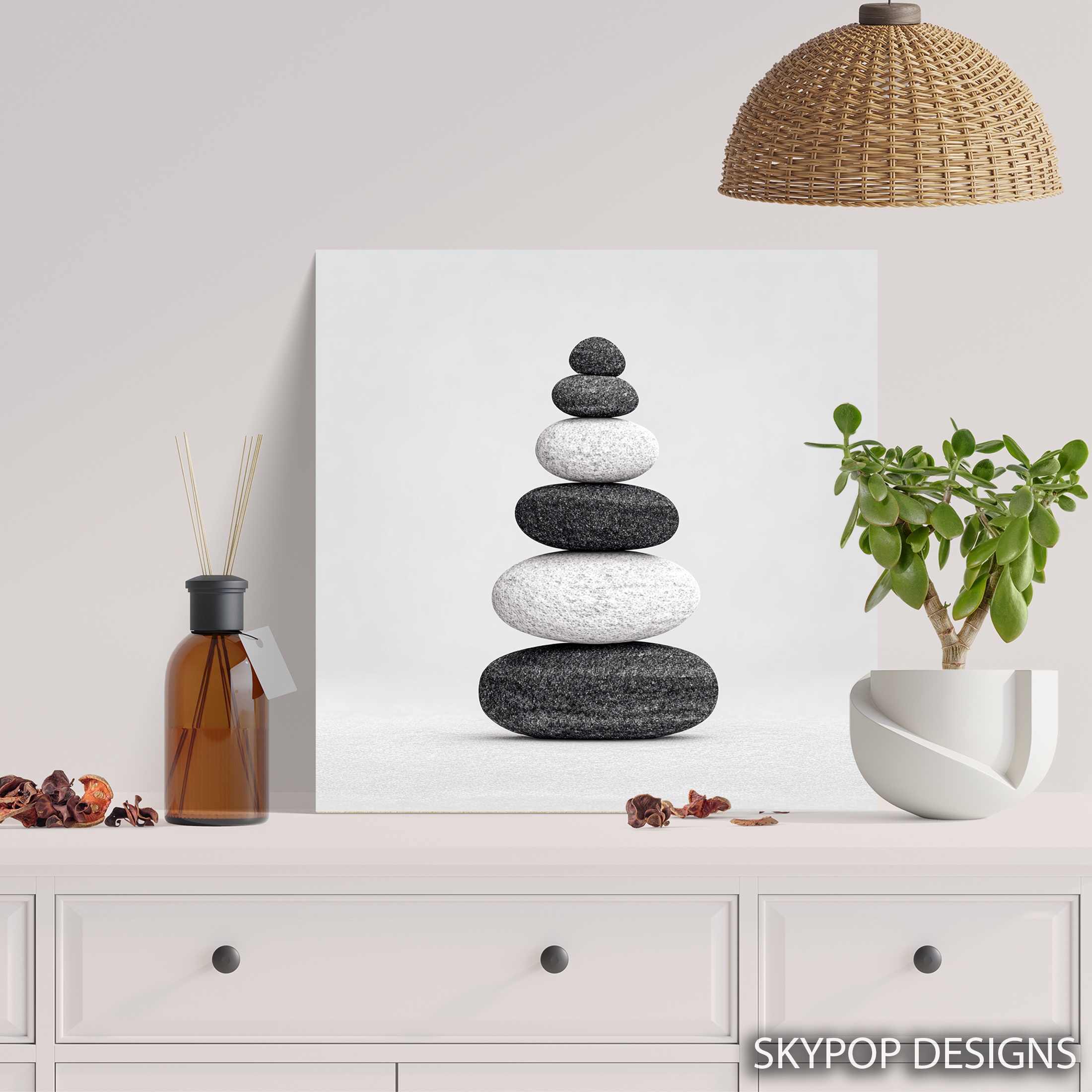
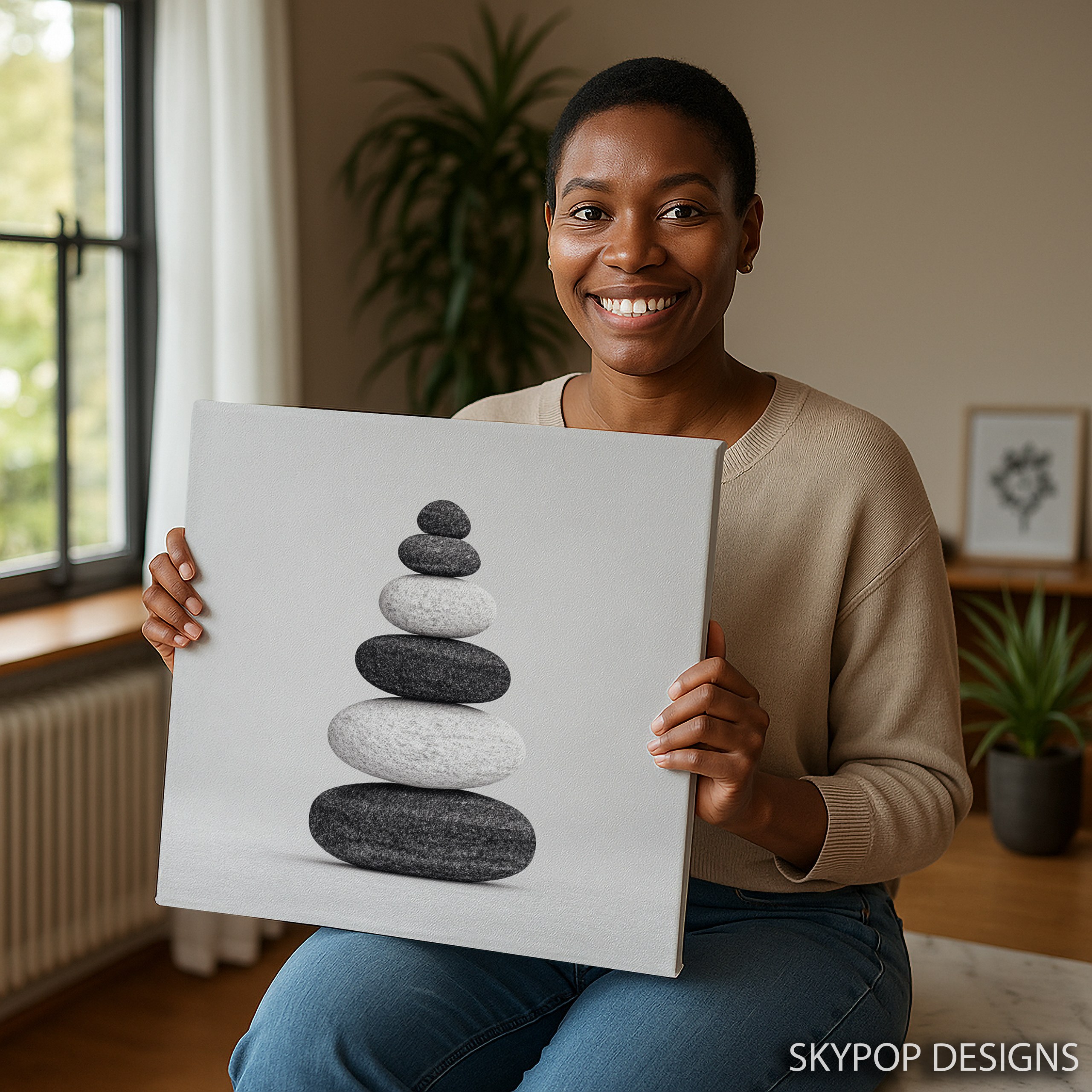
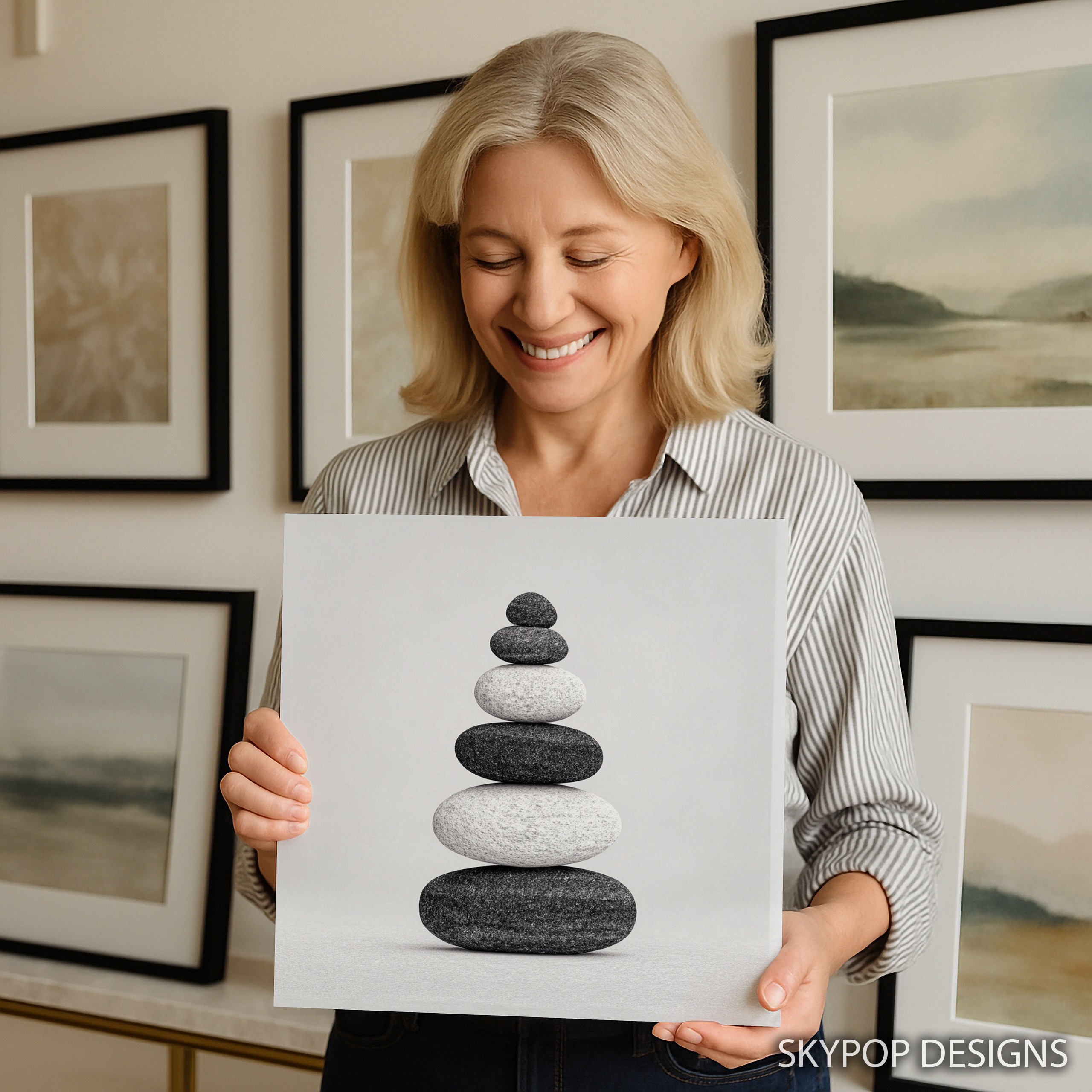
This balanced stones art does something most wall prints don’t—it actually pulls a room together without stealing the show. Picture a tower of smooth river rocks stacked just so, in crisp black, white, and grey tones that scream calm and focus. If you’re a young professional juggling work and wellness, or just someone who digs mindfulness vibes, this piece fits right in. It’s all about that zen edge, turning everyday spaces into spots where you can breathe easy.
You’ll see how it shines in bedrooms for better sleep vibes, offices to dial down stress, living rooms for subtle harmony, and even bathrooms for a spa feel. We’ve got tips on sizing, pairing, and why this minimalist gem works in 2026’s clean-line trends. Check out our Black and White category for more like this, or dive into our blog for fresh decor ideas. No fluff here—just real ways to make your walls work harder for you.
What Makes This Print Stand Out
What makes this balanced stones art stand out is its dead-simple power. The photorealistic rendering of those stacked stones hits with high-contrast shading that pops against any neutral wall, but it never overwhelms. Colors stick to black, white, and grey—no wild accents to fight your setup. It’s minimalist through and through, inspired by zen philosophy where balance isn’t just pretty; it’s a mindset.
This fits homes leaning modern or contemporary, especially if you’re into Scandinavian vibes with clean lines and natural elements. Available in square sizes like 10×10 inches up to 28×28 inches, it scales easy. Grab the 16×16 or 18×18 for a nightstand accent in the bedroom—keeps things intimate without crowding. For an office desk wall, the 20×20 inches gives enough presence to ground your workspace. The larger 24×24 or 28×28? Perfect over a console in the entryway, drawing eyes without dominating.
Tying back to art roots, this draws from the Minimalism art movement), which kicked off in the 1960s as artists stripped things down to essentials, focusing on form over fuss. Think Donald Judd’s clean geometries—same idea here, but softer with natural motifs. In 2026, with everyone chasing that uncluttered life, balanced stones art resonates because it mirrors our push for inner equilibrium amid chaos. Hang it, and it becomes a quiet reminder to stack your own priorities right.
The Art & History
This balanced stones art pulls from the minimalist movement, which exploded in the 1960s as artists like Frank Stella and Sol LeWitt ditched excess for pure form and material honesty. The Minimalism art movement) reacted against abstract expressionism’s emotional splatters, aiming instead for viewer engagement through simple shapes—think Judd’s metal boxes that force you to confront space itself. Zen influences creep in too, echoing Japanese rock gardens from the 14th century, where raked pebbles and balanced stones represent impermanence and harmony.
Today, this style clicks with modern interiors because life’s too cluttered; we crave that stripped-back calm. In homes chasing 2026’s wellness trends, balanced stones art isn’t just decor—it’s a daily nod to equilibrium. Hang it, and you’re tapping into a tradition that says less is more, turning your wall into a mini meditation spot. No PhD needed; it’s accessible art that works for real people building balanced lives.
Color Pairing Guide
Pairing colors with this balanced stones art keeps things grounded in neutrals. Walls in Benjamin Moore’s ‘Revere Pewter’ or Sherwin-Williams ‘Agreeable Grey’ let the grey tones shine without washing out—avoid stark whites that make it vanish. For deeper vibes, try a soft beige like ‘Edgecomb Gray,’ but steer clear of warm yellows; they clash with the cool palette.
Furniture-wise, white oak tables or walnut desks warm up the greys nicely, while black metal frames echo the shadows. Upholstery in charcoal or cream upholstery complements without competing—skip bold blues that pull focus. Accents? Brass hardware adds subtle glow, and grey throw pillows tie it in per the 60-30-10 rule: 60% neutrals, 30% this artwork’s tones, 10% plants or wood.
Dive into basic color theory to see why these muted shades promote calm. In practice, this setup creates flow—your eye rests on the stones, not fights the room.
Size Selection Guide
Sizing this balanced stones art right keeps it from looking off-kilter. For above a sofa, aim for 2/3 the furniture width—say your couch is 84 inches, grab the 24×24 or 28×28 inches to fill without overwhelming. Too small, like a 10×10, and it floats like an afterthought; too big in a tight spot, and the room shrinks.
Bedrooms call for cozier scales: 16×16 or 18×18 inches over a nightstand hits about 60% of the surface for balance. In small bathrooms or entryways, stick to 12×12 or 14×14—perfect for 24-inch vanities without crowding the mirror. Check scale and proportion in interior design for more on measuring your setup. For the 20×20 inches in an office, center it 57 inches from the floor to eye level. Get the math wrong, and the zen vibe crumbles—measure twice, hang once.
Where to Hang It
Bedroom Bliss with Balanced Stones Art
In the bedroom, this balanced stones art calms things down fast. Hang a 20×20 inches canvas above your queen headboard—leave 8-10 inches clearance so it doesn’t crowd the pillows. Pair it with linen bedding in soft greys and a wooden nightstand for that zen flow. It promotes better wind-downs, especially if meditation’s your thing. But skip it over a super-busy patterned quilt; the minimal lines get lost.
Office Focus: Balanced Stones Art Setup
Your home office gets a productivity boost from this piece. Go for the 24×24 inches on the wall opposite your desk—it draws your eye during breaks without distracting. Team it with a sleek metal lamp and neutral chair upholstery. The stacked stones symbolize steady focus, ideal for long workdays. Fair warning: in a window-heavy office, position it away from glare to keep those shades sharp.
Living Room Harmony via Balanced Stones Art
Living rooms love this for subtle zen accents. A 28×28 inches version over the fireplace anchors the space—measure your mantel at 60 inches wide, and this covers about half without overwhelming. Mix with potted ferns and a beige sofa for grounded vibes. It sparks chats about balance during gatherings. One issue: if your room’s got bold reds, the greys might dull—tone down with neutrals.
Spa-Like Bathroom with Balanced Stones Art
Turn your bathroom into a retreat with this print. The 12×12 or 14×14 inches fits neatly beside the mirror—keeps steam from warping if it’s canvas. It evokes river rocks in a zen garden, pairing with white tiles and bamboo accents. Perfect for morning routines. Just avoid direct water spray; even matte finishes can spot.
Design Styles This Works With
Minimalist
This thrives in minimalist setups with its stripped-down stones echoing empty spaces—pair with white walls and sparse shelves for pure zen.
Modern
Modern lines love the clean contrasts; hang above a glass console with chrome accents to sharpen the contemporary edge without fuss.
Zen
Zen interiors get a boost from the harmony symbol—add bamboo rugs and low platforms, letting the artwork ground the meditative flow.
Gallery Wall Pairing
Incorporate balanced stones art into a gallery wall as the steady anchor—its square shape centers a mix of rectangles. Place it top row, middle, with smaller black-and-white photos flanking for symmetry. Or go asymmetrical: pair a 24×24 canvas with 8×10 family shots below, keeping 2-3 inches spacing.
Complementary pieces? Abstract line drawings or nature prints in greys—browse our Abstract Art for matches. Mix sizes: large this one, small accents to balance visual weight. Colors stay neutral across to avoid chaos. Start layout on the floor with kraft paper outlines. See how to create a gallery wall for pro tips. It turns personal chaos into curated calm.
Canvas vs. Poster
Canvas vs. poster for balanced stones art? Canvas wins for most because the 0.75-inch or 1.5-inch gallery wrap gives those stones a subtle 3D lift, making the shading pop in lit rooms. No frame needed, so it hangs flush and modern—ideal for zen spaces where texture hints at real rocks. But it’s bulkier to move if you’re renting.
Posters shine for flexibility: print on thick stock, then frame in slim black to match your Contemporary setup. Cheaper entry point if you’re testing the vibe, and easy to swap. For this minimalist piece, poster suits temporary spots like shared offices, but canvas elevates the serenity long-term. Trade-off: posters might need glass, adding glare in bright areas. I’d lean canvas for the depth that sells the balance theme, unless framing’s your jam.
What You’re Getting
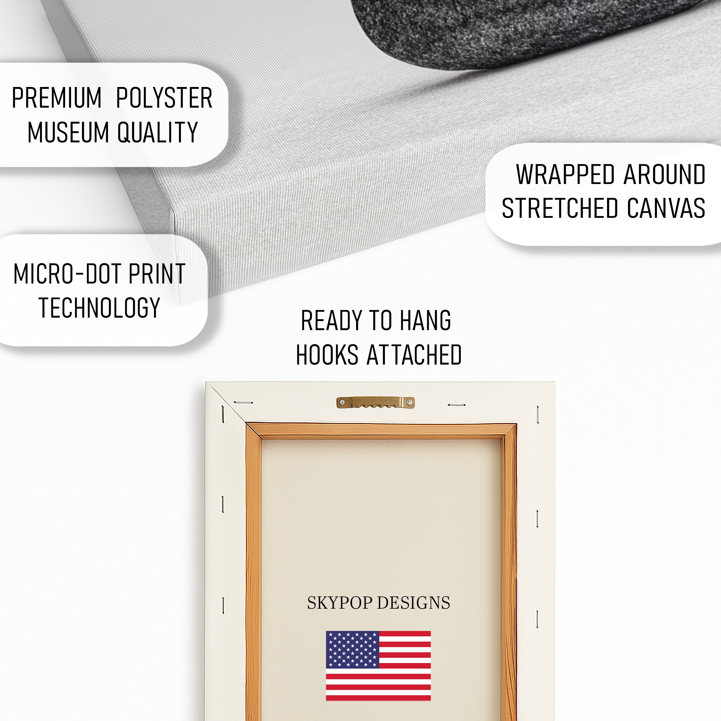
You’re getting a solid 290 gsm Giclee canvas with an ultra-fine texture that mimics real brushwork without the mess. Archival inks mean it holds color for decades—no fading worries. The matte finish cuts glare, so it looks great under any light. Choose 0.75-inch slim wrap for a low-profile hang or 1.5-inch gallery wrap for depth. Sawtooth bracket’s included for easy setup. Made right here in Ohio, it ships in 3-5 business days. Posters come on premium 200 gsm paper if you want that framed option. Either way, it’s built to last in your daily grind.
Care & Maintenance
Dust your balanced stones art with a dry microfiber cloth weekly—gentle sweeps keep the matte finish crisp. Skip water or sprays; they can seep into canvas edges over time. Hang out of direct sun to lock in those archival inks for 75+ years.
For longevity, avoid steamy spots like showers, though bathrooms are okay if ventilated. Moving? Bubble wrap loosely, no folds. Light scuffs on the frame? Rub with a soft cloth. It’s low-maintenance, but treat it right and it’ll outlast trends.
Frequently Asked Questions
What sizes are available for this balanced stones art?
Options include 10×10, 12×12, 14×14, 16×16, 18×18, 20×20, 24×24, and 28×28 inches—all square to match the balanced design.
Does this artwork pair well with light grey walls?
Absolutely, the black, white, and grey tones blend seamlessly with light greys like Benjamin Moore’s ‘Gray Owl’ for a cohesive, serene look.
Is balanced stones art suitable for a small office?
Yes, it’s ideal for compact offices—the 16×16 or 18×18 sizes add calm without crowding your desk area.
How long does shipping take?
Ships in 3-5 business days from Ohio, with free shipping on orders over $75.
Canvas or poster—which is better for this piece?
Canvas gives the stones a textured depth that enhances the minimalist vibe, but the poster works great if you’re framing to match existing decor.
Can I hang this in a humid bathroom?
Sure, the archival materials handle moderate humidity fine, but keep it away from direct steam to avoid any moisture buildup.
How does it look in modern decor?
It slots right into modern setups, emphasizing clean lines and neutral palettes for that effortless zen touch.
Bottom Line
Bottom line: balanced stones art nails that serene upgrade without the hassle. It fits your push for mindful spaces in 2026, whether you’re chilling in the bedroom or grinding in the office. Pick a size that scales to your spot, like 20×20 for intimacy or 28×28 for impact. Head to the product page to see options and check current pricing. Your walls deserve this quiet win—grab it and feel the shift.
Free shipping on orders over $75 • 30-day satisfaction guarantee
Shop Related Art
Complete Your Collection
Lion Art, Canvas or Poster, Contemporary Urban Decor, Living Room Office Game Room Wall Art, Black White Red, Minimalist Animal Print
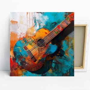
Vibrant Guitar Art, Canvas or Poster, Contemporary Bohemian Decor, Living Room Office Music Room Wall Art, Orange Blue Red Yellow
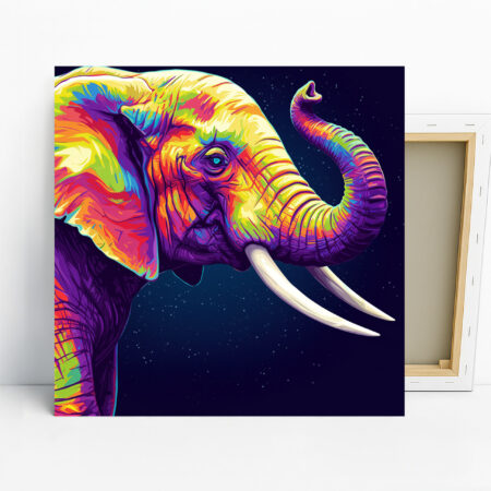
Elephant Art, Canvas or Poster, Pop Art Animal Decor, Living Room Bedroom Office Hallway Wall Art, Multicolor Purple Blue Yellow
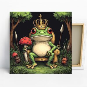
Frog King Art, Canvas or Poster, Whimsical Nature Decor, Living Room Children's Room Game Room Office Wall Art, Green Red Gold Brown