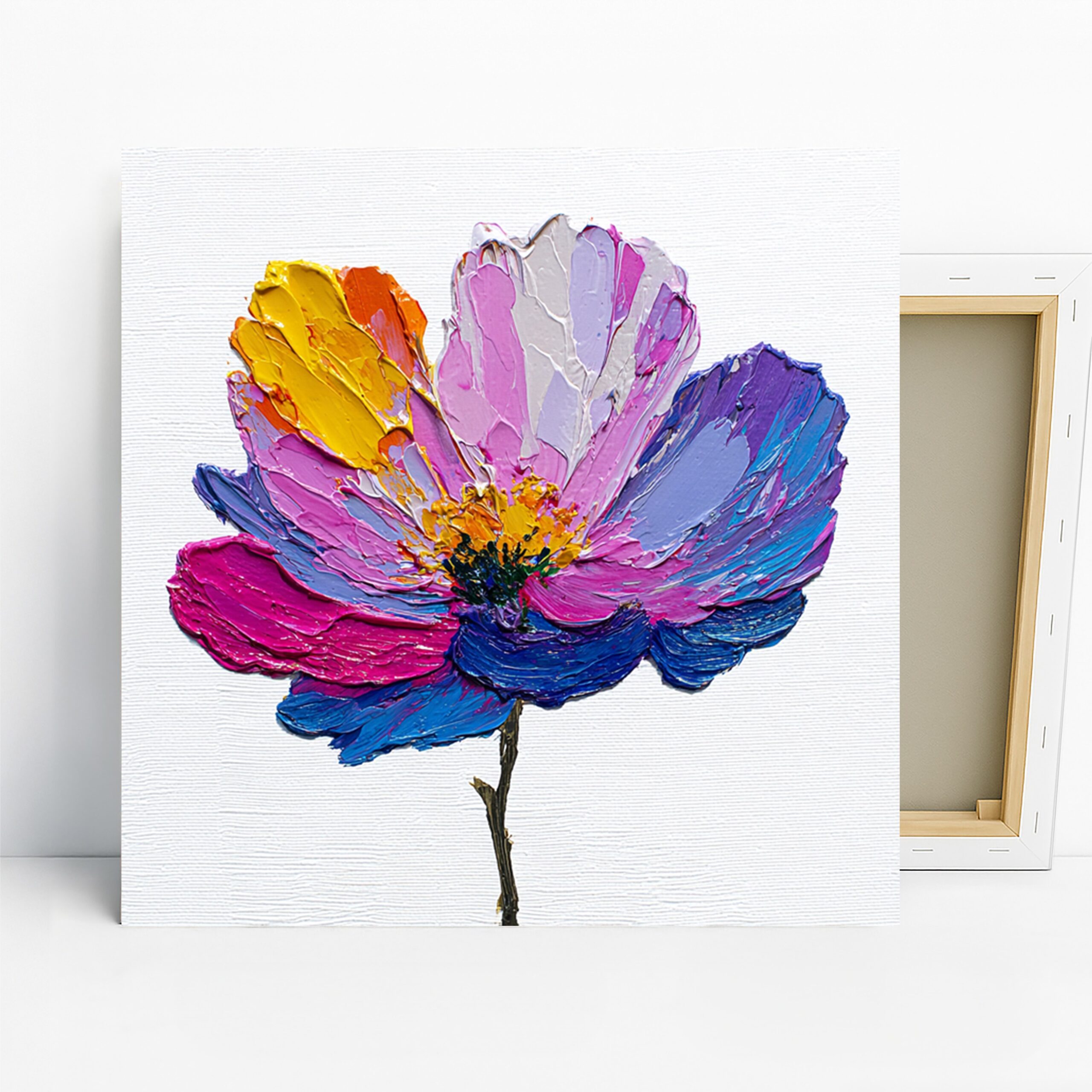
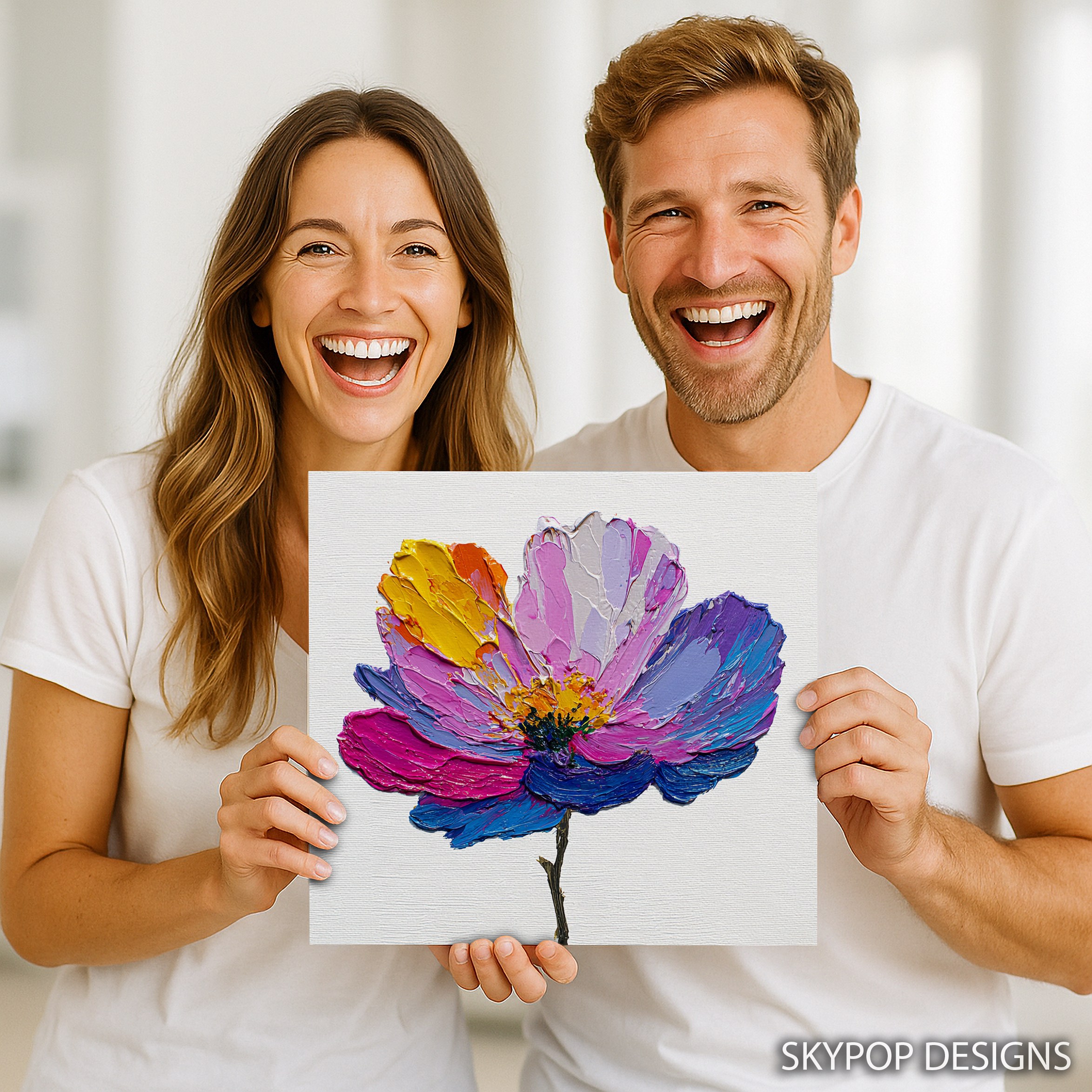
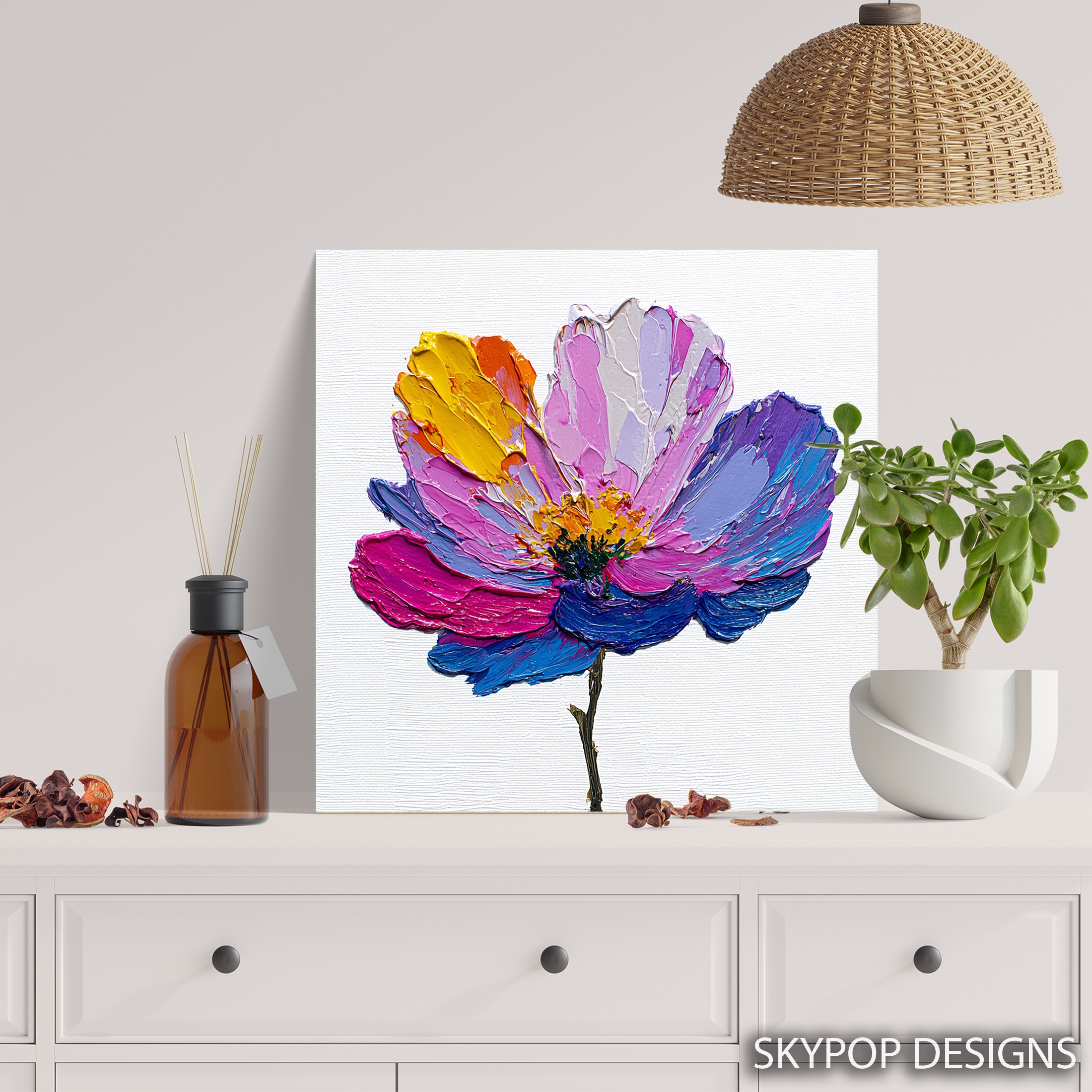
This vibrant flower art does something most floral prints don’t—it injects real energy into a room without screaming for attention. Picture a single bloom exploding in purples, pinks, blues, and yellows against a clean white backdrop, all captured in thick, textured brushstrokes that mimic a hand-painted original. It’s perfect for young professionals or families wanting to add a touch of modern impressionism to their spaces, especially in contemporary setups. Whether you’re outfitting a living room, bedroom, or office, this piece works because its bold colors play nice with minimalist furniture, creating that uplifting vibe without clutter. In this post, we’ll dive into six styling tips to help you make it shine, from picking the right size to lighting it just so. We’ve pulled insights from our blog on similar floral pieces, so you can visualize exactly how it fits your home. It’s drawn from the Impressionism movement, which started in the late 1800s as artists like Monet rebelled against stiff salon paintings, focusing instead on light and color to capture fleeting moments. Today, that translates to walls that feel alive and joyful. If you’re into colorful home decor, this is your go-to for bohemian or modern vibes. Let’s get into the tips that turn a good print into a great one.
1. Pick the Perfect Spot for Vibrant Flower Art
Start with placement—where you hang this vibrant flower art matters more than you think. In a living room, position it above the sofa at eye level, about 57 inches from the floor to the center of the piece. That height keeps it from feeling too high or low when you’re seated. For smaller spots like an entryway, lean it on a console table instead of wall-mounting; the textured petals will draw eyes right away. Avoid hallways—they’re too narrow, and the bold colors can overwhelm the flow. Pair it with a dining room setup if you want conversation fuel; guests always ask about the impasto strokes that make the bloom pop. Here’s the thing: this artwork thrives in social areas because its energetic mood sparks joy without dominating. Test the spot with painter’s tape first—outline the frame on the wall to see how it interacts with your furniture. If your room has high ceilings, go for a spot near a window where natural light hits the canvas at an angle, enhancing those blended hues of purple and yellow. Fair warning, though: don’t stick it behind a TV; the distraction kills the focal point. This simple choice sets the tone for everything else.
2. Size It Right to Fit Your Space
Sizing this vibrant flower art isn’t guesswork—match it to your wall and furniture for balance. For a standard 8-foot living room wall above a 80-inch sofa, the 24×24 inches or 28×28 inches canvas hits the sweet spot; it covers about two-thirds of the wall width without swallowing the space. Check out scale and proportion in interior design for why this rule works—it keeps things proportional. Smaller options like 12×12 inches or 16×16 inches suit nightstands in bedrooms or office desks, where you want intimacy over impact. The 20×20 inches is versatile for entryways, adding punch without crowding. But heads up: the 10×10 inches feels lost on big walls—skip it unless you’re building a gallery. Measure your wall first: subtract the furniture height and aim for the artwork to be 6-9 inches larger on each side. This piece’s square format shines in modern rooms, echoing the symmetry of Scandinavian styles. If you’re in a bedroom, the 18×18 inches leans casual against a headboard. Get it wrong, and the room feels off—too big dwarfs everything, too small gets ignored. Nail this, and your space instantly feels curated.
3. Coordinate Colors with Your Walls
Wall colors can make or break this vibrant flower art, so think harmony over matchy-matchy. Light neutrals like soft beige or white let the purples, pinks, blues, and yellows bloom without competition—it’s like the canvas becomes the star. For a subtle pop, try light gray walls; the cool tone grounds the warm yellow accents nicely. Dive into basic color theory to see how complementary hues like blue and yellow energize a room. Avoid deep reds—they clash with the pink petals and turn chaotic. In a bohemian setup, pale blue walls echo the flower’s blue streaks for a cohesive feel. Test samples: paint a poster board and hold it next to the print (grab a sample image from the product page). This artwork’s white background keeps it versatile, but pair it with colors that nod to one hue, say yellow for a sunny office vibe. One caveat: glossy paints reflect glare onto the matte canvas, dulling the texture—stick to eggshell finishes. Done right, your walls amplify the joyful energy, making neutral rooms feel alive. It’s not about perfection; it’s about that uplifting lift you get walking in.
4. Light It Up for Maximum Impact
Lighting transforms this vibrant flower art from flat to fabulous—get it wrong, and the colors mute out. Natural daylight works best; hang near a south-facing window so the sun hits the textured brushstrokes, making the purple-to-pink blends glow. In dimmer spots, add a picture light or LED strip above the frame—aim for 3000K warm bulbs to mimic sunlight without yellowing the yellows. Avoid direct overhead fluorescents; they wash out the blue tones. For evening vibes in a dining room, layer with table lamps that bounce light off the wall behind. This piece’s impasto depth catches shadows beautifully, adding movement. Pro tip: if your room has recessed lights, angle one toward the canvas for subtle drama. But watch for hot spots—the matte finish fights glare, yet strong beams can create uneven shine on the whites. In bedrooms, soft bedside lamps keep it cozy without overwhelming. Lighting isn’t just functional; it pulls the eye to those joyful petals every time. Experiment after dark—flip switches and step back. You’ll see how this simple tweak makes the artwork feel alive, sparking that playful energy all season.
5. Pair It with Furniture and Accents
Furniture pairings keep this vibrant flower art grounded—think modern minimalist sofas in gray or beige to let the colors shine. Add potted greens nearby; the real foliage echoes the bloom’s stem for a biophilic touch that calms the boldness. In eclectic bohemian rooms, layer with colorful throw pillows in pink or yellow—match one accent from the print to tie it in. Skip heavy wood pieces; they compete with the contemporary vibe. For offices, a sleek desk and metallic vase nearby nod to the abstract edges. This canvas plays well with Scandinavian lines—clean, light woods enhance the white background. Warning: avoid patterned rugs underfoot if they’re floral too; it muddies the focus. Instead, solid weaves in neutral tones let the artwork lead. In living areas, flank it with slim shelves holding blue ceramics that pick up the secondary hues. These combos create balance—the energy from the print warms up sparse setups. It’s straightforward: choose pieces that support, not steal, the show. Your space ends up feeling intentional, like you curated it with care.
6. Hang It Securely and at the Right Height
Installation seals the deal for this vibrant flower art—proper hanging ensures it stays put and looks pro. Use the included sawtooth bracket for easy wall mount; for heavier 28×28 inches sizes, add D-rings and wire for stability. Hang at 60 inches center for standing eye level in most homes—adjust down 3 inches if your crowd skews shorter. Tools? Level, pencil, and studs finder—drill into studs for zero wobble. Gallery-wrap options need no frame, but if framing a poster, go slim black to frame the colors without bulk. In humid spots like kitchens, ensure it’s away from steam to protect the archival inks. This piece’s slim profile (0.75-inch depth) hugs walls nicely, but measure twice—off-center throws the room’s balance. For renters, command strips work on lighter 12×12 inches, but test weight first. Done sloppily, it distracts; nailed, it elevates. Take your time; a quick 30-minute job pays off in daily enjoyment. Now your vibrant flower art isn’t just decor—it’s a statement that lasts.
What You’re Getting
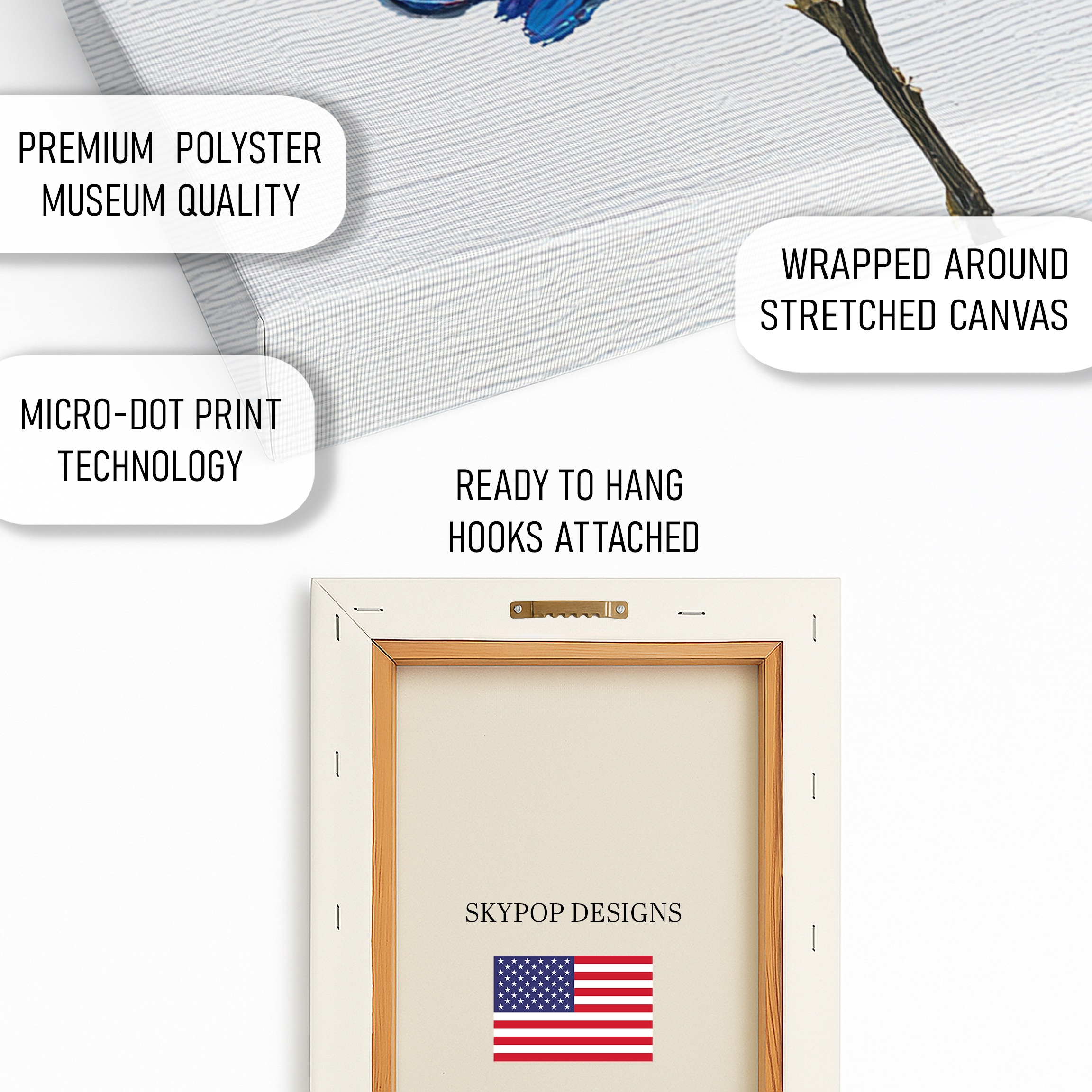
You’re getting a premium 290 gsm Giclee canvas with ultra-fine texture that captures every impasto stroke, or opt for the poster print on archival paper. It uses fade-resistant inks rated for 100+ years in normal light, so those vibrant purples and yellows stay true. The matte finish cuts glare, perfect for any lighting. Choose slim 0.75-inch depth for a flush look or 1.5-inch gallery wrap for dimension—no staples show on the front. Each piece comes ready-to-hang with a sawtooth bracket, made right here in Ohio. Ships in 3-5 business days, rolled or stretched to arrive pristine. Check the product page for current pricing and to select your size from options like 24×24 inches or 18×18 inches.
What Customers Are Saying
“I hung this in my office, and it totally changed the energy—those blended colors make my workday feel less drab, and clients always comment on the texture. It’s like having a mini vacation on the wall.”
– Sarah K., Verified Buyer
Frequently Asked Questions
What sizes are available for this vibrant flower art?
Options include 10×10 inches up to 28×28 inches, all square formats. For most walls, start with 20×20 inches; check the product page for exact fits.
Does this artwork pair well with dark walls?
It shines best on light walls like white or beige to let the colors pop, but light gray works too. Dark walls can mute the vibrancy—test with a sample first.
Is this suitable for a bedroom?
Absolutely, especially in modern or bohemian bedrooms. The uplifting colors add warmth without being too stimulating; try the 16×16 inches above a nightstand.
How long does shipping take?
Ships in 3-5 business days from Ohio. Free shipping on orders over $75—canvas arrives stretched or rolled, ready to hang.
Bottom Line
Bottom line: this vibrant flower art is a smart pick for adding color and depth to your home without the hassle. Follow these six tips, and you’ll have it looking like it belongs in a design mag. Head to the product page at https://skypopdesigns.com/product/vibrant-flower-art-skydesigns1001025/ to explore sizes like 24×24 inches and grab yours. Your walls deserve that joyful boost—don’t wait.
Free shipping on orders over $75 • 30-day satisfaction guarantee
Shop Related Art
Complete Your Collection

Autumn Leaf Flower Art, Canvas or Poster, Nature Whimsical Decor, Living Room Bedroom Office Wall Art, Orange Yellow Brown Green
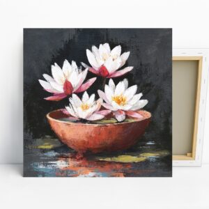
Lotus Flower Bowl Art, Canvas or Poster, Floral Contemporary Decor, Living Room Bedroom Bathroom Office Wall Art, White Pink Red Brown
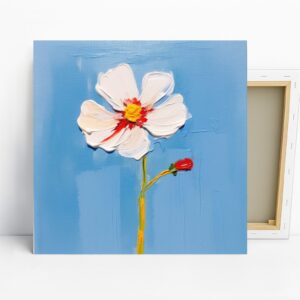
Bold Flower Art, Poster or Canvas, Impressionism Minimalist Decor, Living Room Bedroom Hallway Wall Art, Blue White Red Yellow, Floral Art
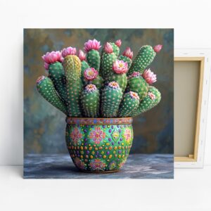
Cactus Flower Art, Poster or Canvas, Bohemian Eclectic Decor, Living Room Bedroom Sunroom Office Wall Art, Green Pink Multicolor Brown