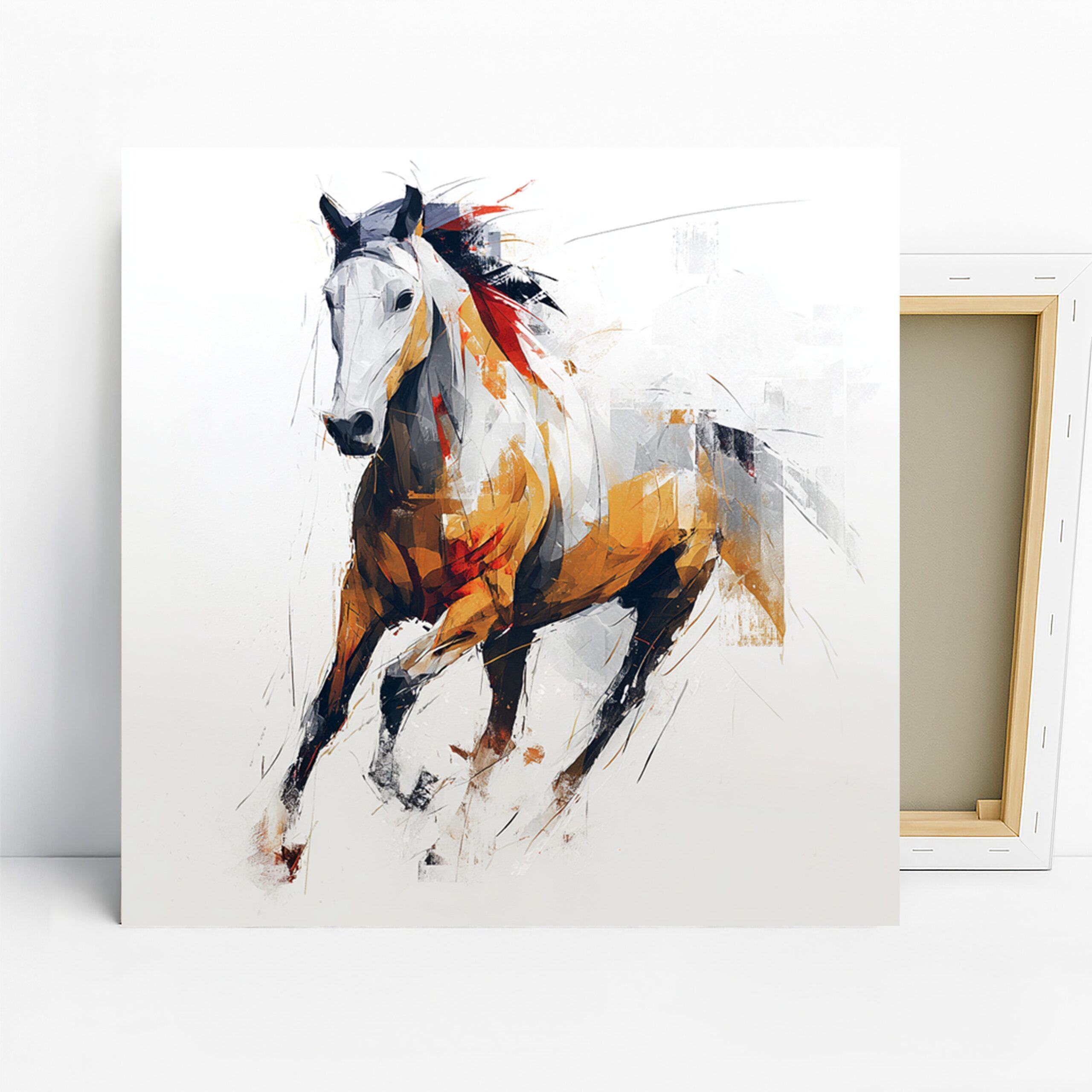
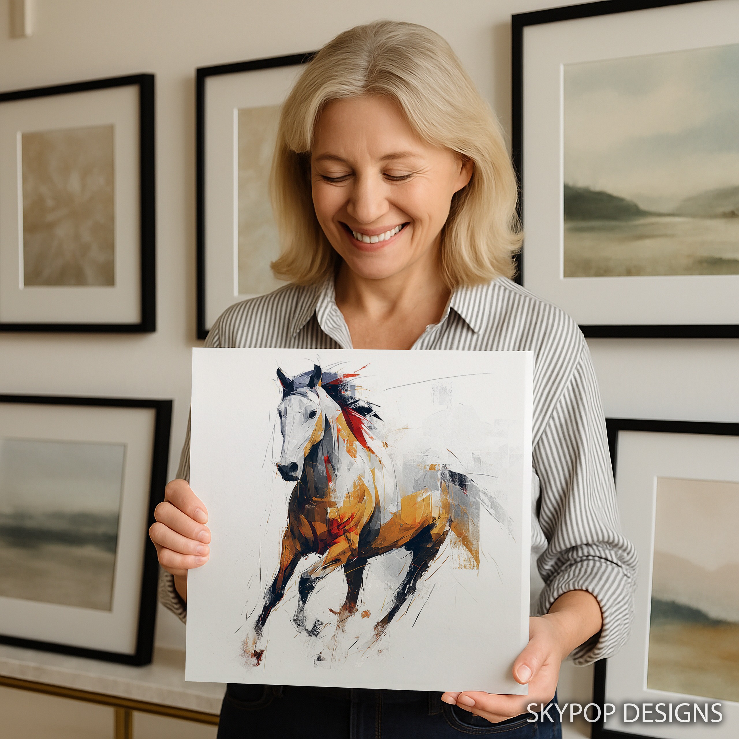
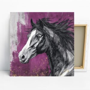
If you’re eyeing galloping horse art that packs a punch without overwhelming your room, this one’s a smart pick. It’s got that contemporary minimalist vibe with a white horse mid-gallop, splashed in yellow, red, and black for some real energy. Perfect for folks into modern setups or equestrian themes, it fits right into our contemporary and horse collections. Whether you’re a young professional jazzing up an office or an art lover refreshing a bedroom, this print turns walls into conversation starters.
You’ll walk away from this post knowing exactly how to hang it, size it, and style it around your furniture. We’ve got tips tailored for 2026 trends, where dynamic abstracts like this are everywhere in minimalist homes. Head over to our blog for more ideas on mixing bold pieces with everyday decor. It’s versatile enough for living rooms or entryways, but shines in spaces craving movement. Let’s dive into the styling so you can picture it up already.
1. Pick the Perfect Size for Your Galloping Horse Art
Sizing matters more than you think with galloping horse art—get it wrong, and it either dwarfs the room or gets lost. Start by measuring your wall space. For a standard living room wall above a sofa, aim for something like the 24×24 inches or 20×20 inches options; they hit eye level without overpowering. If you’re working with a smaller nook, say in a bedroom, the 16×16 inches or 12×12 inches keeps things balanced—leave about 6-8 inches from the furniture edge to the frame bottom.
Here’s the thing: all these are square, which suits symmetrical setups but might feel off in super narrow spots. Check scale and proportion in interior design for more on why matching the print’s scale to your room’s furniture prevents that awkward vibe. I once hung a 28×28 inches in a tight office, and it worked because the desk was low—test with painter’s tape first. Avoid the tiniest 10×10 inches over anything bigger than a side table; it’s too subtle for the bold lines here. Head to the product page at https://skypopdesigns.com/product/galloping-horse-art-skydesigns1002255/ to see all available sizes and visualize them in your space. This way, your galloping horse art becomes the focal point it deserves.
2. Find the Best Spot to Hang Galloping Horse Art
Placement can make or break galloping horse art—hang it too high, and it feels disconnected; too low, and it’s in the way. In the living room, center it 57 inches from the floor to eye level, right above the console or sofa for that dynamic entry feel. The motion in the horse’s pose draws the eye across the space, especially if your room has neutral tones.
Bedrooms work great too, but keep it on a side wall opposite the bed so morning light hits the yellow and red accents just right. Fair warning: don’t cram it into a hallway; the abstract lines need breathing room, at least 12 inches from corners or doors. For offices, position it behind the desk at a slight angle— it adds energy without distracting during calls. Think about traffic flow; this piece thrives where people pause, like entryways with 18×18 inches for a welcoming pop. Pair it with our living room ideas for more inspo. Ultimately, mock it up with paper cutouts. Your galloping horse art will energize the room when it’s at the right height and spot.
3. Coordinate Colors Around Galloping Horse Art
Colors in galloping horse art—the white base with yellow, red, and black pops—play nice with most palettes, but you’ve got to match them smartly. Go for walls in Benjamin Moore’s ‘Simply White’ or Sherwin-Williams ‘Alabaster’ to let the vibrancy shine; neutrals ground the energy without competing. The black outlines pair with warm grays, but skip cool blues—they mute the red accents.
For furniture, walnut or oak tables echo the bold lines, while white-painted pieces keep it minimalist. Upholstery in soft beiges or light grays complements the white horse, but avoid deep reds; too much clash with the print’s pops. Accents? Brass lamps or gold frames amp up the yellow, following the 60-30-10 rule where your walls are 60% neutral, furniture 30%, and this artwork plus red pillows 10%. Dive into basic color theory to see why these contrasts create balance. In my setup, I added geometric pillows in black and yellow—ties everything without overwhelming. Steer clear of orange-heavy rugs; the yellow in the art handles that warmth. This approach makes your galloping horse art the star while harmonizing the whole room.
4. Light Your Galloping Horse Art Just Right
Lighting transforms galloping horse art from good to unforgettable—the matte finish cuts glare, but you still need the right glow. Natural light from east-facing windows warms the yellow and red without washing out the white; north-facing walls give even, soft illumination all day. Avoid south-facing direct sun; it can fade those archival inks over time, though they’re built tough.
Artificial setups? Warm LED bulbs at 2700K make the colors pop like they’re moving—perfect for evening vibes in a bedroom. Track lights angled from above highlight the horse’s motion lines, but skip harsh fluorescents; they flatten the black contrasts. In an office, a simple desk lamp bounced off the wall adds subtle drama. I hung mine near a window with sheer curtains—diffuses light beautifully. For larger 24×24 inches pieces, consider picture lights if you’re fancy, but a floor lamp works for most. The key is even coverage so the dynamic pose feels alive. Your galloping horse art deserves light that enhances its energy, not hides it.

5. Style Furniture and Decor with This Piece
Pairing galloping horse art with your stuff turns a room from flat to alive—focus on modern minimalist furniture to match its vibe. A sleek leather sofa in gray lets the print’s energy stand out, while wooden accents like an oak coffee table nod to the horse’s power. Add geometric throw pillows in black and white for subtle ties, but keep it sparse; this artwork doesn’t need clutter.
In a living room, flank it with metallic gold vases—echoes the yellow without stealing focus. For bedrooms, a simple nightstand with red ceramic lamp pulls in the accents. Avoid heavy farmhouse pieces; the contemporary lines clash with rustic wood. Industrial metal shelves work if they’re slim. I styled mine with a Scandinavian chair nearby—clean lines amplify the motion. Throw in a rug with neutral patterns to ground it, following 2026 trends toward bold walls with calm floors. This piece sparks conversations, so place it where guests linger. Done right, your galloping horse art elevates everyday decor into something personal and punchy.

6. Install Galloping Horse Art Effortlessly
Hanging galloping horse art is straightforward, but a few tricks make it pro-level. Use the included sawtooth bracket for drywall—add anchors if it’s not into a stud, especially for 20×20 inches or bigger. Center at 60 inches from the floor for solo walls, or 6-8 inches above furniture like a headboard.
Two people help with the 28×18 inches sizes; they’re light but awkward alone. Mark spots with a level, and pre-drill if plaster walls are in play—toggle bolts hold firm. The slim 0.75-inch depth keeps it flush, no bulky frame needed. Test placement with tape; ensures the horse’s gallop aligns with your sightline. In humid spots like bathrooms, it’s fine short-term, but offices or living rooms are ideal long-term. I skipped anchors once and regretted it—wobble city. For safety, check weight limits; these canvases are under 10 pounds easy. Once up, step back—it should feel dynamic, not static. Your galloping horse art installs quick and stays put with these steps.
What You’re Getting
You’re getting a high-quality giclee print on 290 gsm canvas with an ultra-fine texture that mimics traditional painting. Archival inks ensure colors stay vibrant for decades, no fading worries. The matte finish kills glare, making it viewable from any angle. Choose slim 0.75-inch or gallery-wrap 1.5-inch depth for a frameless look. Sawtooth bracket comes ready for hanging. Handmade in Ohio, it ships in 3-5 business days, rolled or stretched to order. Posters available too for lighter options. Check the product page for current pricing and exact details.
Frequently Asked Questions
What sizes are available for this galloping horse art?
Options include 24×24 inches, 20×20 inches, 16×16 inches, 12×12 inches, 28×28 inches, 18×18 inches, 14×14 inches, and 10×10 inches—all square to fit modern spaces. Pick based on your wall; larger for focal points, smaller for accents.
How does this artwork pair with wall colors?
It shines against neutrals like soft whites or warm beiges, letting the yellow, red, and black pop. Avoid deep reds or cool blues to prevent clashing; grays work well for a balanced look.
Is galloping horse art suitable for an office?
Absolutely—its energetic vibe inspires without distracting, ideal behind a desk in modern offices. The minimalist design keeps it professional for young pros or equestrian fans.
What’s the difference between canvas and poster versions?
Canvas offers a textured, ready-to-hang wrap with depth; posters are lighter, affordable prints for framing. Both use archival quality; ships in 3-5 business days from Ohio, free over $75.
Bottom Line
Galloping horse art like this brings motion and sophistication to your walls without much fuss. With these six tips, you’re set to size, place, and style it perfectly for 2026’s modern trends. Whether in a living room or office, it’ll add that uplifting energy you need. Head to https://skypopdesigns.com/product/galloping-horse-art-skydesigns1002255/ to check sizes, pick your format, and get it home. Your space is about to feel more alive—go for it.
Free shipping on orders over $75 • 30-day satisfaction guarantee
Shop Related Art
Complete Your Collection
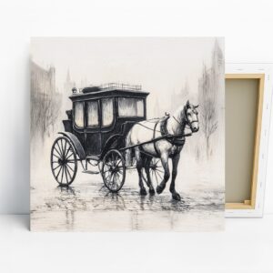
Horse Art, Canvas or Poster, Vintage Rustic Decor, Living Room Entryway Office Dining Room Wall Art, Black White Grey Brown
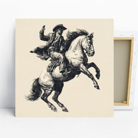
Vintage Cowboy Horse Art, Canvas or Poster, Western Rustic Farmhouse Decor, Living Room Game Room Office Entryway Wall Art, Black and White Brown
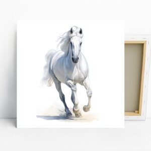
White Horse Art, Canvas or Poster, Contemporary Minimalist Decor, Living Room Bedroom Office Wall Art, White Grey Blue Color Print
Horse Art, Canvas or Poster, Contemporary Rustic Minimalist Decor, Living Room Bedroom Office Dining Room Wall Art, Black White Purple Gold