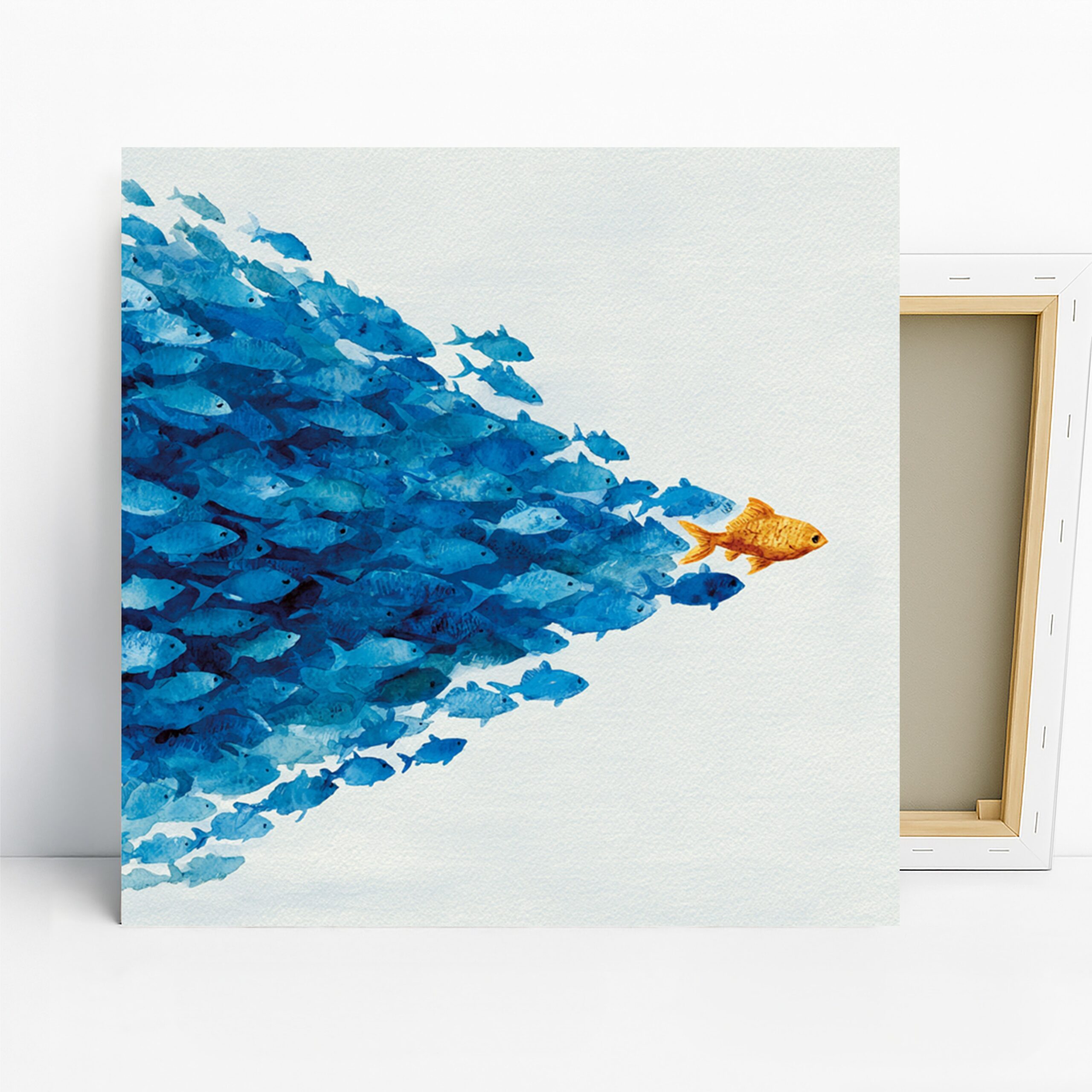
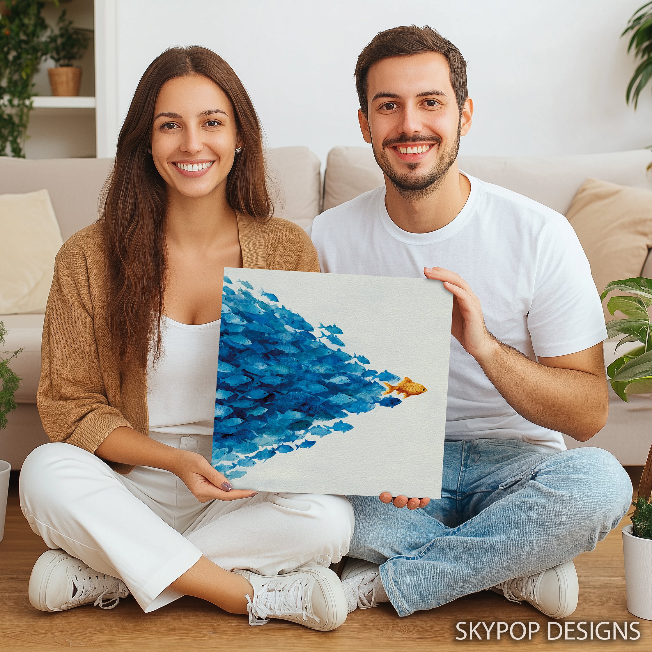
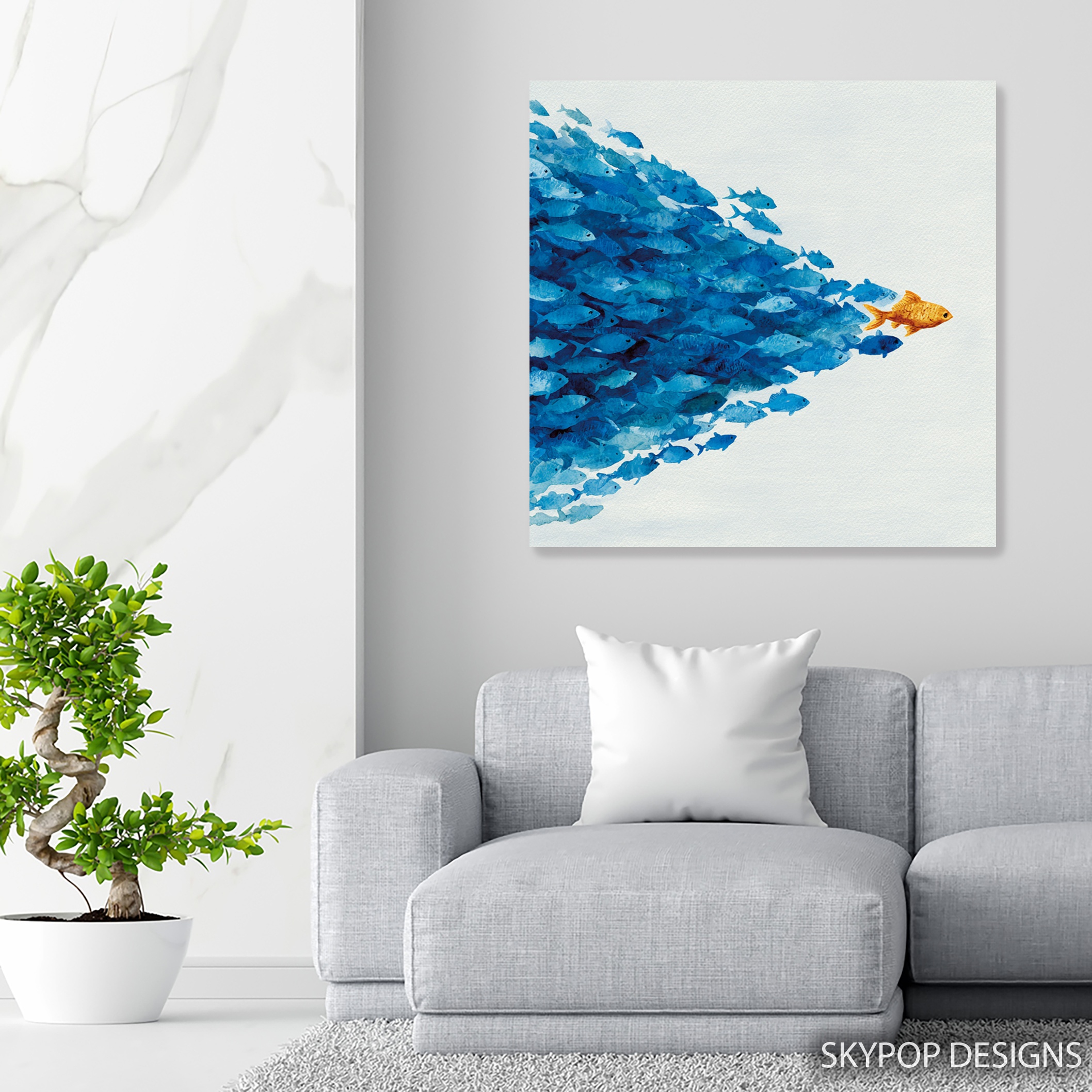
If you’re eyeing blue fish school art for your walls, you’re in for a treat—this piece isn’t just pretty; it adds that subtle coastal energy without overwhelming the room. Picture a school of deep blue fish gliding along, led by one bold orange standout against a crisp white backdrop. It’s got this serene yet playful vibe that fits right into modern homes, especially for young professionals or families who love nature-inspired touches. Whether you’re sprucing up a living room or an office, this artwork pulls it off with ease.
You’ll find it works best in spaces craving a bit of underwater calm, like bathrooms for that spa feel or entryways to welcome guests with whimsy. In this post, we’re diving into six styling tips to help you place it just right. We’ve drawn from our coastal decor category for ideas that match real homes, and if you want more inspo, check out our blog for trends in 2026. No fluff here—just straightforward advice to visualize this blue fish school art in your space. It’s versatile for contemporary or minimalist setups, but we’ll cover the details so you avoid common pitfalls. Let’s get into how to make it shine.
1. Pick the Perfect Room Spot
Start with where you hang your blue fish school art—location sets the tone for the whole room. In a living room, position it above the sofa at eye level; that draws the eye without competing with TV or bookshelves. For offices, try it on a side wall behind your desk—it adds focus without distraction, like those gentle ocean currents in the print.
Bathrooms love this too; the serene blues create a relaxing vibe over the vanity. But here’s a caveat: skip super humid spots without good ventilation, as moisture can affect the canvas over time. Aim for walls with natural light—windows nearby make the colors pop, turning a plain space into something alive. If you’re in an entryway, center it on the main wall to greet visitors with that coastal welcome. Pair it with a console table below, leaving 6-8 inches of space for breathing room. This placement highlights the orange leader fish as a conversation starter. For dining areas, hang it opposite the table so it catches light during meals, enhancing the playful energy. Overall, choose spots where the artwork’s movement feels natural, not forced. That way, it integrates seamlessly, boosting the room’s flow.
2. Size It Right for Your Wall
Sizing matters more than you think with blue fish school art—get it wrong, and it either dwarfs the space or gets lost. For a standard sofa that’s about 7 feet wide, the 24×24 inches or 28×28 inches canvas hits the sweet spot; it covers two-thirds of the furniture width without overwhelming. Smaller walls, like in a bathroom or entryway, call for the 12×12 inches or 16×16 inches options—they add punch without crowding.
Measure first: tape out the footprint on your wall to see how it feels. According to scale and proportion in interior design, aim for the artwork to be 2/3 to 3/4 the width of what’s below it. The 20×20 inches works great over a nightstand in bedrooms, keeping things balanced. But fair warning: the tiniest 10×10 inches might look too petite above larger furniture—save it for powder rooms or gallery walls. Larger like 18×18 inches suits offices for impact. Since all sizes are square, they play well in symmetrical setups. Test with paper mockups; it’ll save you headaches. This approach ensures the school of blue fish feels dynamic, not static, on your wall.
3. Match Colors to Your Palette
Blue fish school art shines when colors harmonize—think deep blues (#2E5B9A) blending with your walls for that cool, refreshing mood. Pair it with soft whites like Benjamin Moore’s ‘Simply White’ or light beiges; they let the orange leader pop without clashing. Avoid deep reds or burgundies—the bright orange fights them, creating tension instead of calm.
In coastal styles, add turquoise accents via pillows or rugs to echo the subtle light turquoise hints. For minimalist rooms, stick to neutrals; the white background keeps it clean. Drawing from Impressionism, which captured light and movement in the late 1800s with loose brushstrokes, this watercolor style brings fluid energy to modern spaces—perfect for 2026’s nature trends. Wood tones like white oak furniture ground the blues nicely, while brass metals warm up the orange. Upholstery in grays or soft blues complements without competing. Apply the 60-30-10 rule: 60% wall neutrals, 30% furniture tones, 10% accents like shells. Check basic color theory for why blues evoke serenity—it’s spot on here. This coordination makes the artwork feel like it belongs, enhancing the room’s harmony.
4. Layer with Lighting Choices
Lighting can make or break blue fish school art—natural daylight brings out the soft watercolor textures, so face it toward windows if possible. In dimmer rooms, add a picture light or LED strips above; they highlight the orange fish without glare on the matte finish. Avoid direct overhead spots that cast shadows on the fluid brushstrokes.
For evening vibes, warm bulbs (2700K) enhance the serene mood, mimicking sunset over water. In offices, desk lamps angled up create subtle drama. But don’t overdo it—harsh fluorescents wash out the deep blues. Pair with driftwood shelves nearby to reflect light softly. This setup emphasizes the directional movement in the school, drawing eyes naturally. Test different angles; you’ll see how it transforms from flat to immersive. With the right glow, this piece adds energy without effort.
5. Pair with Complementary Decor
Styling blue fish school art means thoughtful pairings—nautical touches like seashell vases or woven baskets tie into the marine theme without going overboard. In living rooms, flank it with modern coastal chairs in light fabrics; the whites and blues sync up. For bedrooms, add linen throws in turquoise to echo the accents.
Skip heavy patterns; the abstract style needs space to breathe. Boho elements like rattan lamps work, but keep them minimal. In bathrooms, coordinate with white subway tiles—the contrast makes the orange leader stand out. From our fish category, similar prints can create a gallery if you want more whimsy. Furniture-wise, Scandinavian pieces in pale woods balance the cool tones. Accents? Driftwood frames around it add texture. This layering builds a cohesive look, sparking chats about ocean harmony. It’s all about subtle unity.
6. Install Securely and Simply
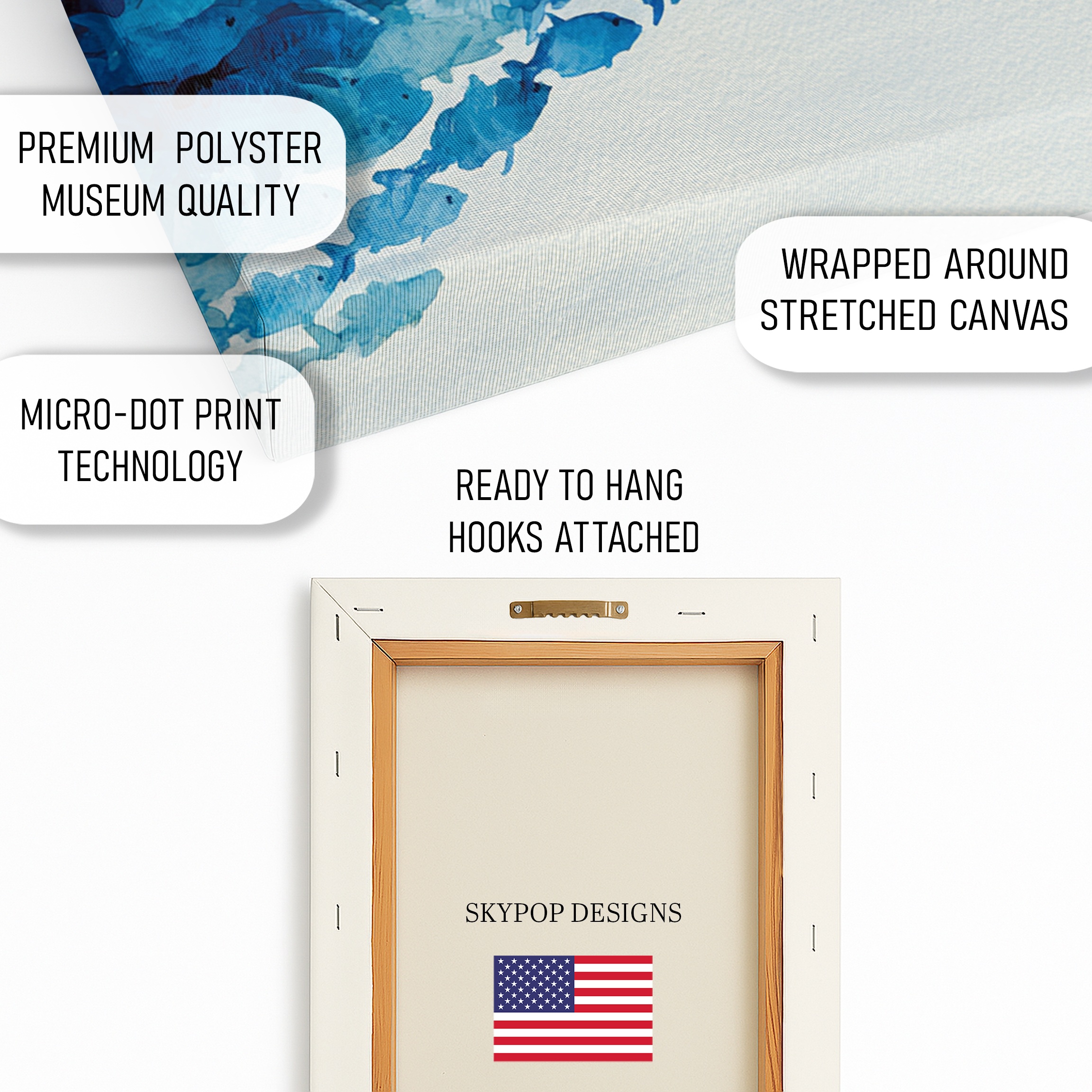
Hanging blue fish school art is straightforward, but do it right for lasting appeal. Center at 57 inches from the floor—gallery standard—or 6-8 inches above furniture. The sawtooth bracket makes it easy; for drywall, use anchors to hold the weight, especially on 28×28 inches sizes.
Two people help with larger ones to avoid smudges. Mock it up with tape first; ensures the square format fits your vision. Plaster walls might need toggle bolts for security. Pro tip: locate studs for bigger pieces to prevent sagging. Comes ready to hang, so no framing hassle. This proper setup lets the serene flow of the fish school enhance your space daily. Check our blue art options for matching pieces if expanding.
What You’re Getting
You’re getting a high-quality giclee print on 290 gsm canvas with an ultra-fine texture that captures every brushstroke in the blue fish school art. Archival inks ensure colors stay vibrant for decades—no fading worries. The matte finish cuts glare, making it ideal for lit rooms. Choose slim 0.75-inch or gallery-wrap 1.5-inch depth for a frameless look. Sawtooth bracket is included for easy hanging. Posters offer the same print quality on premium paper. All made in Ohio with care, ships in 3-5 business days. Sturdy packaging protects during transit. It’s built to last in your home.
What Customers Are Saying
“This blue fish school art totally transformed our bathroom—it brings such a calming ocean feel without being too busy. The orange fish adds just the right pop!”
– Sarah K., Verified Buyer
Frequently Asked Questions
What sizes are available for blue fish school art?
Options include 10×10, 12×12, 14×14, 16×16, 18×18, 20×20, 24×24, and 28×28 inches—all square for versatile placement. Check the product page for current availability.
Does this artwork pair well with light gray walls?
Yes, the deep blues and white background complement light grays beautifully, creating a serene contrast. Avoid pairing with warm oranges in accents to prevent clashing.
Is blue fish school art suitable for a home office?
Absolutely—its subtle energy and leadership metaphor inspire focus in offices. Hang a 20×20 or 24×24 size on a side wall for balanced impact.
What’s the difference between canvas and poster versions?
Canvas has a textured, wrapped finish for depth, while posters are on premium paper for a flat, framed look. Both use archival inks; ships in 3-5 business days from Ohio with free shipping over $75.
Bottom Line
Bottom line: blue fish school art delivers that fresh coastal touch your space needs, whether calming a bathroom or energizing an office. With these six tips, you’ll style it confidently—no guesswork. Head to the product page at https://skypopdesigns.com/product/blue-fish-school-art-skydesigns1003818/ to explore sizes and options. Check current pricing there, and bring home this serene piece today.
Free shipping on orders over $75 • 30-day satisfaction guarantee
Shop Related Art
Complete Your Collection
Colorful Fish Art, Canvas or Poster, Vintage Nature Decor, Kitchen Dining Room Bathroom Wall Art, Blue Red Yellow Orange, Beach House Decor
Blue Poppy Art, Canvas or Poster, Floral Nature Decor, Living Room Bedroom Office Bathroom Wall Art, Blue Yellow Green Turquoise
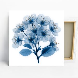
Blue Cherry Blossom Art, Canvas or Poster, Floral Nature Contemporary Decor, Living Room Bedroom Office Bathroom Wall Art, Blue White Brown
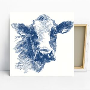
Blue Cow Face Art, Canvas or Poster, Contemporary Rustic Farmhouse Decor, Kitchen Dining Room Living Room Office Wall Art, Blue White