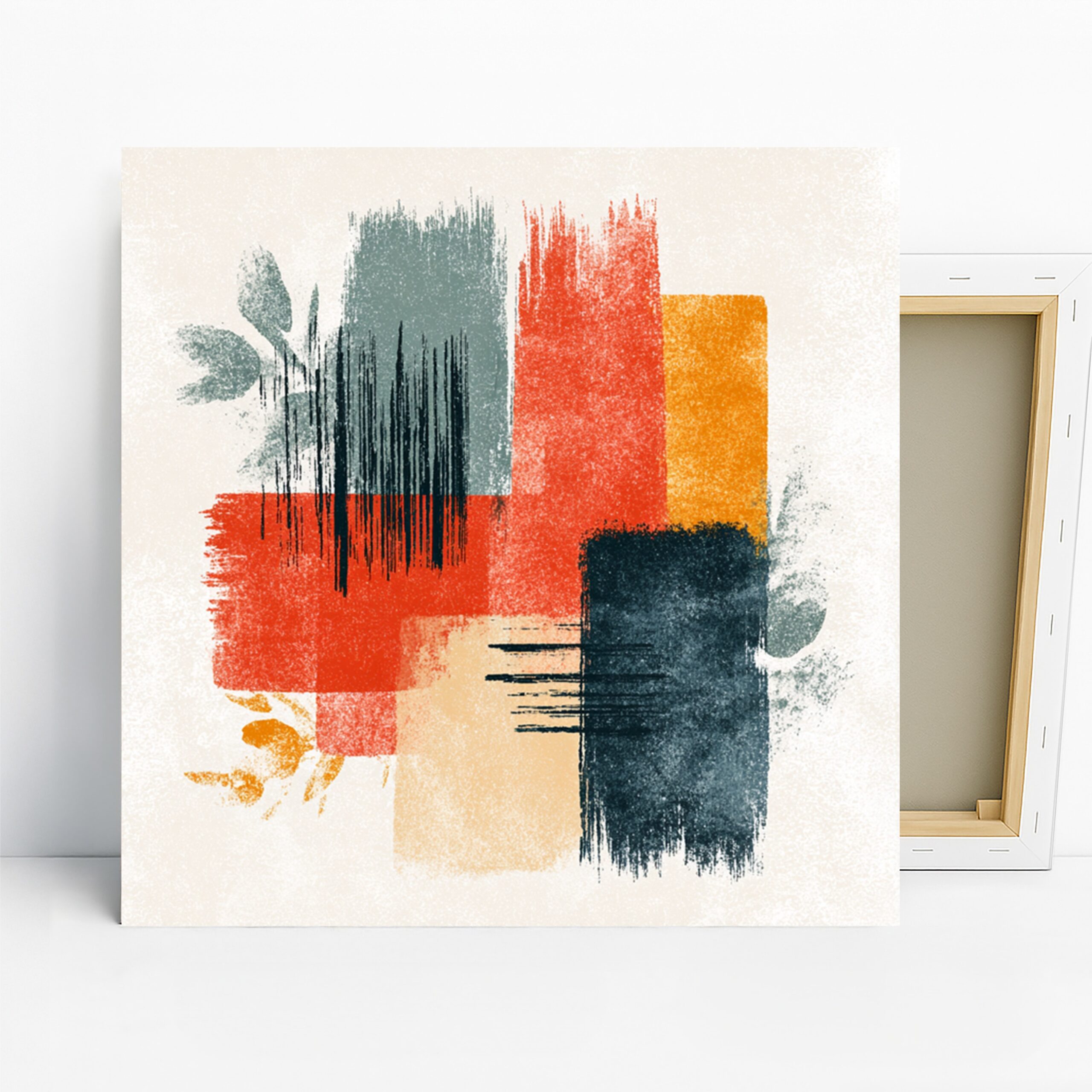
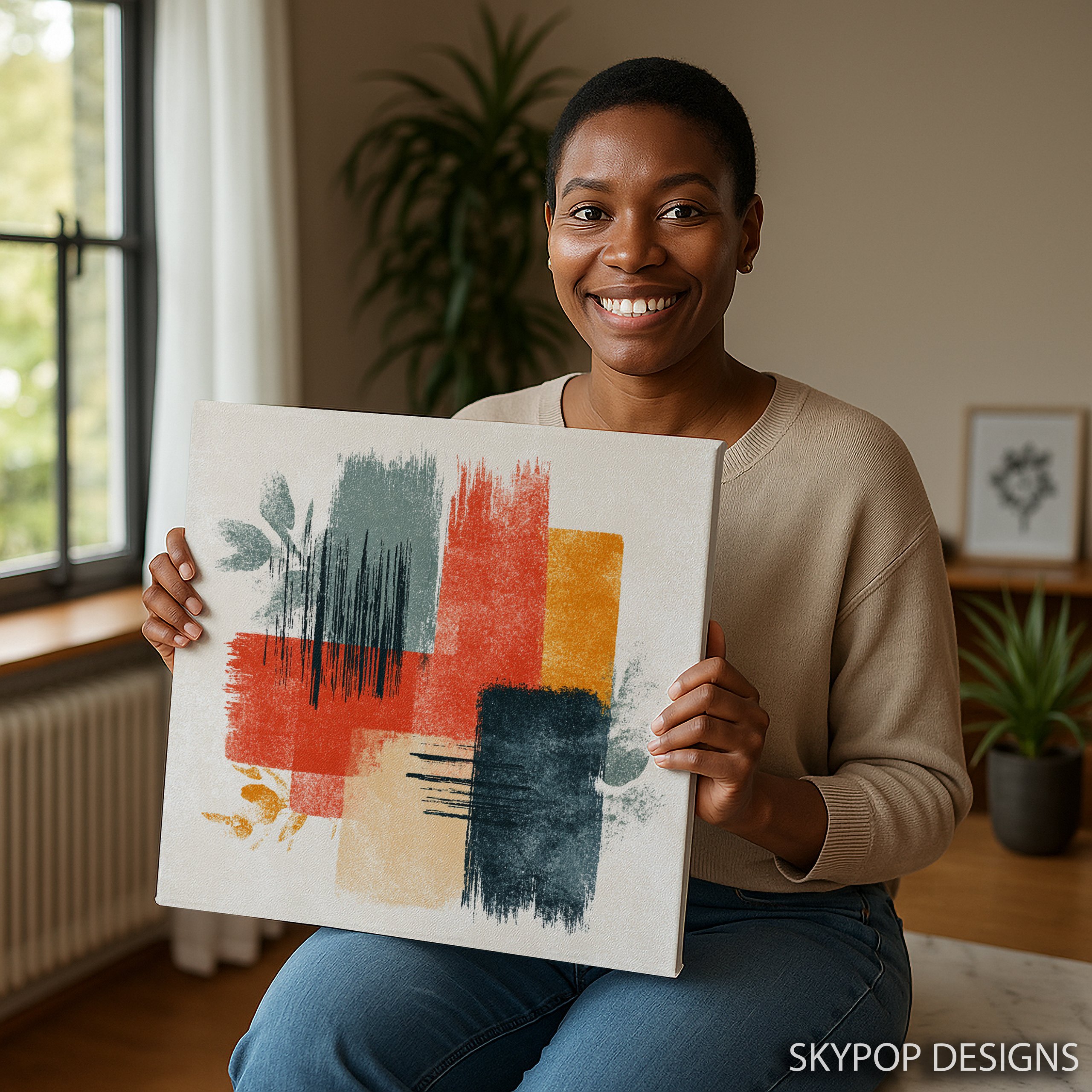
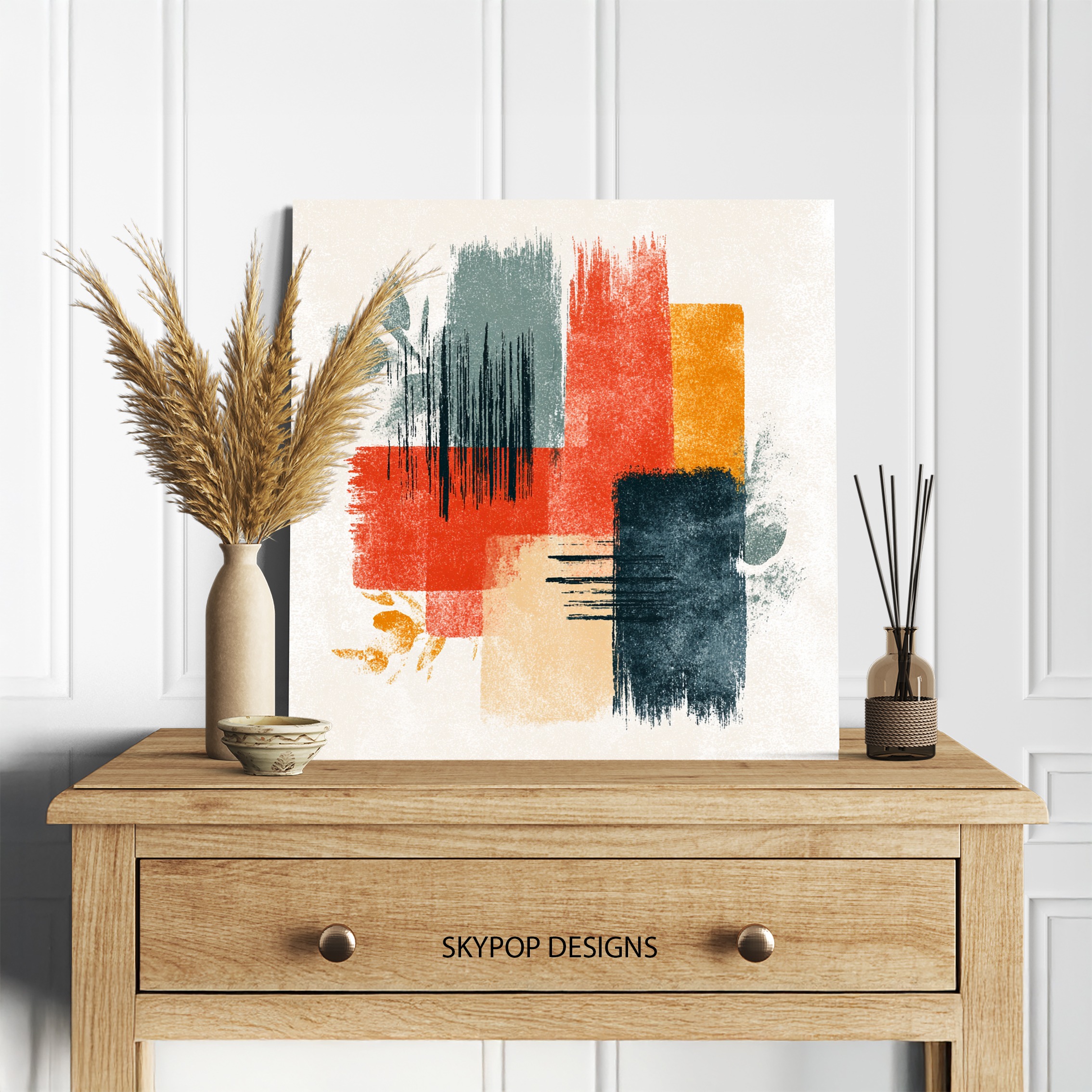
This abstract brushstroke wall art catches your eye right away with its bold swipes of red, orange, blue, and yellow that somehow feel balanced, not chaotic. If you’re a young professional juggling a sleek office setup or a modern family wanting to liven up the living room without going overboard, this piece fits right in. It’s got that contemporary edge that works in minimalist bedrooms too, adding just enough pop to make the space feel alive.
You’ll walk away from these 6 styling tips knowing exactly how to hang it so it enhances your room instead of fighting it. We’re talking practical stuff like picking the right size from our square options—think 24×24 inches for bigger walls or 12×12 for accents—and pairing it with your existing decor. Check out our contemporary category for more ideas like this, or dive into our blog for fresh decorating inspo. No more staring at blank walls; this artwork turns them into conversation starters that feel personal and polished.
1. Pick the Perfect Room for Abstract Brushstroke Wall Art
Start by thinking about where this abstract brushstroke wall art will shine brightest—it’s all about the room’s vibe and how much energy you want to inject. In a living room, hang it above the sofa to draw folks in during gatherings; the vibrant reds and oranges warm up neutral spaces without screaming for attention. For offices, place it behind your desk at eye level—about 57 inches from the floor to the center—to keep things dynamic during long workdays, but skip super formal boardrooms where it might distract.
Bedrooms call for a softer touch: position this artwork on a side wall opposite the bed so morning light hits those blue and yellow strokes just right, creating a harmonious wake-up view. Entryways work too if they’re not too cramped—the 18×18 inch size fits narrow halls without overwhelming. Fair warning, though: in a bathroom with high humidity, stick to the poster option over canvas to avoid any warping risks. Overall, this piece thrives in social or personal spots like living rooms and offices, as noted in design guides for contemporary decor. It adds that sophisticated punch modern families crave, blending warmth from the oranges with cool blues for balance. Just measure your wall first—aim for at least 30 inches wide to give it breathing room.
2. Size It Right: Selecting Abstract Brushstroke Wall Art Dimensions
Sizing this abstract brushstroke wall art is key to avoiding that awkward ‘floating’ look—go too small, and it gets lost; too big, and it dominates. For a standard 7-foot sofa in the living room, the 24×24 inch canvas hits the sweet spot, covering about two-thirds of the furniture width as pros recommend in scale and proportion in interior design. That square format keeps things modern and symmetric, perfect over a console table too.
In smaller bedrooms, drop to 16×16 or 14×14 inches above a nightstand—anything under 12×12 inches feels puny next to a queen bed. Offices? The 20×20 works great on a feature wall behind a desk, leaving space for shelves. We’ve got options up to 28×28 for grand statements, but remember, all are square, so they suit balanced layouts best. If your wall’s oddly shaped, test with painter’s tape first: outline a 18×18 spot and step back. This prevents regrets, especially since the bold brushstrokes demand visibility—the 10×10 is ideal only for powder rooms or gallery walls, not solos. Pro tip: for walls over 8 feet tall, bump up to 28×28 to fill the vertical space without crowding.
3. Coordinate Colors with Your Abstract Brushstroke Wall Art
Pairing colors with this abstract brushstroke wall art means leaning into its rusty reds, burnt oranges, slate blues, and golden yellows—they’re vibrant but not clownish. Soft neutrals like beige or light gray walls let the artwork pop without clashing, creating that energetic yet harmonious mood. According to basic color theory, the warm-cool mix here evokes balance, so pair with mid-century furniture in teak or walnut for a grounded feel.
Avoid deep reds or burgundies nearby; the oranges fight them and muddy the energy. Instead, echo the blues with navy accents—a throw pillow or rug ties it in. For minimalist setups, cool whites amplify the yellows, making the space feel fresh. In a living room, this setup calms chaos while uplifting neutrals. One caveat: if your room’s all cool tones like pale blues, the warms might overpower—test swatches first. Add metallic gold frames to nod at the accents, or potted greenery for organic flow. This approach keeps the abstract brushstroke wall art as the star, enhancing sophistication without overthinking.
4. Light It Up: Best Ways to Illuminate Abstract Brushstroke Wall Art
Lighting this abstract brushstroke wall art right makes those textured strokes dance—natural light is your friend, but direct sun fades colors over time, so north-facing walls give even glow without glare thanks to the matte finish. In a bedroom, position near a window with sheer curtains to soften the rays on the yellows and blues, keeping the energy uplifting yet restful.
For artificial setups, warm LEDs at 2700K-3000K enhance the reds and oranges, making them glow cozy in an office after dark—clip-on spots work if you lack track lighting. Skip cool fluorescents; they wash out the vibrancy. Picture lights add elegance over a dining setup, but for casual hangs, a simple gallery light suffices. The canvas’s ultra-fine texture catches light subtly, avoiding hot spots. In entryways, layer with overheads for that welcoming vibe. Bottom line: aim for 100-200 lux on the piece—test with your phone’s light meter app. This ensures the abstract brushstroke wall art’s dynamic harmony shines, turning any corner into a focal point without harsh shadows.
5. Style Around It: Furniture and Decor Pairings
When styling around this abstract brushstroke wall art, think Scandinavian minimalism or bohemian touches—pair with clean-lined sofas in linen for the living room, letting the bold strokes contrast softly. Add a wooden side table with a single plant; the organic motifs in the art echo that without clutter. In offices, flank it with floating shelves holding books in neutral tones—the blues ground the space for focus.
For bedrooms, a bedroom setup shines with a low-profile headboard in gray; layer in amber pillows to pull the oranges. Avoid heavy ornate frames—they compete with the contemporary feel. Instead, gallery-wrap the canvas for a frameless edge. One limit: in tiny spaces, skip bulky accents; the artwork’s energy fills enough. Throws in slate blue tie rooms together seasonally—light cotton for summer, wool for fall. This creates a sophisticated flow, making the abstract brushstroke wall art feel integral, not tacked on. It’s versatile for modern families, sparking chats over coffee.
6. Hang It Properly: Installation Tips for Abstract Brushstroke Wall Art
Installing this abstract brushstroke wall art securely starts with the right height—center it at 57-60 inches from the floor for seated views in living rooms, using a level app on your phone for precision. The sawtooth bracket makes it easy, but for heavier 28×28 sizes, add D-rings and wire to distribute weight evenly on drywall.
Mark spots with pencil, pre-drill if needed, and leave 8-10 inches clearance from furniture edges to breathe. In offices, secure to studs for stability—vibration from fans can shift lighter pieces. Avoid adhesive hooks; they fail on textured walls. For gallery walls, cluster with smaller prints at least 2 inches apart, keeping this as the anchor. The slim 0.75-inch depth hugs walls nicely, but if you want depth, opt for 1.5-inch wrap. Test the spot empty first—step back 10 feet. This ensures the abstract brushstroke wall art integrates seamlessly, enhancing your space’s modern harmony without DIY headaches.
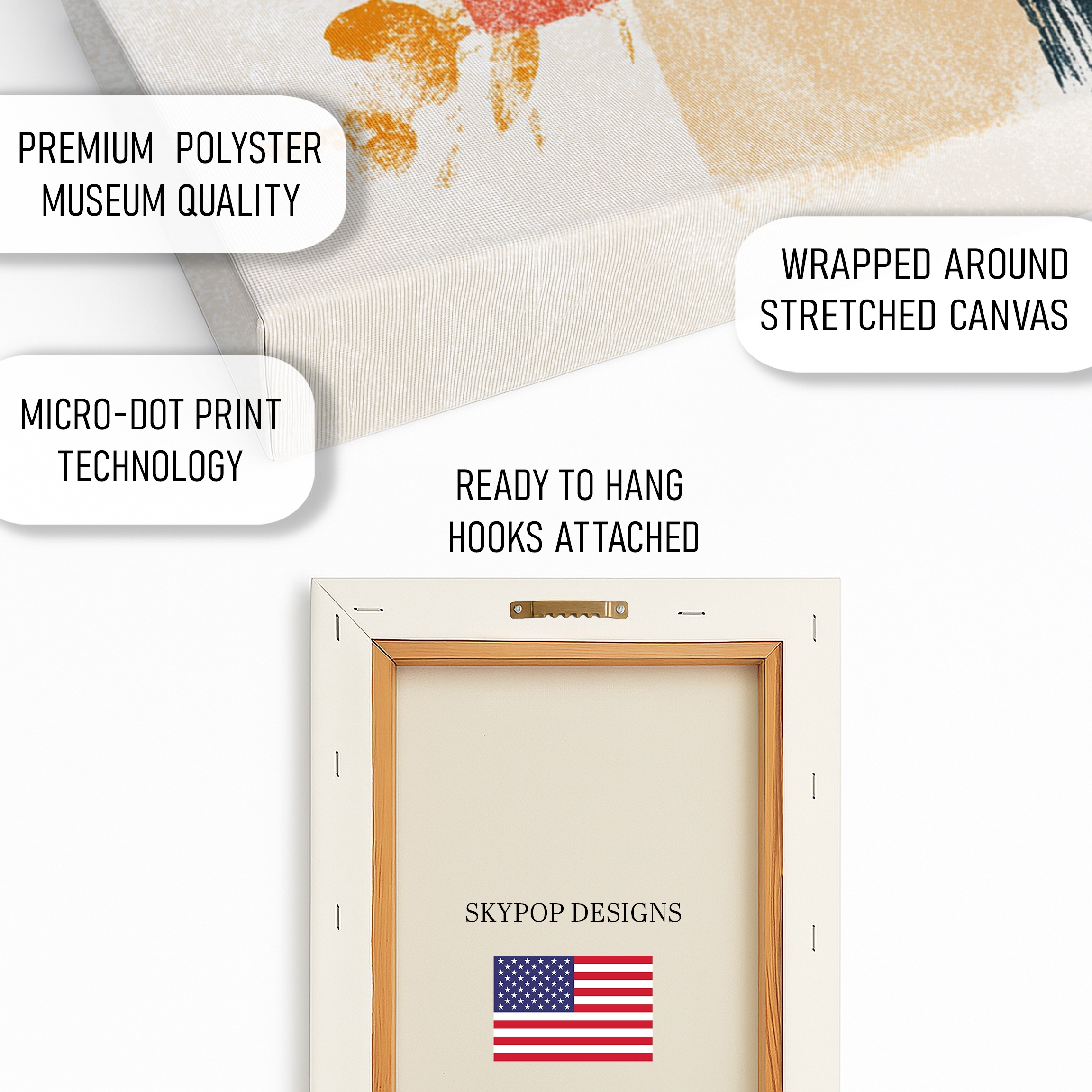
What You’re Getting
You’re getting a premium 290 gsm Giclee canvas with an ultra-fine texture that captures every brushstroke detail. Archival inks ensure colors stay true for decades, no fading worries. The matte finish kills glare, perfect for any lighting. Choose 0.75-inch slim wrap for a low-profile look or 1.5-inch gallery wrap for dimension. Sawtooth bracket’s included for easy hanging. Handcrafted in Ohio, it ships in 3-5 business days—ready to elevate your wall fast.
What Customers Are Saying
“This print totally transformed my home office—the colors make late nights feel energizing, not draining. Hung the 20×20 above my desk, and it pairs perfectly with my gray walls without overwhelming the space.”
– Sarah K., Verified Buyer
Frequently Asked Questions
What sizes are available for this abstract brushstroke wall art?
Options include 10×10, 12×12, 14×14, 16×16, 18×18, 20×20, 24×24, and 28×28 inches—all square for balanced modern looks. Check the product page for current pricing.
Does this artwork pair well with blue walls?
Yes, the slate gray-blue tones in the print complement cool blue walls, but balance with warm accents like wooden furniture to avoid a chilly feel.
Is abstract brushstroke wall art suitable for a bedroom?
Absolutely—its harmonious colors create an uplifting yet calming focal point, especially in 16×16 or 18×18 sizes over a nightstand.
How long does shipping take?
Ships in 3-5 business days from Ohio. Free shipping on orders over $75—track it easily online.
Canvas or poster—which is better for this design?
Canvas gives a textured, gallery feel that enhances the brushstrokes, but posters are lighter and easier for renters; both use archival quality.
Can I hang this in a high-humidity room like a bathroom?
Opt for the poster version to resist moisture better; canvas works in low-humidity spots but avoid direct steam.
How do I clean the abstract brushstroke wall art?
Dust gently with a soft microfiber cloth—no liquids needed. For deeper cleans, use compressed air sparingly to preserve the matte finish.
Bottom Line
These tips show how abstract brushstroke wall art can slot into your life effortlessly, bringing that vibrant harmony to living rooms, offices, or bedrooms. Whether you’re sizing up a 24×24 for impact or coordinating colors for balance, it elevates without effort. Head to the product page at https://skypopdesigns.com/product/brushstroke-harmony-art-skydesigns1003464/ to see sizes and options—grab yours and transform a wall today. Check the product page for current pricing.
Free shipping on orders over $75 • 30-day satisfaction guarantee
Shop Related Art
Complete Your Collection
White Ranunculus Bouquet Art, Canvas or Poster, Floral Still Life Modern Decor, Living Room Bedroom Dining Wall Art, White Blue Green Yellow
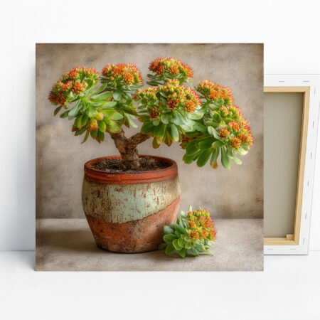
Succulent Art, Canvas or Poster, Contemporary Rustic Bohemian Decor, Living Room Bedroom Dining Room Entryway Wall Art, Green Orange Brown Multicolor Plant Print
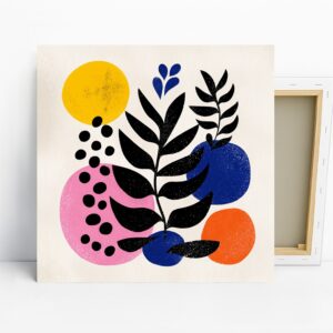
Geometric Botanical Art, Canvas or Poster, Modern Minimalism Decor, Living Room Office Bedroom Dining Room Wall Art, Yellow Blue Pink Black

Caged Mind Art, Canvas or Poster, Surrealism Contemporary Decor, Office Living Room Study Library Wall Art, Black White Grey Brown