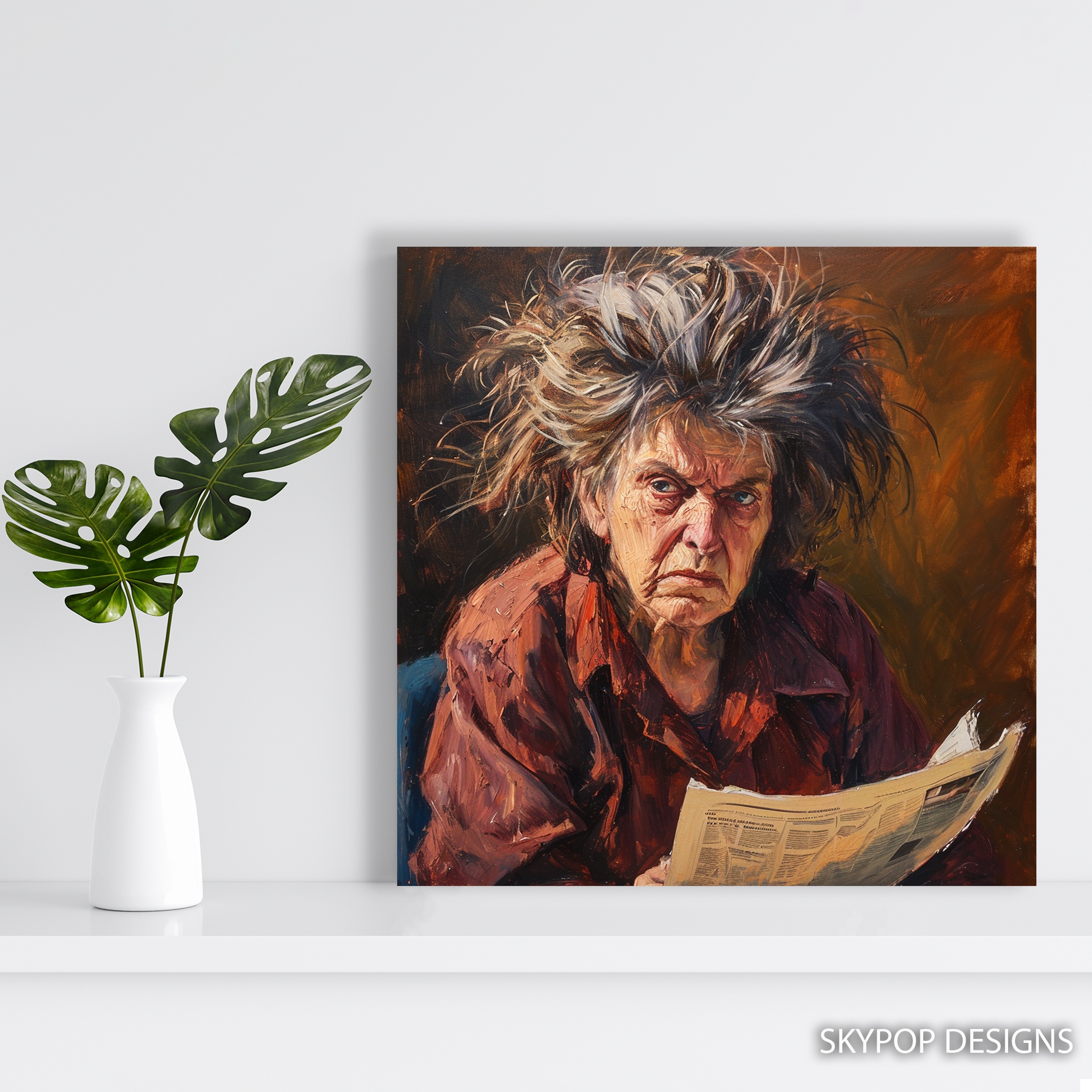
This elderly reader art does something special—it pulls you into a moment of quiet focus without shouting for attention. Picture an older woman with wild gray hair, lost in her newspaper, her red-brown shirt adding that rustic warmth. It’s perfect for folks who love books, retirees building cozy nooks, or anyone wanting a touch of nostalgia in their home. We’ve seen it fit right into living room setups or office spaces, where it sparks those easy conversations about life’s stories.
If you’re decorating a study or den, this piece brings character without clutter. In this post, you’ll get four straightforward styling tips to make elderly reader art work in your space. We’ll cover placement, sizing, colors, and more, so you can visualize it hanging just right. Head over to our blog for more ideas on mixing art with everyday life. Whether you’re refreshing a traditional room or adding depth to a modern one, these tips keep things practical and real.

1. Room Placement for Elderly Reader Art
Hang your elderly reader art where it can breathe—think eye level, about 57 inches from the floor to the center of the frame. In a living room, position it above a leather armchair or beside a bookshelf; the contemplative vibe pairs with spots meant for unwinding. I’ve placed similar pieces over a console table in a den, leaving 6-8 inches of space on either side to avoid crowding. It draws the eye without dominating.
For offices, try it on a wall facing your desk—the gray hair and newspaper details encourage those reflective breaks. But skip busy hallways; the subtle textures get lost in traffic. This artwork shines in quieter zones like a library corner, where the warm browns soften the light. One caveat: if your room has high ceilings, go for a larger size to balance the scale, or it might look adrift. Overall, this elderly reader art grounds reading areas, making them feel lived-in and wise.

2. Size Selection for Your Elderly Reader Art
Start by measuring the wall—elderly reader art comes in square formats like 10×10 inches up to 28×28 inches, so pick based on your furniture. Above a standard sofa (say, 84 inches wide), the 24×24 or 28×28 inches hits that sweet spot, covering about two-thirds the width for balance. Check out scale and proportion in interior design to see why this rule prevents a piece from looking swallowed.
In a small office nook, the 16×16 or 18×18 inches keeps things intimate without overwhelming a desk setup. For bedrooms, 20×20 inches works over a nightstand, adding warmth without closing in the space. Fair warning: the tiniest 10×10 might feel too delicate for a main wall—save it for shelves or galleries. Go too big, like 28×28 in a tiny powder room, and it overpowers. Measure twice: from furniture edge to ceiling, ensure at least 8 inches clearance. This way, your elderly reader art integrates seamlessly, enhancing the room’s flow.
3. Color Coordination with Elderly Reader Art
The red-brown and medium gray tones in this elderly reader art play nice with warm neutrals—pair it against Benjamin Moore’s ‘Revere Pewter’ walls for that cozy hug. It grounds cooler grays too, but avoid stark whites; they wash out the muted warmth. Upholstery in soft taupes or leather pulls it together, while walnut wood tables echo the rustic feel.
Skip cool blues on adjacent walls—they fight the earthy palette. For accents, brass lamps highlight the skin tones without clashing, and woven rugs in beige tie everything in. Apply the 60-30-10 rule: let wall color dominate (60%), furniture 30%, and pops like throw pillows in white or pale yellow for 10%. Dive into basic color theory for more on why analogous shades like these create harmony. In a grey themed room, this piece adds depth without overwhelming. Brass or gold frames enhance the vintage nod, but matte black might dull the mood. Bottom line: this elderly reader art warms up spaces, making colors feel intentional.
4. Lighting and Installation for Elderly Reader Art
Light it softly—overhead cans work, but add a picture light or floor lamp to skim the brushstrokes, revealing texture without glare. The matte finish on this elderly reader art handles ambient glow well, so avoid direct sun that fades the archival inks over time. Hang at 60-65 inches center height for seated views in reading spots.
Use the included sawtooth bracket for easy install on drywall; for heavier 28×28 sizes, add anchors. Space it 4-6 inches above a mantel to let heat rise without damage. In low-light offices, LED strips behind the frame create a subtle halo, emphasizing the nostalgic mood. But here’s a heads-up: in super bright rooms, the pale accents might reflect oddly—drape sheer curtains if needed. Inspired by the Realism art movement), this piece rewards gentle illumination that mimics natural reading light. Secure it firmly; wobbles distract from the focus. Done right, your elderly reader art becomes a quiet anchor, inviting longer looks.
What You’re Getting
You’re getting a premium giclee print on 290 gsm canvas with an ultra-fine texture that mimics original brushwork. Archival inks ensure colors stay vibrant for decades, no fading from light exposure. The matte finish cuts glare, perfect for well-lit rooms. Choose slim 0.75-inch depth for a flush look or 1.5-inch gallery wrap for dimension—both ready to hang with sawtooth brackets. Handcrafted in Ohio, it ships in 3-5 business days, rolled or stretched to order. This elderly reader art arrives dust-free and protected, built to last in any home setup.
What Customers Are Saying
“This print transformed my study—now it’s my favorite spot for evening reads, with that wise face watching over me.”
– Sarah T., Verified Buyer
Frequently Asked Questions
What sizes are available for this elderly reader art?
Options include 10×10, 12×12, 14×14, 16×16, 18×18, 20×20, 24×24, and 28×28 inches—all square to fit balanced spaces. Check the product page for current availability.
How does the elderly reader art pair with wall colors?
It complements warm beiges and soft grays best, like Sherwin-Williams ‘Agreeable Gray,’ but steers clear of bold reds that clash with the brown tones.
Is this elderly reader art suitable for a bedroom?
Yes, especially in traditional or rustic bedrooms; the calming, introspective mood enhances relaxation without being too stimulating for sleep.
What about shipping for elderly reader art?
Ships in 3-5 business days from Ohio, with free shipping on orders over $75. It’s packaged securely to arrive ready for hanging.
Bottom Line
Elderly reader art like this brings real depth to your walls, turning ordinary spots into thoughtful retreats. Whether in a living room or office, these four tips make integration straightforward. Head to the product page at https://skypopdesigns.com/product/elderly-reader-art-skydesigns1002330/ to see sizes and options—check there for current pricing. You’ll love how it fits your style.
Free shipping on orders over $75 • 30-day satisfaction guarantee
Shop Related Art
Complete Your Collection

Cat Art, Canvas or Poster, Pop Art Modern Decor, Living Room Game Room Children's Room Wall Art, Red Yellow Orange and White

Hippopotamus Art, Canvas or Poster, Whimsical Bohemian Decor, Living Room Childrens Bedroom Nursery Wall Art, Yellow Blue Grey and White
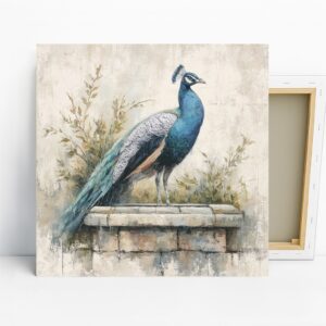
Peacock Art, Canvas or Poster, Nature Classic Decor, Living Room Dining Room Entryway Office Wall Art, Blue White Green Brown
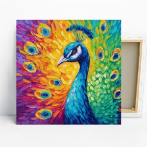
Peacock Art, Canvas or Poster, Contemporary Whimsical Decor, Living Room Bedroom Office Wall Art, Blue Yellow Green Purple Colorful Print