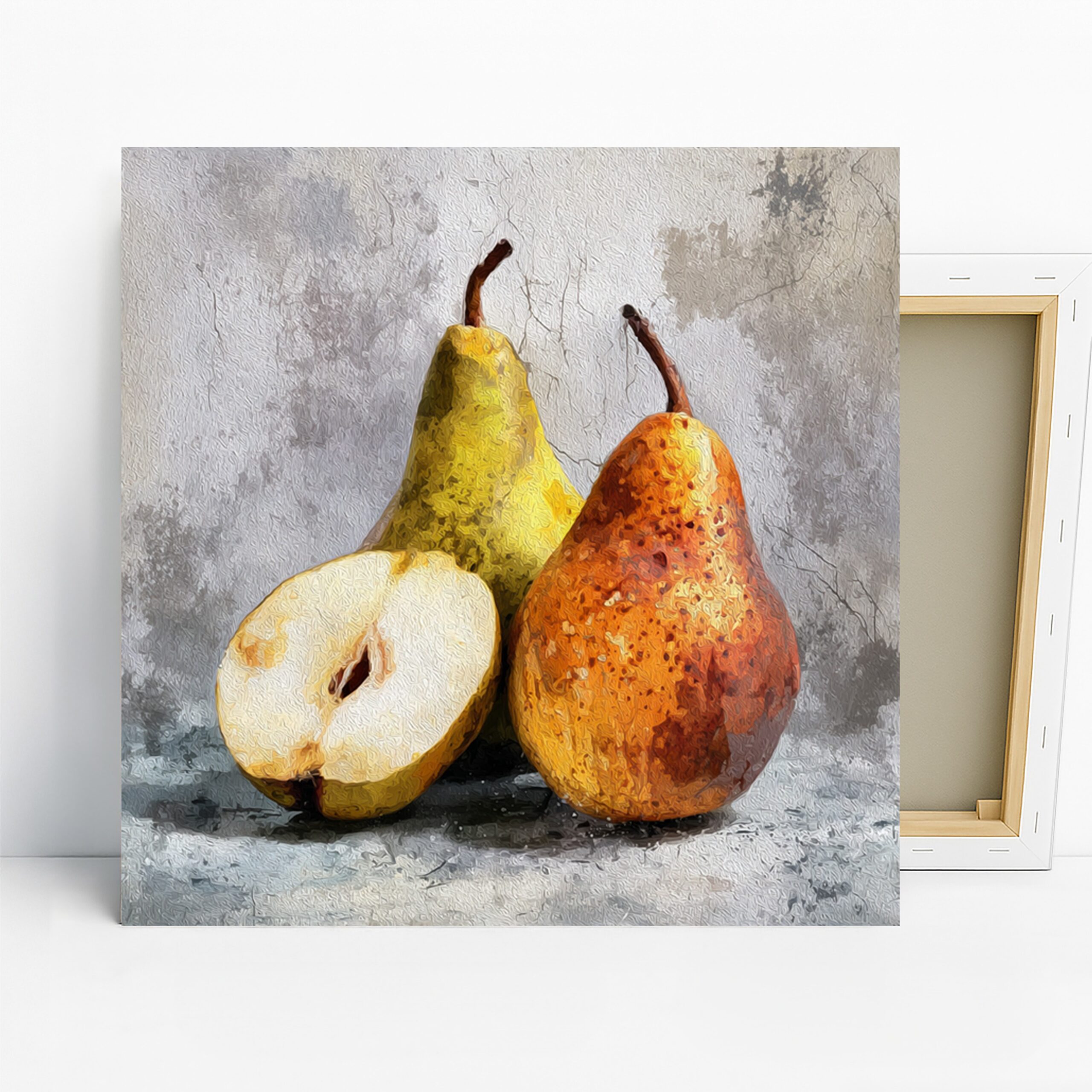
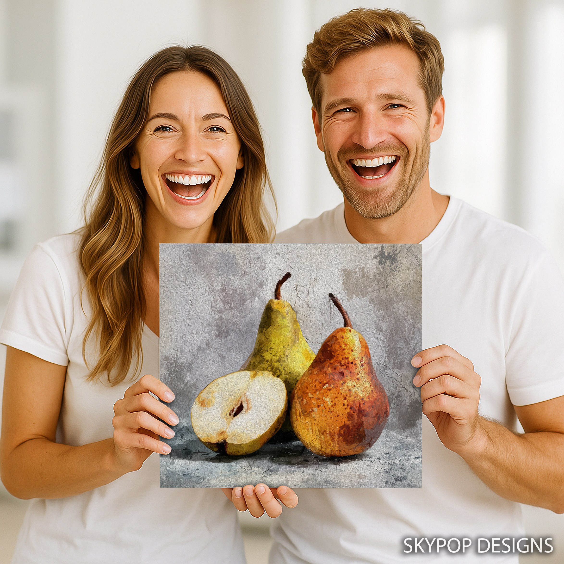
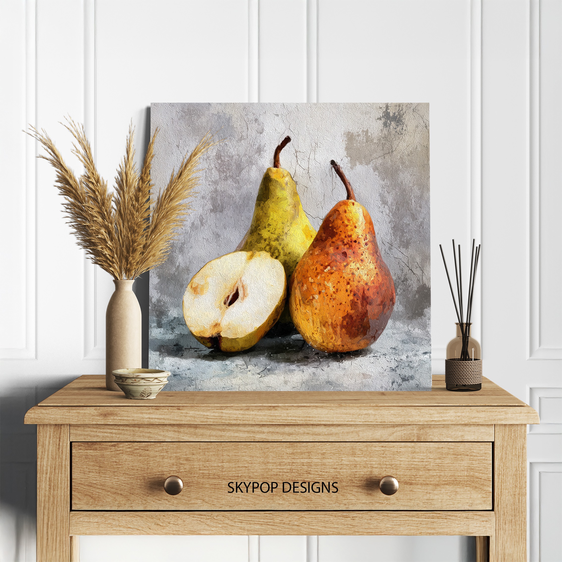
This golden pear art does something most fruit prints don’t—it brings a cozy, realistic vibe to everyday spaces without feeling outdated. Picture two ripe pears, one golden-yellow and the other with warm brown tones, set against a subtle gray backdrop that highlights their natural texture. It’s inspired by classic still life traditions, like those in the Still life painting genre, but with a modern twist that fits 2026’s clean, nature-infused trends.
If you’re a young professional stocking a minimalist kitchen or a family wanting warmth in the dining room, this piece speaks to you. It works best in areas where you gather for meals, evoking freshness and abundance. You’ll learn how to hang it right, pick sizes that scale to your walls, and pair it with furniture that lets those golden hues shine. Check out our Kitchen category for more ideas, or dive into our blog for seasonal decor tips. Whether you’re into cooking or just love subtle art that sparks conversation, this golden pear art fits right in. It’s versatile for modern, farmhouse, or contemporary setups, adding that inviting touch without dominating the room. Let’s get into the styling details so you can visualize it on your wall today.
1. Pick the Best Room for Golden Pear Art
Start with placement—golden pear art thrives in spaces tied to food and relaxation, like kitchens or dining areas. Hang it above a console table in your entryway for a welcoming pop, but honestly, it shines brightest over a dining table where the pears’ appetizing glow ties into mealtime vibes. For a standard 6-foot table, position the center of the frame 57 inches from the floor; that’s eye level when seated.
In the kitchen, it calms the chaos of counters and appliances. Pair it with open shelves stocked with wooden bowls—those brown tones in the sliced pear echo cutting boards nicely. Avoid hallways; the subtle details get lost in traffic. If your living room has a breakfast nook, that’s gold too. This artwork creates serenity amid daily hustle. One caveat: steer clear of bedrooms if you want bold energy elsewhere—the cozy mood here suits active zones better. Measure your wall first; anything under 12 inches wide feels squeezed. Families love how it sparks chats about fresh produce, making meals more engaging. For offices, it adds a non-distracting focal point during breaks. Bottom line, choose rooms where warmth matters most.
2. Scale Golden Pear Art to Your Wall
Sizing matters more than you think with golden pear art—go too small, and it vanishes; too big, and it overpowers the pears’ intimate scale. Our options run square from 10×10 inches up to 28×28 inches, perfect for balanced compositions. For a sofa-backed wall around 7 feet wide, pick the 24×24 or 20×20; it covers about two-thirds the length without crowding.
Above a queen bed? The 18×18 inches hits sweet—centered 60 inches up, it draws the eye without dominating headboards. Small powder rooms call for 10×10 or 12×12; anything larger bounces off tight mirrors. Check scale and proportion in interior design for visuals on why this rule prevents awkward hangs.
Fair warning: the 28×28 might dwarf a narrow 4-foot hallway shelf—stick to 14×14 there. Measure furniture width, then aim for 2/3 to 3/4 coverage. This print’s square format suits symmetrical spots, like flanking a mirror. In 2026 trends, oversized isn’t always better; intimacy wins for still lifes. Test with painter’s tape on the wall first. You’ll see how the golden pear art anchors without overwhelming, creating harmony in any setup.
3. Coordinate Colors Around Golden Pear Art
Golden pear art’s palette—golden yellow-orange, greenish-yellow, warm brown, and white against muted gray—pairs best with soft neutrals that let the fruit pop. Warm whites or light beiges on walls amplify the coziness; think a creamy backsplash in the kitchen. Earth tones like soft taupe ground it without competing.
Cool grays? They work if subtle, but the warm hues fight back—add linen pillows in amber to bridge. Per basic color theory, warm tones like these evoke harvest comfort, boosting appetite in dining spots. Avoid deep reds; the orange clashes, turning vibrant into chaotic.
For accents, wooden frames or brass hardware echo the browns. In a Gold themed room, it fits seamlessly. Vary textiles: pair with neutral rugs to keep focus on the canvas. One sentence: Navy walls? This golden pear art softens them surprisingly well with a side table in oak. Test swatches against the print’s hex shades—#DAA520 golden won’t fade into beige overload. It’s forgiving for mixed palettes, but always prioritize balance.
4. Light Your Golden Pear Art Right
Lighting transforms golden pear art from flat to lifelike—natural light enhances the textured brushstrokes without glare, thanks to the matte finish. Hang on east or north-facing walls for even glow; direct south sun washes out the subtle shadows on the pears.
Artificial setups? Warm LEDs at 2700K-3000K make the golden tones radiate, mimicking sunset on ripe fruit. Ditch cool fluorescents—they dull the warmth to sickly. Picture lights clip on top for focused beams, ideal over dining tables. In low-light offices, a floor lamp angled 45 degrees highlights the white interior without hot spots.
Here’s the thing: avoid overhead halogens if your ceiling’s high; they cast uneven shadows on the gray background. For 2026 smart homes, dimmable strips under shelves work wonders, adjustable for moods. This piece calms under soft illumination. Test at different times—morning light pops the yellows, evening warms the browns. Simple swaps like warmer bulbs elevate it instantly.
5. Pair Golden Pear Art with Furniture
Furniture choices make or break golden pear art—rustic farmhouse wood tables draw out the pears’ organic feel, like pairing with a live-edge dining set. Modern minimalist lines keep it clean; think sleek white cabinets in the kitchen where the white pear flesh echoes marble counters.
Add accents: fresh fruit bowls nearby amplify the theme, or linen curtains in beige soften edges. In Contemporary spaces, it contrasts glass vases nicely. Steer clear of ornate antiques—the simplicity gets buried.
For living rooms, above a neutral sofa with brown leather arms, it ties in seamlessly. Vary heights: shelf below at 8 inches clearance prevents crowding. This artwork invites casual styling—throw in amber glassware for depth. Families find it sparks healthy eating chats. Limitation: heavy velvet drapes mute the vibrancy; opt for sheers. It’s versatile, but thrives with natural materials that nod to the still life’s roots.
6. Hang Golden Pear Art Effortlessly
Installation’s straightforward for golden pear art—use the included sawtooth bracket for flush hangs on drywall. Mark 57 inches from floor to center; that’s standard gallery height. For heavier 28×28 sizes, add anchors to studs—prevents wobbles over busy kitchens.
Tools needed: level, pencil, hammer. Space multiples 4-6 inches apart if grouping, but this solo piece stands alone. In humid bathrooms? Opt for poster over canvas to avoid warps, though matte holds up well.
Pro tip: wire kits for heavier frames ensure straight lines. Avoid adhesive hooks on textured walls—they slip. This print’s slim profile (0.75-inch depth) hugs close, no bulky frames required. Test placement with removable tape first. Once up, step back—adjust 2 inches if off. It’s renter-friendly too; no permanent marks. Quick hangs mean you enjoy the warmth sooner.
What You’re Getting
You’re getting a premium 290 gsm Giclee canvas with ultra-fine texture that captures every brushstroke in the golden pear art. Archival inks ensure colors stay vibrant for decades, no fading worries. The matte finish kills glare, perfect for lit rooms. Choose 0.75-inch slim wrap for subtle depth or 1.5-inch gallery style for bolder presence. Sawtooth bracket’s included for easy setup. Handcrafted in Ohio, it ships in 3-5 business days. Posters offer the same print quality on thick stock, ready for your frame. Check the product page for current pricing and options.
What Customers Are Saying
“I hung this in my kitchen, and it totally warmed up the space—makes me smile every time I grab an apple. The textures feel so real, like the pears are fresh from the market, and it pairs perfectly with my oak cabinets without overpowering the counters.”
– Sarah T., Verified Buyer
Frequently Asked Questions
What sizes are available for golden pear art?
Options include 10×10, 12×12, 14×14, 16×16, 18×18, 20×20, 24×24, and 28×28 inches—all square to match the balanced composition. Pick based on your wall; smaller for accents, larger for focal points.
How does golden pear art pair with wall colors?
It shines against soft neutrals like warm white or light gray, enhancing the golden tones. Cool blues work if accented with wood, but avoid deep reds to prevent clashing warmth.
How long does shipping take for this piece?
Ships in 3-5 business days from Ohio. Free shipping on orders over $75—track your order via the confirmation email for updates.
Bottom Line
Golden pear art adds that fresh, inviting touch your space needs, whether in a bustling kitchen or cozy dining nook. These tips show how to make it fit seamlessly, from sizing to lighting. Don’t overthink—measure, hang, and enjoy the warmth it brings. Head to the product page at https://skypopdesigns.com/product/golden-pear-duo-art-skydesigns1000696/ to explore sizes and formats. Your walls will thank you.
Free shipping on orders over $75 • 30-day satisfaction guarantee
Shop Related Art
Complete Your Collection
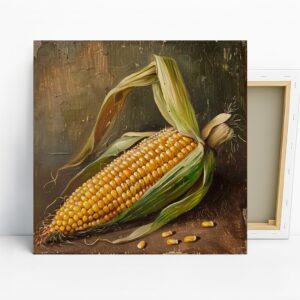
Golden Corn Harvest Art, Canvas or Poster, Still Life Rustic Decor, Kitchen Dining Room Pantry Wall Art, Yellow Green Brown Gold

Golden Lips Art, Canvas or Poster, Contemporary Glam Minimalist Decor, Bedroom Living Room Office Wall Art, Black Gold White
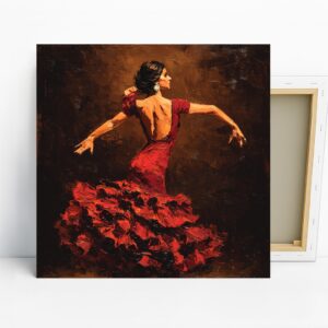
Flamenco Dancer Art, Canvas or Poster, Contemporary Figurative Decor, Living Room Bedroom Dance Studio Wall Art, Red Brown Black Colors
Modern Selfie Girl Art, Poster or Canvas, Pop Art Minimalist Decor, Living Room Bedroom Office Hallway Wall Art, Multicolor Blue Yellow Pink