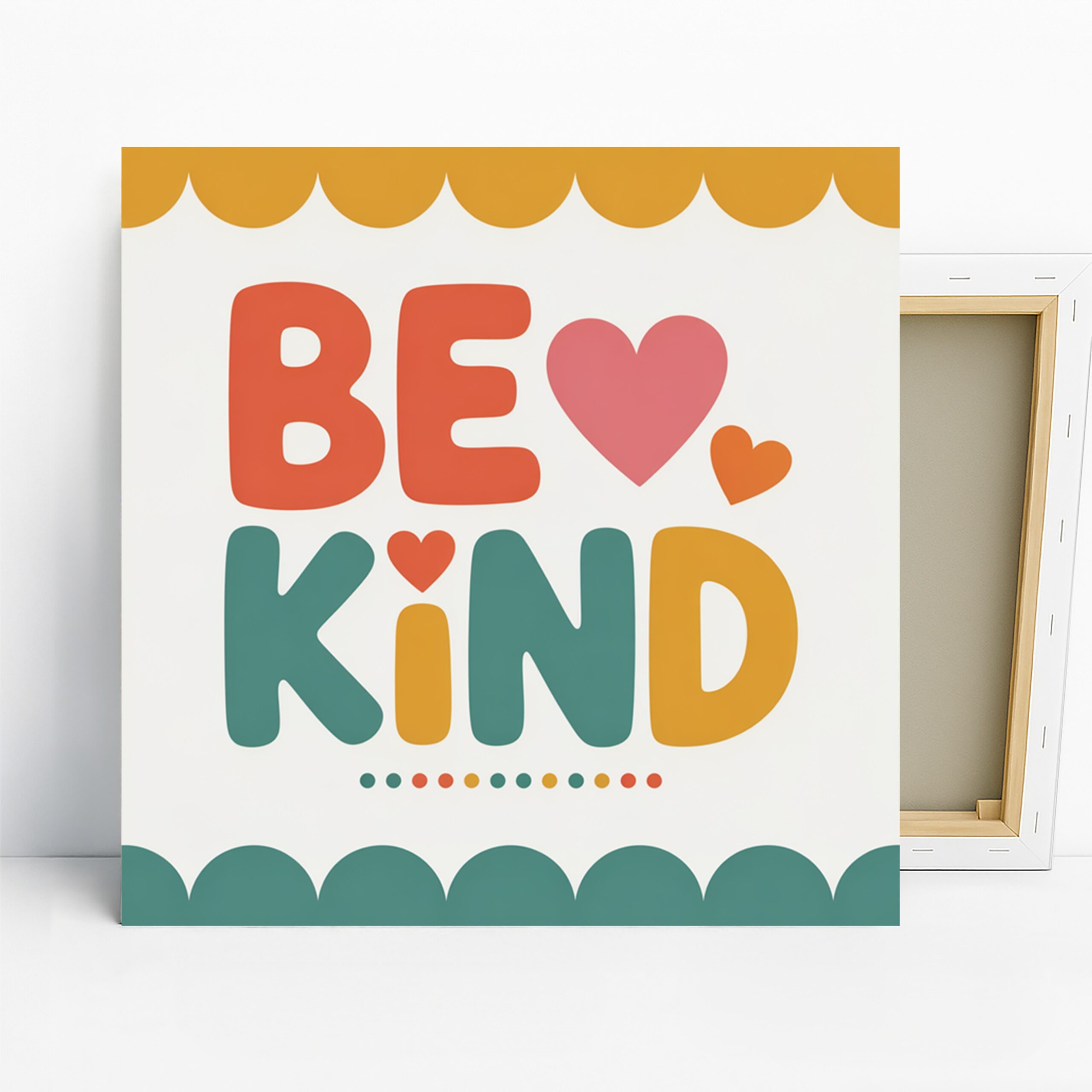
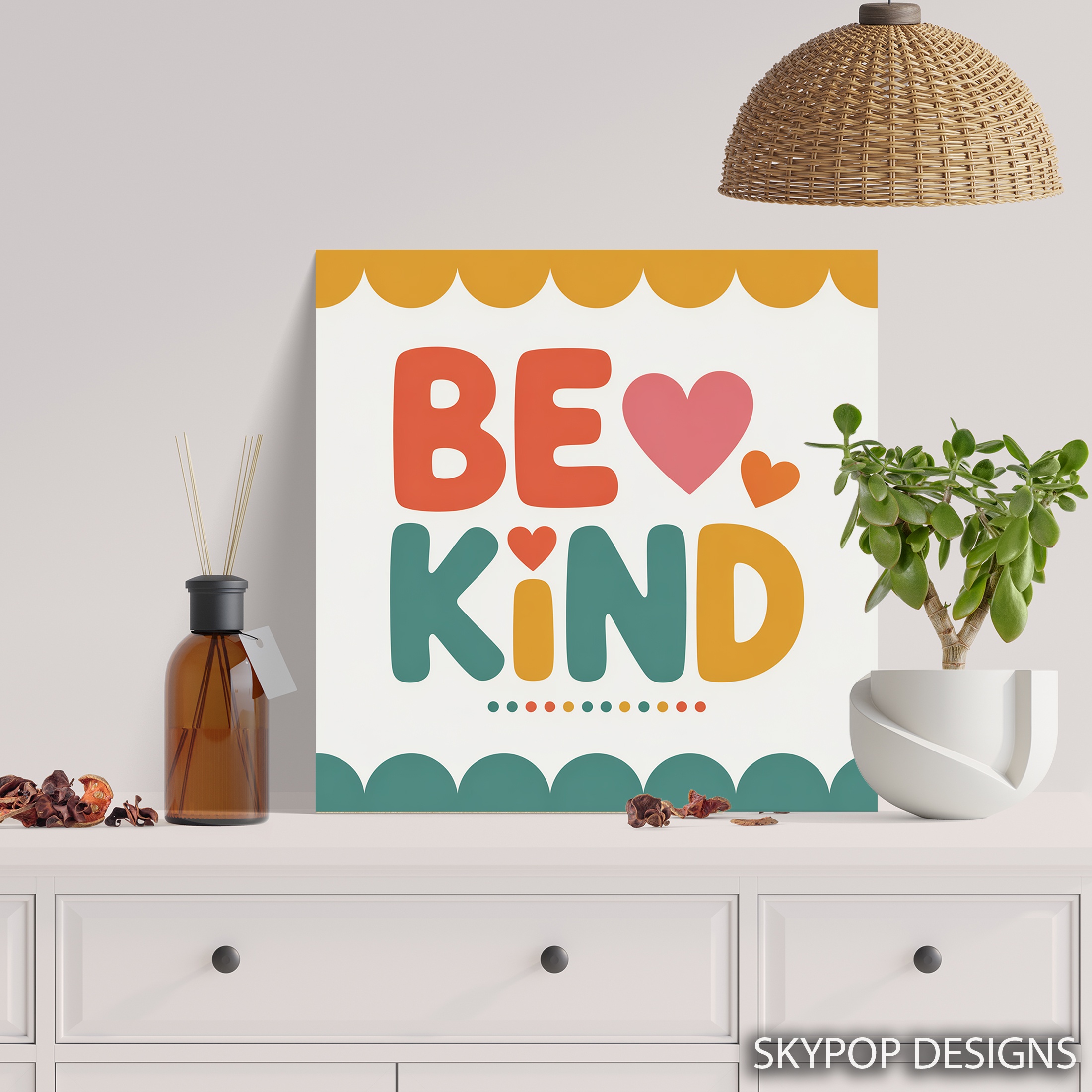
This be kind wall art catches your eye right away with its playful retro typography shouting ‘BE KIND’ in bold orange and green letters, dotted with pink hearts. It’s the kind of piece that fits families with kids or anyone wanting a nudge toward positivity without going overboard. Perfect for nurseries, children’s rooms, living areas, or even offices, it adds warmth and motivation to everyday spaces. If you’re into contemporary decor or green accents, this one’s a winner. In this post, we’ll dive into four styling tips to help you place it just right—think size picks for different spots, color matches that pop, and lighting tricks to keep those colors vibrant. Whether you’re refreshing a kid’s room or your home office in 2026, these ideas make it easy to visualize. We’ve got more decorating inspo on our blog, so stick around for practical advice that feels like chatting with a friend who’s tried it all.
1. Pick the Perfect Spot for Be Kind Wall Art
Start by thinking about where this be kind wall art will have the most impact—it’s all about creating that welcoming vibe. In a nursery or children’s room, hang it above a changing table or crib at eye level for little ones, around 48 inches from the floor to the center of the frame. That way, the whimsical letters and hearts become part of their daily routine, subtly teaching kindness amid the playtime chaos. For living rooms, position it over a console table in the entryway area; the vibrant orange and pink will greet guests and set a positive tone right from the door. Avoid hallways though—the narrow space makes the bold colors feel cramped, and you’d lose that uplifting punch. If you’re eyeing an office, go for the wall behind your desk; it turns mundane work hours into something motivational. Just measure twice: leave at least 6-8 inches of breathing room around the edges so it doesn’t crowd the furniture. This placement tip ensures the artwork feels intentional, not tacked on. Pair it with simple wooden shelves stocked with books or plants to echo the retro playfulness without overwhelming the room.
2. Size It Right for Your Be Kind Wall Art
Sizing matters more than you think with this square be kind wall art—those available options like 12×12 inches up to 28×28 inches give you flexibility, but pick wrong and it looks off. For a small nursery wall, the 12×12 or 16×16 inches works great; it’s intimate without dominating the space, especially above a rocker where you want focus on the baby, not the art. Above a standard 72-inch sofa in the living room? Step up to 24×24 inches minimum—anything smaller, like the 10×10, gets swallowed by the furniture and loses its whimsical charm. In an office, the 20×20 inches strikes a balance for a desk setup, filling the view without blocking light. Here’s a pro tip: aim for the artwork to be two-thirds the width of the surface below it. So for a 60-inch console, the 18×18 or 20×20 fits nicely. Go too big, say 28×28 in a tiny powder room, and it overpowers the vanity—stick to modest scales there. Check out this scale and proportion guide for more on getting it spot-on; it saves headaches later.

3. Pair Colors Smartly Around Be Kind Wall Art
The orange, pink, green, and yellow in this be kind wall art demand thoughtful pairing—it’s vibrant but not chaotic if you play it right. Walls in soft neutrals like Benjamin Moore’s ‘Simply White’ or Sherwin-Williams ‘Alabaster’ let those colors shine without competing, creating a clean backdrop for the retro typography. In a bedroom, pair it with light oak nightstands and beige linens; the warm tones cozy up the space nicely. Steer clear of deep reds or burgundy accents though—they clash with the orange and turn the whole vibe muddy. For accents, add throw pillows in soft yellow or green to tie it in, following the 60-30-10 rule: 60% neutral walls, 30% furniture in complementary woods like walnut, and 10% pops from the art itself. Metals? Brass lamps enhance the playful energy, while chrome keeps it modern. In an entryway, a beige rug grounds the piece beautifully. Dive into basic color theory if you want to geek out—it’s why analogous colors like these greens and yellows feel so harmonious here. This approach makes your room feel pulled together, not like a color explosion.
4. Light It Up to Highlight Be Kind Wall Art
Lighting can make or break how this be kind wall art pops—those flat color blocks and scalloped borders need even illumination to stay true. Natural light from a north-facing window works wonders; it keeps the orange and pink from washing out, unlike harsh south sun that fades the vibrancy over time. In a living room, position it near but not in direct sunlight to avoid glare on the matte finish. For evenings, warm LED bulbs at 2700K bring out the yellow accents beautifully, making the hearts glow without harsh shadows. Skip cool fluorescents—they dull the greens to grayish tones. In an office without windows, a simple clamp-on picture light above the frame does the trick; angle it to skim the surface for depth in the typography. Fair warning: overhead recessed lights often miss the details, so add a floor lamp nearby if needed. This setup ensures the uplifting message reads clearly from across the room. It’s straightforward—no fancy gallery setup required, just smart placement to keep the whimsy alive all day.
What You’re Getting
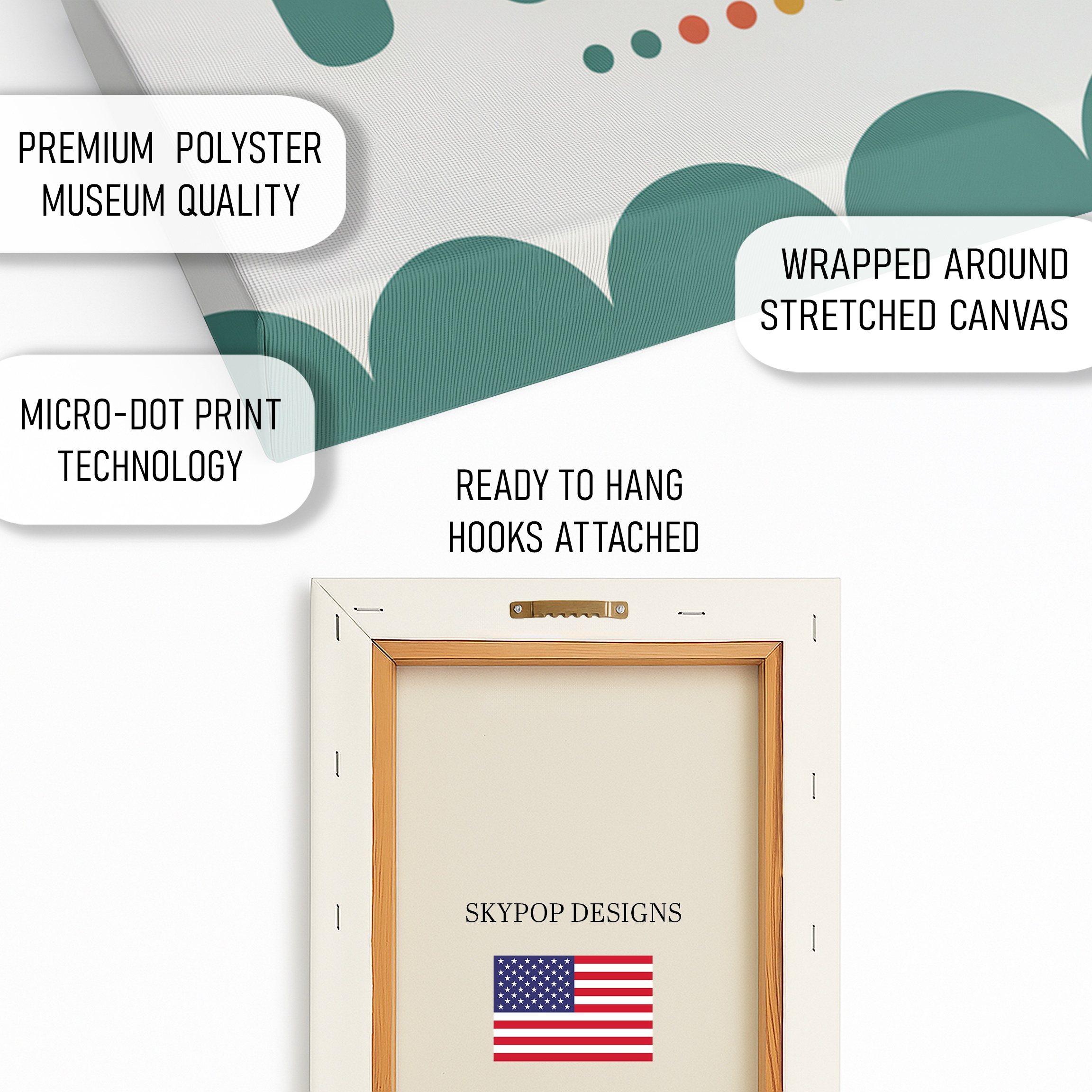
You’re getting a high-quality giclee print on 290 gsm canvas with an ultra-fine texture that mimics traditional painting without the fuss. Archival inks mean it won’t fade for decades, even in sunny spots. The matte finish cuts glare, so colors stay true under various lights. Choose between 0.75-inch slim wrap for a sleek look or 1.5-inch gallery wrap for more dimension—both ready to hang with included sawtooth brackets. Made right here in Ohio, it ships in 3-5 business days, packed securely to arrive flat and flawless. Posters are an option too, on premium 100 lb paper if you prefer framing yourself. Check the product page for current pricing and exact options.
What Customers Are Saying
“This be kind wall art transformed our nursery— the kids point at the hearts every morning, and it just makes the room feel happier without being too babyish. Love the colors; they match our green accents perfectly.”
– Sarah T., Verified Buyer
Frequently Asked Questions
What size of be kind wall art should I get for a small nursery?
For a small nursery wall, the 12×12 or 16×16 inches sizes are ideal—they add whimsy without overwhelming the space, especially above a crib or dresser.
Does this be kind wall art work with cool-toned walls?
It pairs best with warm neutrals like soft beige, but light pastels such as pale blue can work if you balance with wooden furniture; avoid stark whites that might make the colors feel flat.
How long does shipping take for this artwork?
Ships in 3-5 business days from Ohio, with free shipping on orders over $75—it’s carefully packaged to prevent damage.
Bottom Line
There you have it—four solid styling tips to make your be kind wall art a standout in any room. From smart sizing to color tweaks, these steps help it blend positivity into your daily life without effort. Head over to the product page to see available sizes like 20×20 inches and pick what fits your space. You’ll love how it lifts the mood. Ready to add some kindness to your walls?
Free shipping on orders over $75 • 30-day satisfaction guarantee
Shop Related Art
Complete Your Collection
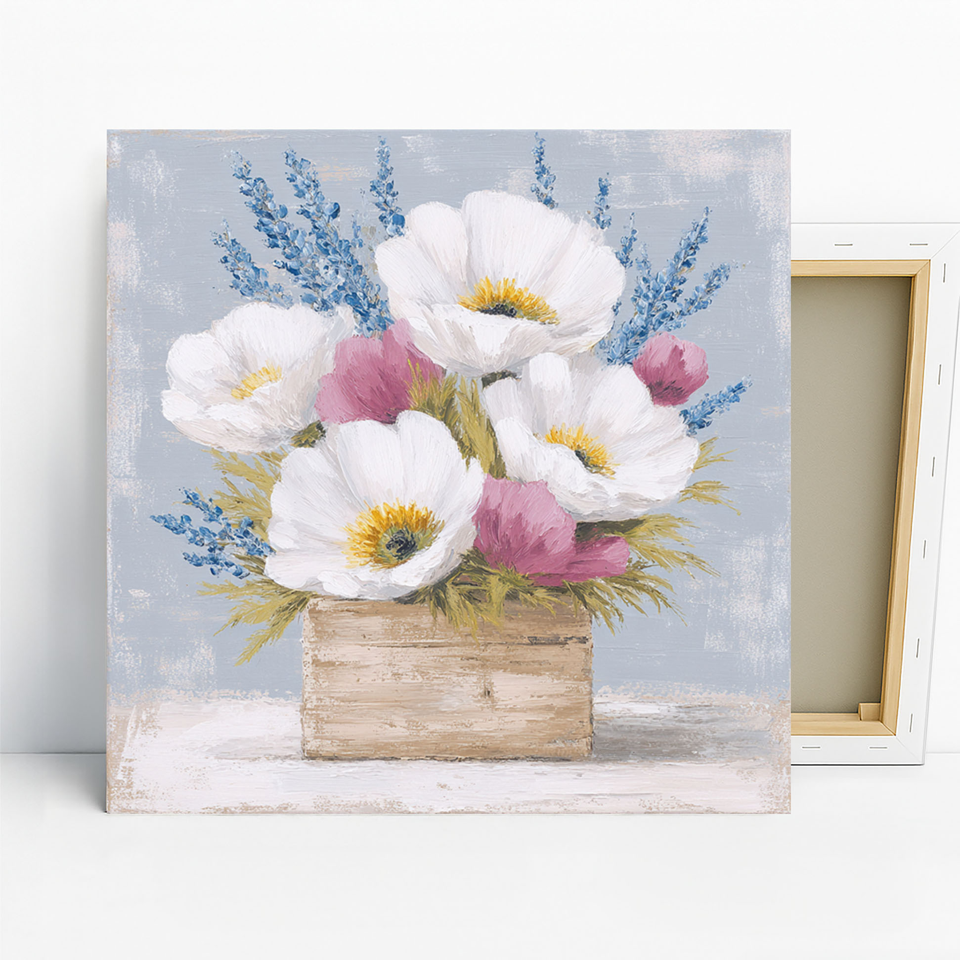
Poppy Floral Crate Art, Poster or Canvas, Impressionism Farmhouse Rustic Decor, Living Room Dining Room Kitchen Wall Art, Red Yellow Purple Grey
Coffee Frog Art, Canvas or Poster, Whimsical Contemporary Decor, Living Room Office Kitchen Bedroom Wall Art, Green Orange White
Abstract Sunset Landscape Art, Canvas or Poster, Minimalism Modern Decor, Living Room Office Dining Room Wall Art, Purple Yellow Gray White

Koala Hugs and Flowers Art, Canvas or Poster, Whimsical Bohemian Decor, Living Room Kids Room Bedroom Office Wall Art, Orange Green Yellow